I preordered Apple's new smartphone on September 12, and it wasn't easy. Few months back, I went "Microsoft All-In" for the summer, purchasing the Nokia Lumia Icon on contract from Verizon. So I didn't qualify for the discounted, upgrade price. But when there's a will, there's a way -- and a generous family member helps make something special happen.
My iPhone 6 review begins with such disclaimer. Like iPad Air, I paid for the device. Apple didn't send me a review unit, but I did ask, and I am not on the preferred list of writers who get early access to "iDevices" and who presumably are more likely to rave. Such qualification is necessary, because iPhone 6 is an exceptionally satisfying handset, and I don't want to be mislabeled fanboy for stating such. That's a brash conclusion coming from someone abandoning a competing smartphone with better specs and satisfying user experience.
Why I'm "All Out"
For nearly two years before this summer, Chromebook was my primary -- and often only -- PC. But Microsoft nagged my subconscious. I built my tech writing career covering the company, around which there remains considerable audience. With Windows 8.1's release, new CEO's tenure, cloud offerings' maturity, and Surface Pro 3's launch, Microsoft intrigued all the more. Something else: In early Spring, I developed serious vision problems (by August healing and now mostly resolved), and Microsoft offers exceptionally readable font technology. So I dived all-in, with hopes of staying there.
Let me say this: Surface Pro 3 is excellent -- as far as the hardware goes. The hybrid tablet-PC concept is a winner. But I consistently rammed against a wall: Available apps and the way I want them (in Modern UI). Additionally Windows 8.1 is quirky, and many of the problems are cloud-sync and service related. The experience particularly jarred coming from Chromebook, which management is easy and where sync is smooth. Ongoing software and services usability problems sapped my time and productivity until finally enough was too much.
So, at the end of August, knowing back-to-school would be a good time to sell, I Craigslisted SP3. The device got a good home -- University of California San Diego freshman, giving up just $200 equity before tax on my original purchase price. I took the cash down to DC Computers, which is in my neighborhood, and bought a used 13-inch MacBook Pro Retina Display. At the time, I planned to keep the Icon, and the Mac would be more compatible companion than Chromebook, which better fits "Google All-In".
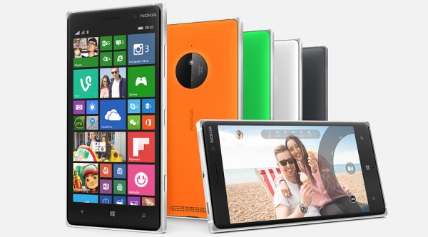
I really like the Nokia phone. By most measures that matter to me, Windows Phone 8 exceeds its desktop sibling. Performance is smoother, sync surer, user interface more uniform, meaningful apps availability better, and built-ins like Mail superior. Then there is the hardware, where the the camera and videocam are showpieces. But the supporting platform ecosystem is inferior to iOS, which is reason enough to go Apple for computing, mobile, and supporting cloud services.
Perhaps later I will regret not waiting for Windows 10. But I must qualify: OS X Yosemite beta running on my Mac is smoother than Windows 8.1 general release on Surface Pro 3, with no lost productivity from glitches or other annoyances.
How I ordered iPhone 6
Deciding to switch is one thing. Making it happen is another: Because my budget is super tight, I needed to fund my iPhone 6 purchase without paying full, non-contract price -- an option not obviously available for preorders starting September 12. My local Verizon store rep had a solution: Buy a $250 Ellipsis tablet, which 4G LTE line would be eligible for immediate upgrade. Out-of-pocket expense would be $200 less than iPhone 6's full price. Just to make sure there would be no glitches, the rep offered to manually switch the device to a flip phone in Verizon's system, ensuring no last-minute hiccups.
Problem: I don't need another Android tablet and nothing about the Ellipsis piques my interest. My sister came to the rescue. She works for a company that provides tech services to enterprises -- the majority using Microsoft software and services -- and needed an off-contract Verizon phone. She already agreed to buy the Icon, which looked to better sync with her lifestyle, but also wanted a tablet. Sis scooped up the Ellipsis, too, while I agreed to pay the $10 a month service. Her two purchases and sale of an older camera on Craigslist provided just enough funds.
As Midnight PDT approached on September 11, I staked out the Apple and Verizon websites. Around 11:58 pm, refreshing the Verizon page brought up the order option. I chose the 128GB space grey model and had the preorder completed by 12:03 am, even before Apple Store came back on line. The phone arrived early afternoon on September 19, after which I drove down to the carrier store for activation on my line and to square up the other for the tablet, which I mailed with the Nokia smartphone to my sister the next day.
My First Impressions
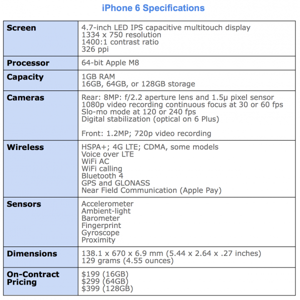
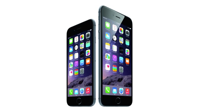
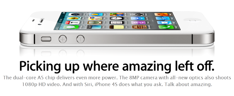
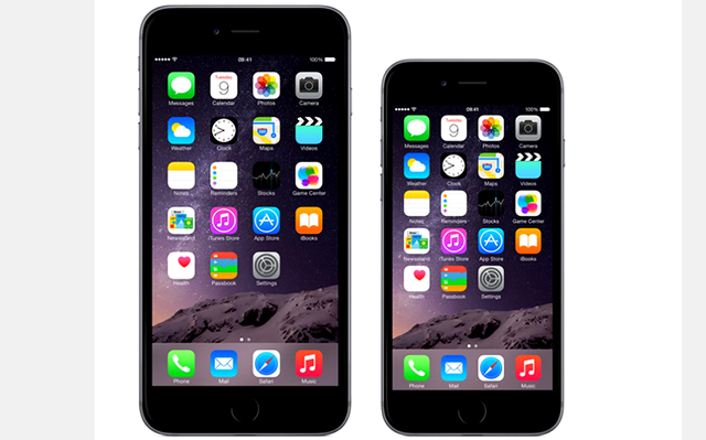
At a time when 1080p screens with 400 pixels per inch (or more) are the standard among high-end smartphones, Apple's device is little better than 720p (1334 x 750) and 326 ppi, which is same as iPhone 5s. While most newer high-ends pack 5-inch or larger screens, the iOS device is 4.7 inches. When 16-megapixels is increasingly standard for mobile cameras, Apple's handset is 8MP. By these and many other metrics, iPhone 6 offers less than competing handsets -- Nokia Lumia Icon among them.
But by measure of benefits, Apple's smartphone is in many ways superior. As such, this review is organized by them, rather than features. My metaphor for the difference. The sleeve placed around a Starbucks cup is a feature. Protecting your hand from burning is a benefit.
Aesthetics
The design of both the 6 and 6 Plus is reminiscent of iPhone classic -- the original sold starting in June 2007. Rounded corners and curvy frame are the visible characteristics they share. Other reviewers point to iPod touch similarities, which is true of thinness, but the prominent aesthetic -- rounded corners -- harkens heritage to the original.
The similarities only begin there. iPhone 6 finely balances benefits against features in ways much like the classic. In 2007, Apple stripped back features available on other phones, such as 3G and MMS, to balance others: battery life and responsive interaction of the new sensors and touchscreen.
Balance is the overall design aesthetic and priority placed delivering benefits before the fanciest features. By the specs, iPhone 6 is inferior to the newest handsets from HTC, Motorola, Nokia, and Samsung, among others. Android and Windows Phone fans are quick to point out the lower specs, such as the "Welcome to 2012" meme referring to Google Nexus 4 features.
However, my experience favors Apple's decision to deliver more by giving less. iPhone 6 is extremely enjoyable to use, and joy is a benefit often overlooked in tech design. How you feel using a device matters much more than how you think about features. There, balance -- how all the features fit together to deliver benefits -- and the device's design mean everything.
iPhone 6's design is understated, which is a long-standing Apple aesthetic (see my 2005 BetaNews story). I've seen some complaints online about the plainness and calling the top and bottom back bans ugly. Picky. Picky.
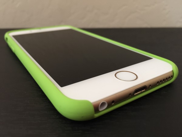
Because of the slick surface, iPhone 6 needs a case for better grip.
Plainness isn't the problem. Apple is sometimes guilty of putting form before function, and this is where aesthetics can undermine usability. How a phone feels and how well it stays in hands and fingers are intertwined benefits. While I find that iPhone 6 feels quite good to hold and can be operated with one hand, the surface is too slick. I can't get good enough grip, and the curved rather than flat frame is one reason why. This is the first iPhone for which I strongly encourage some kind of case. This baby eventually will slip from your hands otherwise, and Apple should be faulted for squandering benefits.
Sight
The screen delivers some of any smartphone's most important benefits. As such, I obviously wondered what the experience would be stepping down from Icon, which 5-inch display is 1920 x 1080 resolution and 441 ppi. Great, surprisingly. iPhone 6's screen is brighter, offers greater contrast, and is more viewable outdoors -- unexpected because the Nokia is quite usable in bright sunlight. These are benefits set against others, such as providing satisfactory battery life.
Nice touch: Standard and Zoom modes. For my ailing, aging eyes Standard is just fine, however.
Pretty much anything viewed on iPhone 6 looks superb. People upgrading from iPhone 3/G/GS or 4/4S might be overwhelmed by the spaciousness, while most 5/5s users will be pleased. If I can go down in screen size and resolution and be satisfied, surely someone moving up will be, too.
That said, my satisfaction somewhat slumped seeing the 6 Plus inside Apple Store. The differences are immediately obvious. The larger phone's screen is crisper, the glass seemingly less reflective, and the desktop so vivid it looks painted on. I actually had to check to ensure I hadn't picked up a dummy phone with paper mockup pasted on.
Some people will wonder why 1080p is Plus-only. Welcome to the Apple way. Since Tim Cook came on as COO and continuing as CEO, the company finely tunes product SKUs, often offering less one place and more somewhere else to maximize margins on the front end of the manufacturing cycle. Later, as the product lifespan extends, Apple iterates, by downstreaming capabilities from costlier iDevices or adding features that match or catch competing devices. Think of it as the "little better" strategy. Apple makes each new device a little better until the next, big release then resets and starts again.
I explained the concept 5 years ago in a post on my personal site: "How Does 'Incremental' Define Apple?" Excerpt:
Apple engages in tried-and-true retail practice. It’s good business. Clothing stores take a similar approach. There are teens who must have the newest wears from Aeropostale, American Eagle, Gap, or Hollister at full price; they can't wait for sales. They want to be cool...
As a product's lifecycle progresses and Apple maximizes margins at the front end, incremental improvements begin. The company typically starts by improving the hardware for the same price. Later, Apple adds better hardware or features and cuts the price. Eventually, Apple retires the product and introduces another 'one more thing'.
iPhone 6 is just that. Plus offers a little better, and 6 will get a little better during the next upgrade cycle. Meanwhile 5s with 16GB storage sells for $99 on-contract, or half what it did before its successor launched.
Sound
iPhone 6 gives great audio -- if you attach headphones or speakers. But the tinny, internal single speaker lacks much, particularly when smartphones like HTC One M8 offer so much more. That said, placement on the bottom frame (in vertical orientation) assures that notifications and phone rings can be heard. On Icon, by comparison, a case can largely silence the back-facing speaker.
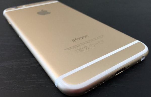
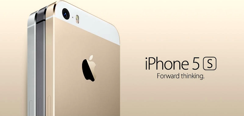
iPhone 6 is available in three color motifs, one of which is white and gold.
Connected to headphones, Beats Music or iTunes streaming sounds fantastic. There's an immediacy to fullness and breadth of soundstage that's good to a fault. With quality cans -- Grado RS1e -- I hear imperfections in the encoding, which on some tracks my ears perceive as over-modulation or muffled vocals.
Photography
More megapixels is meaningless, as I have asserted for years. Apple wisely sticks to 8MP, which is the reasonable limit, because cameraphone sensors are tiny (I would prefer 5MP). The greater packed the sensor with pixels, the more artifacts and other aberrations appear in photos. Like iPhone 5s, the 6 offers 1.5 micron pixels, which, among other benefits, let in more light than the standard 1.1 micron pixels, which tightly pack on 16MP phone shooters.
The f/2.2 aperture lens is good choice, and in my testing finely balances with sensor and software. I can't emphasize the importance of the latter and choices made when shooting and post-processing. In 2012, I used the 5MP Samsung Galaxy Nexus to shoot San Diego Comic-Con. One reason: The phone produced surprisingly good photos in low light, mainly because of the superb balance of features and wise settings choices made in auto mode. Something else: Google promised and the smartphone delivered instant-shutter response.
The catchup capability is one of iPhone 6's best photography benefits, particularly in HDR mode. Shutter response is fast. Immediate. But there is more: In my early testing, iPhone 6 smartly chooses aperture, ISO, and shutter speed -- and that's best observed in low-light settings.
Still, something bugs me. Like earlier iPhones and many Androids, the handsome photos are more balanced than realistic. I don't feel the images are what my eyes see. Maybe I need to fiddle the settings some. By comparison, the original Moto X, which shooter is overall inferior, produces color and contrast as I see them -- or what I expect in the images. That's a matter of taste, where I prefer photos that are less-saturated than iPhone 6 produces. Color accuracy is generally spot on, despite my complaints.
Most people are not professional photographers. They wouldn't know f-stop from exposure compensation. Rather than presenting confusing controls and numbers, Apple provides a nifty slider for adjusting exposure -- lightness or darkness the user sees in the screen preview. Just tap the display. Other niceties, many carried forward from iPhone 5s and iOS 7 or long available elsewhere, include auto stabilization, face detection, and panorama mode.
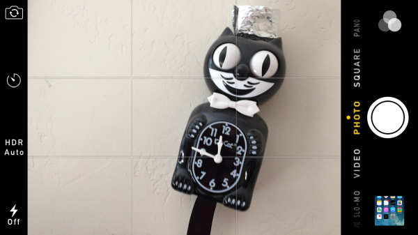
iPhone 6 camera settings resemble those found on its predecessor.
However, optical stabilization is only available on iPhone 6 Plus, which is an instance where "a little better" means a lot. The technology is rather nifty, using the gyroscope in conjunction with the lens, which position changes, to reduce camera shaking that often blurs photos. Getting this benefit means buying a considerably larger and heavier iPhone.
Reality check: Nokia phone cameras are legendary -- and for good reasons. While Icon and iPhone 6 both produce excellent photos, differences matter -- such as optical stabilization on the Lumia, which offers finer control when shooting images, offers via DNG a RAW option, produces superb images despite the 20MP handicap, and provides better post-editing options using Nokia software, such as ability to blur the background (e.g., produce bokeh) after taking the photo. Icon also has a dedicated shutter button. However, the device is a slower shooter compared to iPhone 6 or Google Nexus handsets.
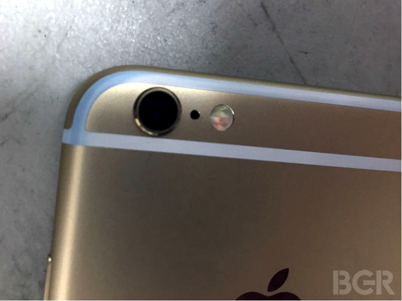
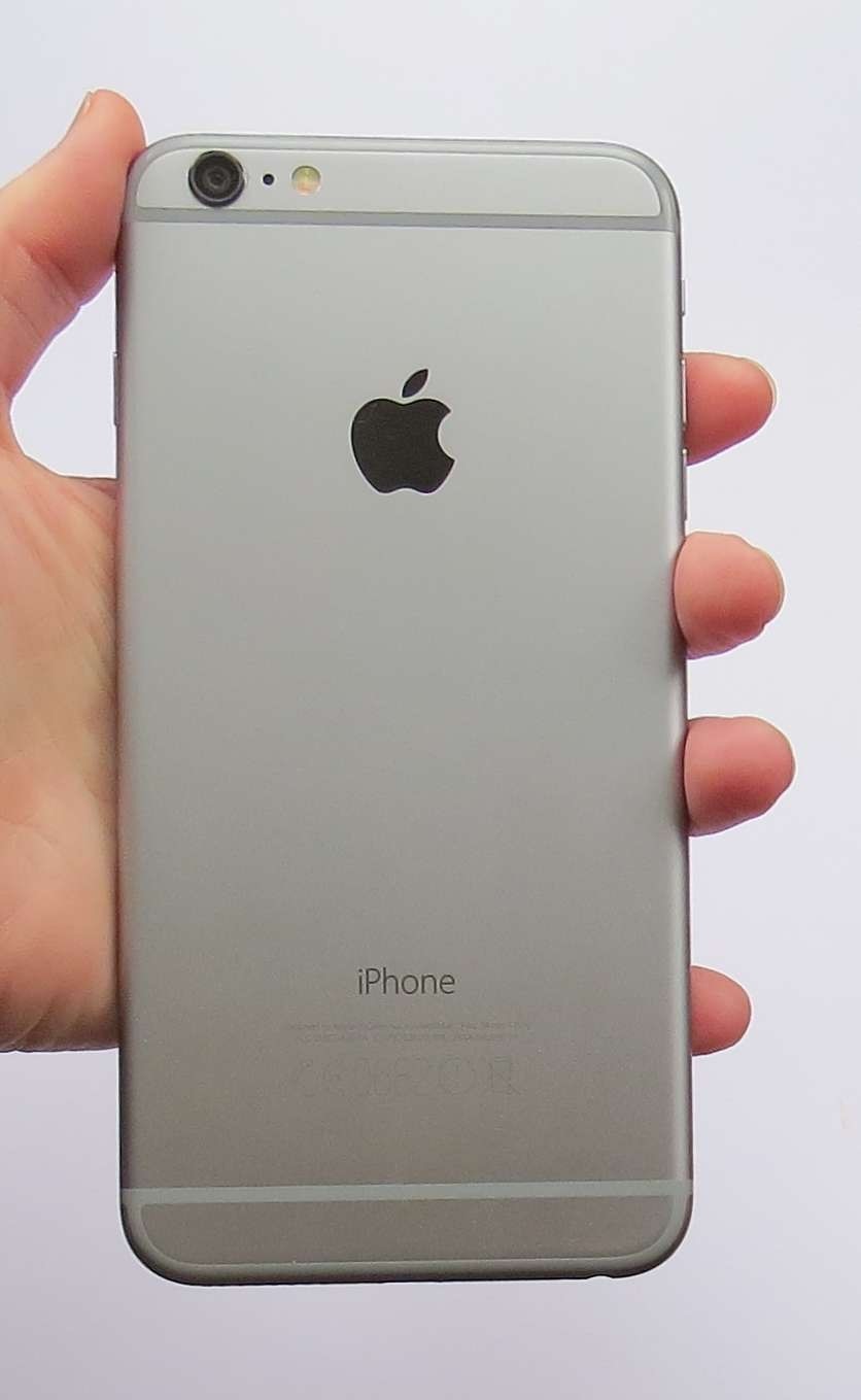
Most people will find iPhone 6 photography to be satisfying if not more. There is no non-pro compact camera with fixed lens -- meaning without telephoto -- that I would recommend over this smartphone. That said, in another form before function move, the handset's body is thinner than the camera can accommodate, such that the lens juts out from the enclosure. It's an unacceptable design compromise that puts the lens at greater risk of damage and is, unfortunately, another reason to buy a back-fitting case. By contrast, Nokia insets the lens on the Icon and 930.
Videography
Apple delivers some nifty tricks shooting videos, and one is desperately-needed catchup: Continuous focus, a feature found on the Icon and Nexus 5, for example. Fixed focus is one of older iPhones' biggest videography handicaps. On the 5 and 5s, you can tap to focus to start but there's trouble if you or the subject moves. In my testing, iPhone 6 adjusts focus as promised. Finally!
Neat trick: Slow-motion at 120 fps or 240 fps, with the latter the default but only 720p. Slo-mo is super fun, but good luck easily exporting clips and keeping the slow speed. I'm struggling to get it right, at this point in the review, and will update later. Meanwhile, phoneArena offers a helpful how-to guide.
The videocam can capture 1080p at 30 or 60 fps, and the latter is beneficial for shooting moving objects or finer-editing later on. Time-lapse videography enables other creative options, and Apple claims something called "Cinematic Video Stabilization", which supposedly lets you GoPro without buying one.
I haven't yet conducted extensive tests of the audio, which for some strange reason is something too often overlooked by phone designers. C`mon, if the video is going to look good, it should sound that way, too. Nokia claims four directional microphones on the Icon (and 930) that can produce some smashing sound shooting vids. If iPhone 6 audio with video is as good as 5s, it's enough.
Some advice: If camera and videography matter most to you, and nothing else, the Icon and near-identical Nokia Lumia 930 are my recommendation, rather than iPhone 6 or any other smartphone (even Nokia's 41-MP shooter). However, as will be explained shortly, considerations like apps availability and supporting ecosystem make Apple's device the better choice for most people. By the way, for anyone wanting 4K video-shooting capability, most major phone makers offer it, including Samsung and Sony. iPhone 6 won't satisfy your 4K dreams.
Longevity
Question everyone should ask about a smartphone: "How long can I use it before the battery dies?" Strangely, I don't have an answer after nearly two weeks using iPhone 6. My best response: Long enough. Time period between charges is so great, I can't keep track.
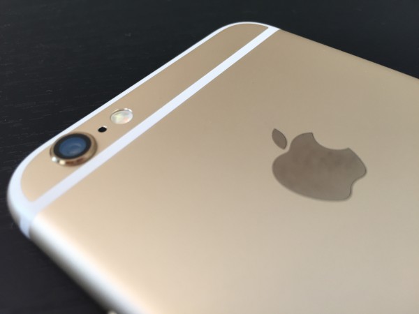
The iPhone 6 camera lens juts from the body, increasing risk of scratches or damage.
Apple claims 24-hour talk time over 3G, 14 hours watching videos, or 12 hours Internet over LTE or WiFi. I care about shooting photos and videos and uploading them to the cloud, while rumbling across social networks or using mapping programs. These functions are more meaningful measures -- and in my random, incomplete testing I easily get through the day with juice left over.
Responsiveness
Performance is an important benefit, and subjectively either elicits joy or generates frustration -- and the latter emotion is one every manufacturer should avoid. I smile and assume you will, too: iPhone 6 is speedy enough, even short a couple cores compared to most other high-end smartphones. Either scrolling or opening apps and browsers is fluid and fast.
Benchmarks are for geeks hung up comparing features rather than looking at benefits. What matters more: How the device does daily tasks that are most important to you. By that measure, I have no complaints about subjective speed. However, I would say same about iPhone 5s. If you own the device and performance is your major buying criteria, expect to be surprised by the subjective speed sameness.
Sizing up the Digital Lifestyle
Smartphones are not isolated devices. If they were, I would use Nokia Lumia Icon today for photography and videography benefits. Companies like Apple, Google, and Microsoft sell lifestyle platforms around which someone builds stuff. Windows Phone is the weakest among the majors -- Android and iOS being the other two. Apps choices aren't as mature, and cloud offerings are comparatively meager. For example, homegrown Apple and Google apps and connected services are absent.
Don't like Internet Explorer on Windows Phone? Suck it up, there's no Chrome for you. But Google's browser is available for iOS. YouTube? Google Now? Google Maps? Nada, nada, nada. But all are available on iOS as well as Android, and, honestly, they look and use better on Apple's platform. Sure, Google sometimes sprinkles more features into Android apps, but in my testing their iOS counterparts give better benefits.
Apple is the Switzerland of mobile apps and cloud computing. I call iOS the "eat your cake and have it, too" platform. You can jump into the Apple lifestyle, while choosing from Google's and Microsoft's too. Meanwhile, the majority of the newest, third-party cloud-connected lifestyle apps are available for Apple's platform first.
Google groupies will wave the comparable number of Android apps and selection. But it's not how many but which ones that matter. Number of apps is a feature, while meaningful selection is a benefit. The most useful Android apps also are available for iOS, or exclusively. These factors greatly influenced my decision to abandon Icon for iPhone 6 -- and I could as easily picked an Android.
Let's cherry-pick pieces from the Apple lifestyle, which would be relevant to any iPhone 6 buying decision:
Command me. iOS gives good speech-to-text capabilities, like Android and Windows Phone, but Siri, still sucks. If she was a living employee, the company would have fired her long ago.
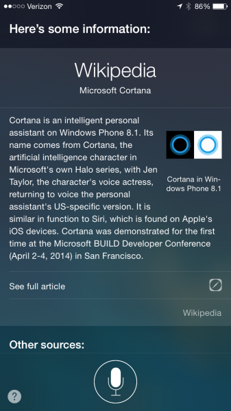
Siri answers correctly: "Who is Cortana?"
Even without Cortana, the Windows Phone 8-packing Icon gives meaningful and helpful answers to voice requests. For example, my 92 year-old father-in-law is at that age where someone thinks lots about the past. So we look together, every day. When I ask Windows Phone for "This day in history", Bing search produces a relevant list, the first link to history.com. If I say exactly the same to Siri, she often brings up the address for a museum in another town.
But I have little praise for Microsoft here. In the past, when Siri couldn't directly answer a question, I relied on the web searches she presented. But with iOS 7 -- and sadly carried forward to iOS 8 -- Bing is the search engine. Sorry, Google delivers more meaningful results.
Griping aside, Siri will get you around town and provide relevant, contextual information -- there Apple Maps is a help rather than hindrance (no more misdirections). She's not as proactive as Google Now, but as such not as snoopy. There's something stalker-like about Big G's app/service that creeps me out.
Call me. iPhone 5s offers HD calling, which T-Mobile supports. Successor 6 serves up Voice over LTE, which on Verizon is oh-so much better. There are two benefits when the feature is enabled in Settings:
- CDMA users can call and Internet at the same time (something GSMers have done for ages).
- Call quality is crystal clear -- such beautiful voice, the person on the other end sounds like a radio announcer.
Additionally, Apple claims support for "up to 20 LTE bands", WiFi is AC, and WiFi calling is available (from carriers offering it).
Granted, talking is like the last thing many people do on cell phones any more. But those who do will delight in these benefits.
Cover me. As the Switzerland of mobile platforms, iOS offers the best cloud cover of them all. These benefits aren't exclusive to iPhone 6, but I would be remiss ignoring them, since they're core to any digital lifestyle. Simply stated: Connected-apps are aplenty.
For simplicity, let's focus on the Apple Way. New to iOS 8 is iCloud Drive, a feature you shouldn't enable unless using Yosemite beta on a Mac, which I am. Doing so will cause problems accessing stuff stored on iCloud from other devices. The service is almost simple to a fault, because it's not obvious on iOS devices; access is from apps rather than a file manager (which is available on Yosemite or iCloud for Windows).

iPhone 6 tackles areas of differing light and contrast.
iCloud Drive finally catches competitors offering content access anytime, anywhere, and on anything (well, for the latter if an Apple-supported platform). Sync is excellent, in my limited testing. "Set it, and forget it" is the design ethic, an attribute that made the original iPod so compelling. Simple sync is a huge benefit, and it works well with other Apple apps and services, such as calendar, contacts, and mail.
I'm puzzled by Apple selling new iPhones with so much storage while offering so many benefits in the cloud. I'll reason that one out for a future analysis, perhaps.
Share me. With this platform release cycle, Apple introduces a goddam useful feature that surprisingly is overlooked in press coverage and reviews: Family Sharing. Think of it as "fair-use" applied to personal, digital content. I've complained for years about ebooks, music, movies, and the like being tied to a single account and not easily shared. Hey, mom can buy a CD or DVD and let the kids watch or lend it to grandma -- but not her digital downloads. Sharing is a humungous benefit.
According to Apple: "Once you set up Family Sharing, family members get immediate access to each other’s music, movies, TV shows, books, and apps. Download what you want with a tap anytime you like. All without having to share an Apple ID or passwords".
This benefit alone is reason to consider iPhone 6 or another iOS device and Apple's reward to long-time content buyers. Six people can share.
Pay me. I haven't tested Apple Pay yet, because the feature isn't available but supposedly releases this month. iPhone 6 includes a NFC chip for the Touch ID-to-pay system, for which there is surprising support. My bank and credit card are on board, as well as some of my favorite retailers. It's anyone's guess whether or not this thing succeeds, but you will want either of the new iPhones to use it.
One More Thing
As this review approaches 4,000 words, I stop the list of benefits, which could be longer. Instead, I end with surprising admission: If this was "Groundhog Day" or "Edge of Tomorrow", I would reset and not buy iPhone 6. I would purchase 6 Plus instead.
For most Apple customers upgrading from older models, the Plus will be too big. I thought the same applied to me, until handling one in Apple Store. My first impression was fabulous, starting with the screen and how the device felt in the hand -- not too large at all.
But iPhone 6 Plus isn't an option. The device is sold out everywhere. My local Verizon store says none are expected there until late October or sometime in November, which is well outside my 14-day return window. Oh well. I'm satisfied with iPhone 6 and believe that most buyers will be, too. Well, unless they wanted Plus and couldn't find one.
Some commenters will label me a flaming fanboy for liking iPhone 6. I refer them to other commenters calling me anti-Apple. Take your pick, but pay attention this: I am first to concede that by the specs iPhone 6 falls short of most major competing devices, including the Nokia Lumia Icon my sister now loves. Specs don't matter and distract from what does.
A smartphone isn't the sum of its features but balance of benefits. Apple understands this principle and handsomely applies it to iPhone 6. Google gets it, too, which is why Nexus devices are so good. Android's answer to Apple comes soon. Which wins? You tell me.
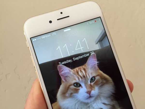
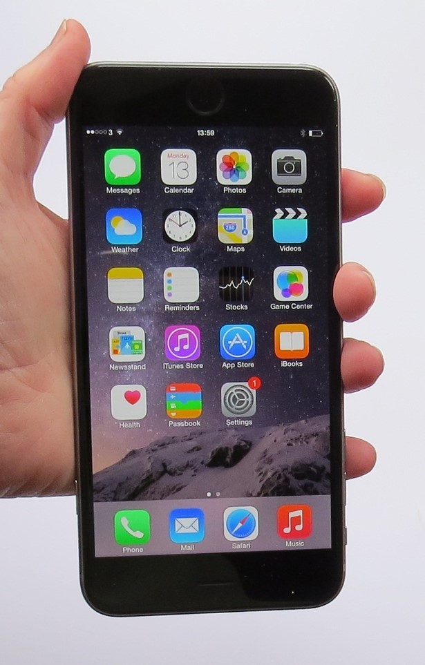
Editor's Note: I own the space grey iPhone 6 and used it to shoot pics of a borrowed white-and-gold model, which photographs better. That's my cat fiendishly and temporarily placed on the lock screen.









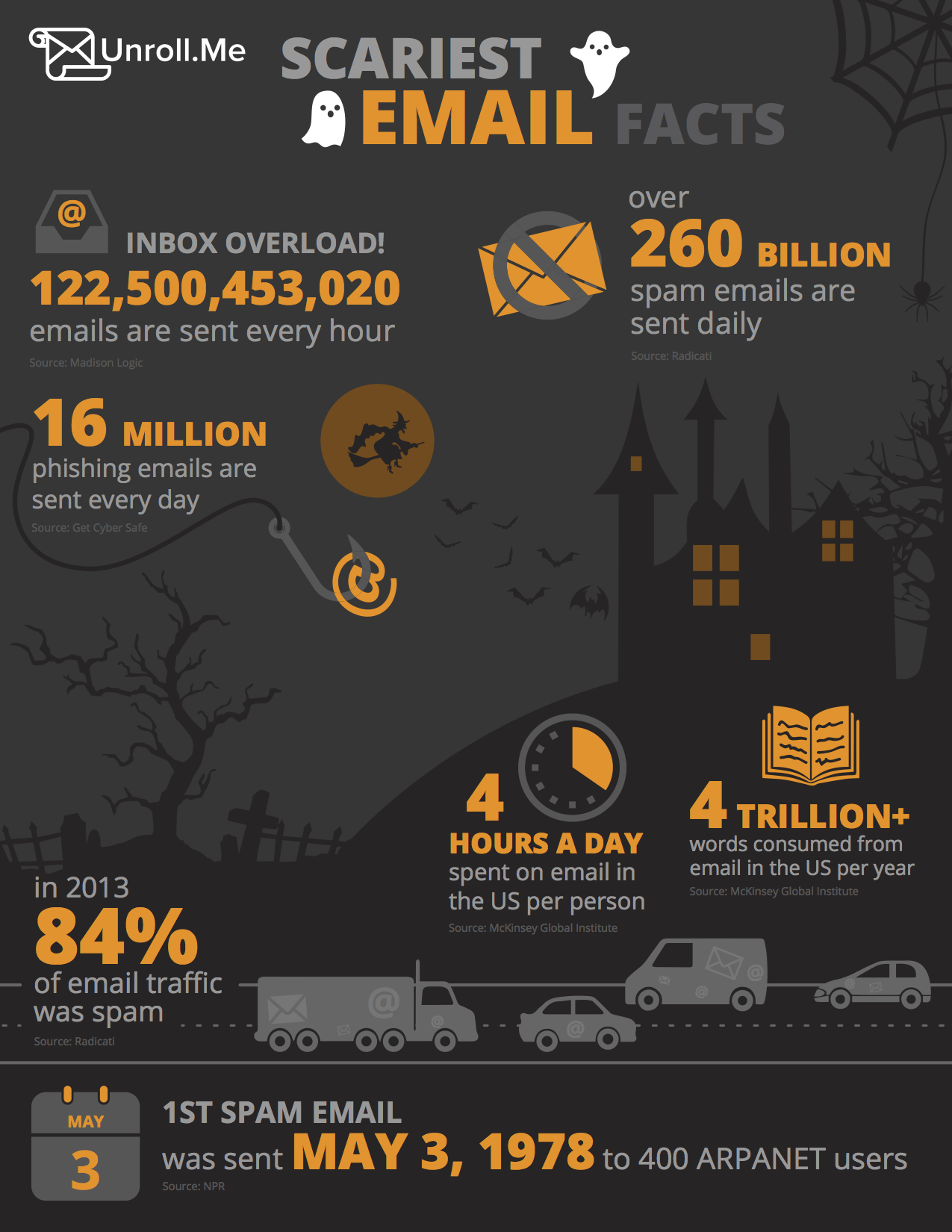
 There are days when I get absolutely swamped with email -- my work and personal inboxes are frequently filled to bursting -- and I’m not alone in struggling with the never ending deluge of demanding messages.



 Ryan Kalember is the chief product officer at



 First proposed in its basic form more than 40 years ago, File Transfer Protocol (FTP) is an archaic networking technology which should have been ditched long ago.

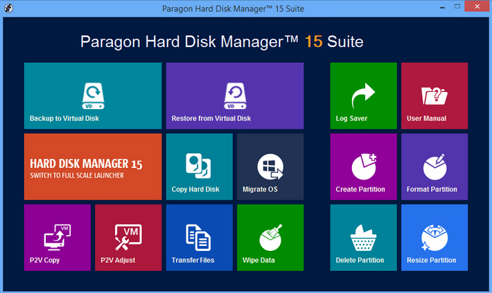
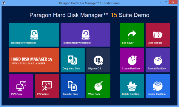
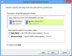 Some of HDM’s advanced partitioning tools could be applications on their own. The Split Partition Wizard not only splits one partition into two, but it also moves files to the new volume, and can even redistribute free space when you’re done (great for separating OS/ applications and data).

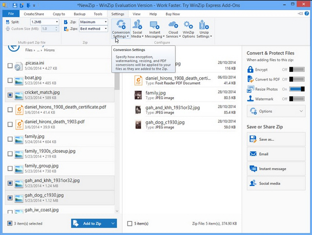



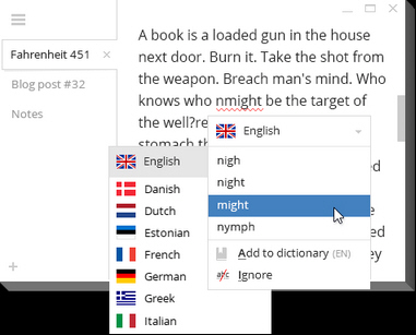 Notepad may be a weak, feeble and hopelessly underpowered editor, but its more powerful replacements can have problems of their own. Piling on the features often brings an array of interface clutter -- ribbons, toolbars, menus, panes, status bar and more -- which can get in your way and slow you down.




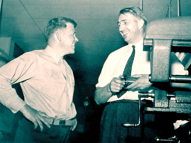
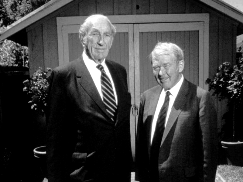
 In 1947, Hewlett-Packard incorporated. A few years later, it got involved in conflict again (the Korean War this time), and found more and more success, as the demand for electronics skyrocketed. Over the years, the company has built a huge range of products, including printers, calculators, medical equipment, business software and, of course, computers.




 Out of nowhere,

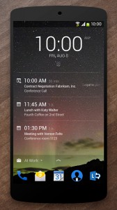 Microsoft app launches are usually predictable. Most are offerings which aim to get us hooked on the software giant's most-prominent products, like Office, OneDrive, Outlook.com and Xbox. But, every once in a while, Microsoft does something out of the ordinary, like it wants to tell the world that, much like startups, it too is capable of intriguing and exciting things.
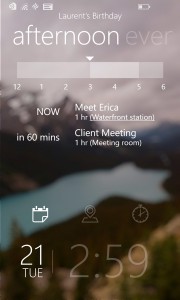 For Windows Phone users, Microsoft launched Tetra Lockscreen. It is very different compared to the stock Windows Phone lockscreen, that is still very sparse feature-wise, and the ones offered by Microsoft through its Live Lock Screen beta app, as, like Next Lock Screen, it shows a tremendous amount of information.


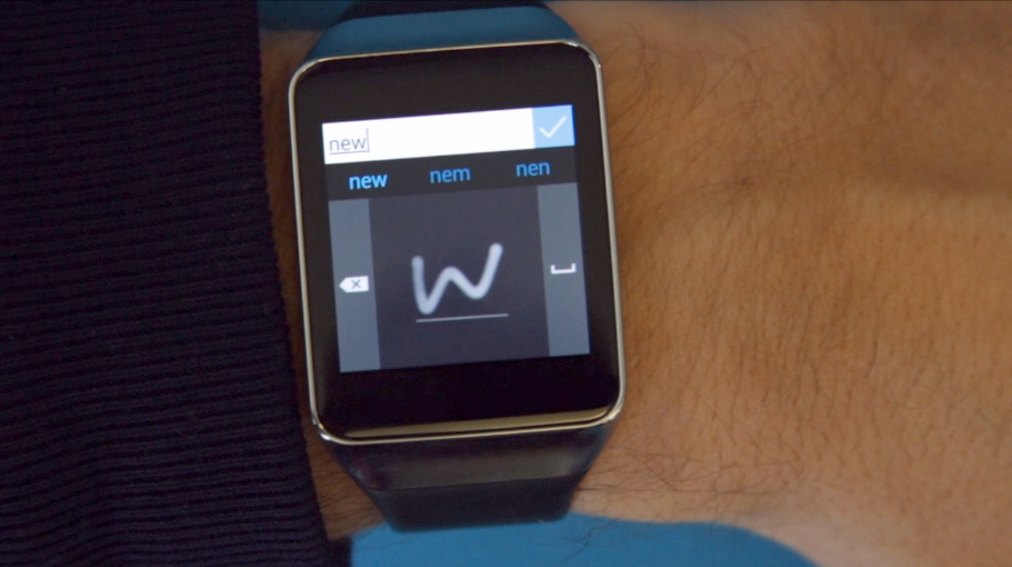
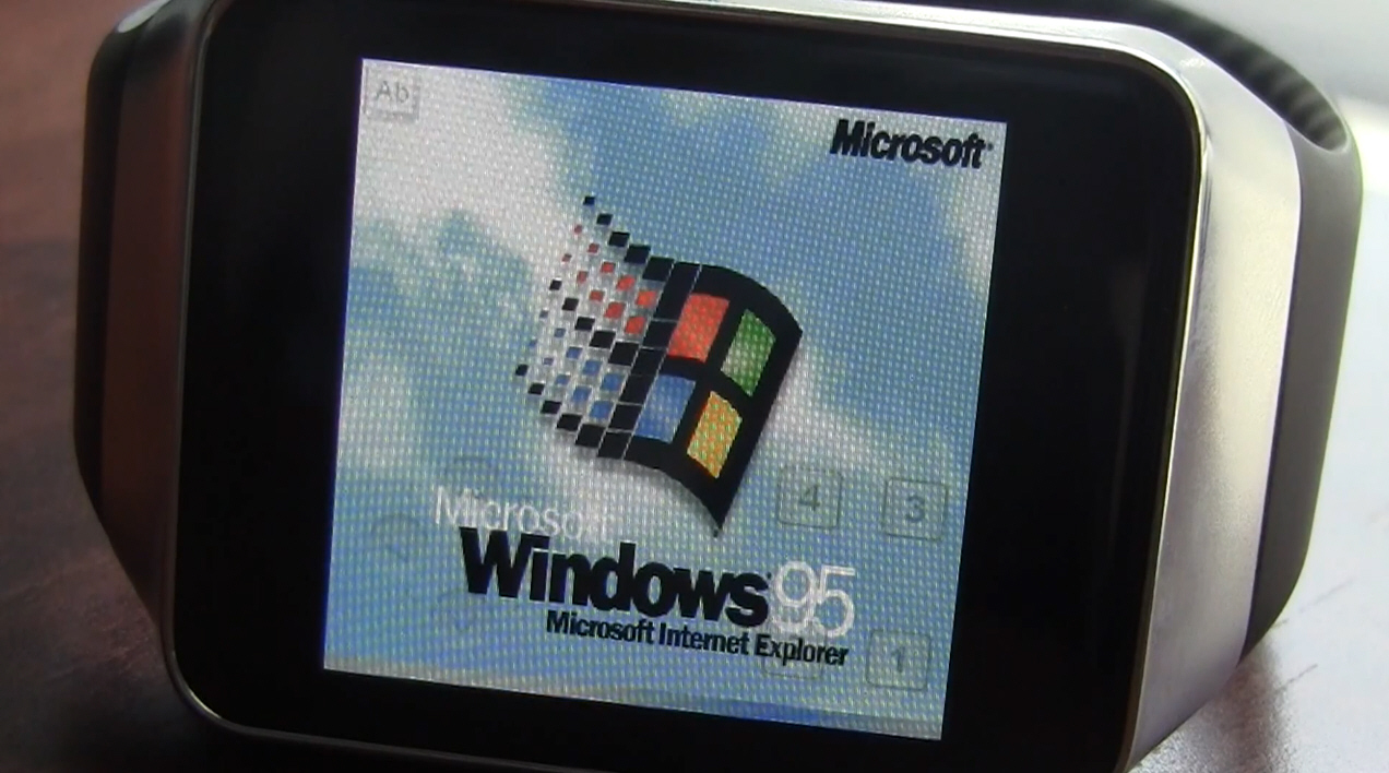
 When the smartwatch concept started to take off, I was dubious to say the least. I mean, I own a smartphone, so why do I need another device that essentially duplicates functionality of my phone? It is an honest argument, but I'll concede that I was wrong -- smartwatches rock. Well, to be more specific, Android Wear in particular kicks major ass. I love my Samsung Gear Live which I recently got.



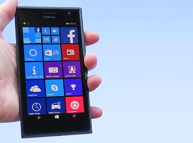
 That microSD card slot can accommodate cards up to 128GB in size. The Lumia 735 ships with 8GB of storage, but there's only 3.4GB of that free for your own use, so getting a nice high capacity card might be a good idea. This being a Windows Phone you also get 15GB of OneDrive storage of course.



 This week, of all weeks, with IBM seemingly melting-down, you’d think I’d be writing about it and I have been, just not here. You can read two columns on IBM I published over at

 UK developer Realmac Software has unveiled
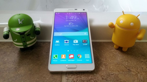
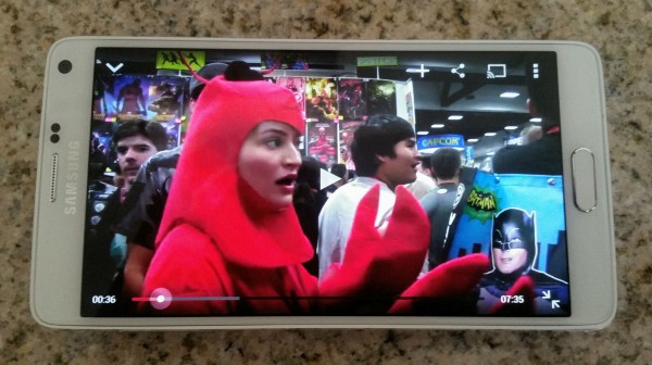
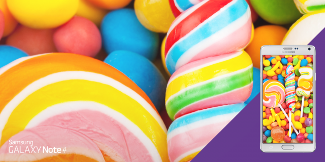
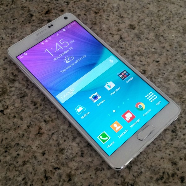
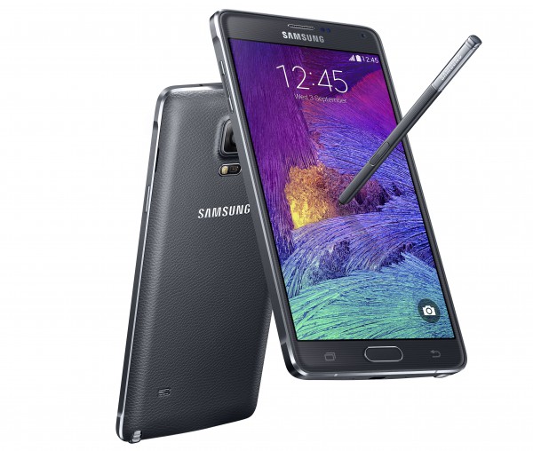
 The speaker is passable and produces decent sound quality, but it is small and located on the rear. The upcoming Nexus 6 features dual front-facing speakers for an optimal stereo experience. Would I prefer that the Note 4 have that level of audio design? Sure, but the rear speaker is totally acceptable when listening to music or watching movies. Quite frankly, I usually use headphones for that.





 Sameer Singh is an M&A professional and business strategy consultant focusing on the mobile technology sector. He is founder and editor of


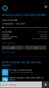 The Bing team further explains, "every morning, Cortana shows you a daily glance of all the information you need to start your day. She displays current weather, the first appointment on your schedule, projected travel time to work and the top headlines of the day. Many of you have asked us to create something similar to end your day. We heard you loud and clear. Starting today, Cortana will show you travel time to home and upcoming items on your calendar so you’re sure to be on time for that dinner date or know to go to bed early for that 7 a.m. meeting. To ensure you’re getting the most from this feature be sure and update Cortana with your home and office addresses".
 Besides business and travel, people do not just work -- they play too. Cortana has you covered in entertainment too, as it (she?) has improved features regarding sports and concerts. NFL fans can now see standings directly within Cortana, while NCAA football nuts can track their favorite teams. If you like soccer, additional leagues have been added such as "EPL, Bundesliga, La Liga, Italian Serie A, and Ligue 1".

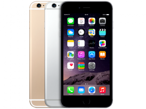 Today is a big day for both Apple and Samsung, as the two are launching their latest flagships in three of the largest smartphone markets: iPhone 6 and iPhone 6 Plus officially hit China, and Galaxy Note 4 arrives in US and UK. It's a "finally" moment in both cases, as the handsets were announced more than a month ago.
 Being the second-largest smartphone market, the US is very important for Samsung. So far, its new phablet has only been available in a limited number of markets, starting in its home country of South Korea. Meanwhile, direct rival iPhone 6 Plus has enjoyed a broader availability and, arguably, more success among consumers because of it.



 Kirill Bensonoff is a founding partner at

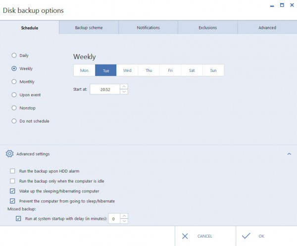
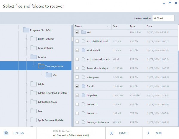
 Acronis’s True Image has always been one of the more feature-packed backup tools around. Imaging, file and folder backups, syncing, online backup, continuous data protection: it’s all here.


 A couple of days ago, I


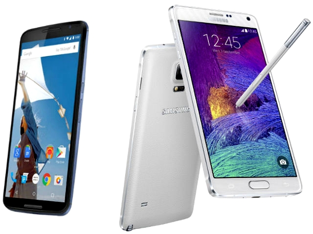
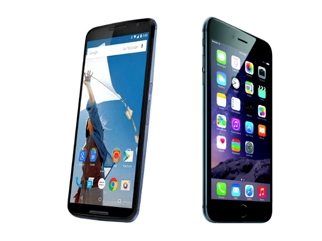 Google (with a lot of help from Motorola) has released the much-anticipated Nexus 6, updating its beloved Nexus 5 with an all-new look and beefed-up specs. But how does the Nexus 6 compare to other smartphones on the market?



 Susanna James is Copywriter and Marketing Executive at HighQ. She specializes in social business and content marketing. Her expertise lies in helping companies streamline the way they work and improving how they collaborate through enterprise technologies and social tools.


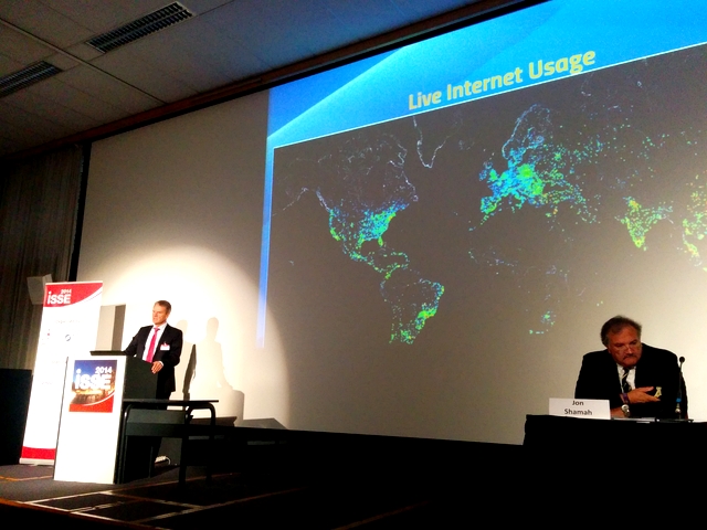
 At the moment I'm taking a lot of flak from privacy people on the Internet, because I want police and law enforcement to have access to people's data on the Internet.
 How do you protect an entity the size of Google? It's something we take for granted now that you have to think along unconventional tangents to do so. At Google we like to measure things a lot. We need to know how you behave. But we also need to see how things change over time.



 With nearly 20 years of open source experience behind him, Markus Rex founded









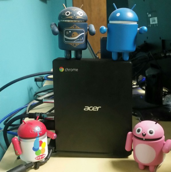
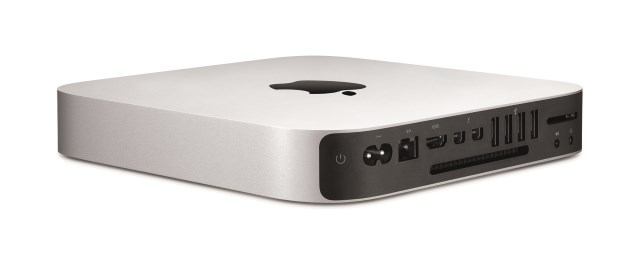
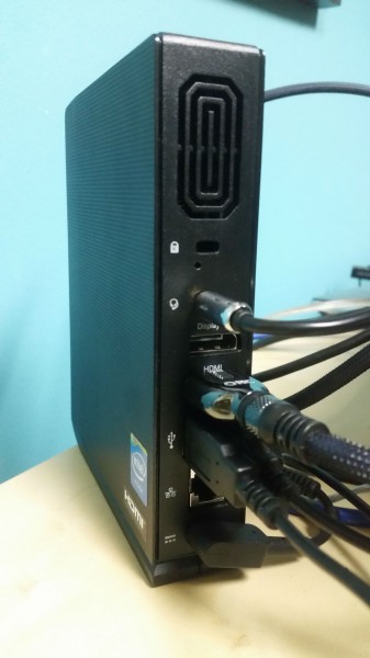 The overall packaging is surprisingly heavy, but that is not the fault of the Chromebox. No, the heft is due to the keyboard and mouse which are included in the box. Yes, a keyboard and mouse are included, but they are of average quality. Don't get me wrong, the keyboard and mouse are totally usable, but you may choose to upgrade them.
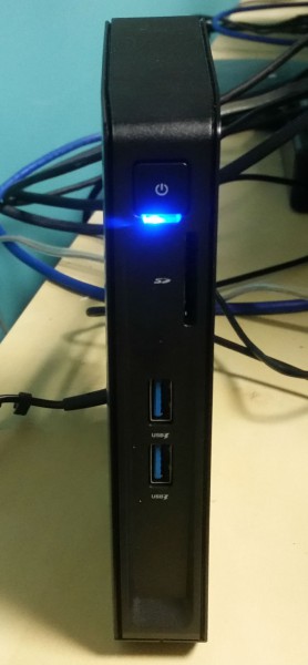 Speaking of USB ports, there are 4 total and all of them are the 3.0 variety -- 2.0 is nowhere to be found (woo hoo!). Two of the ports are on the front -- ideal for flash drives -- and the other two are on the rear and is designed for a USB keyboard and mouse. Of course, a webcam is also a smart addition.

 There have been various headlines recently about cloud security breaches -- including
 Himanshu Sareen is the Founder and CEO of Icreon Tech, a leading IT consultancy working with some of the world’s largest and most influential brands including National Geographic Channel, Fox, PepsiCo, Nokia Siemens Networks and more. He founded Icreon in 2000 and grew the company through a mix of acquisitions and organic growth, and is responsible for the company’s strategic and overall business development. Himanshu is part of the Owners and Presidents Program of Harvard Business School. He received his MBA in international business from the Indian Institute of Foreign Trade.
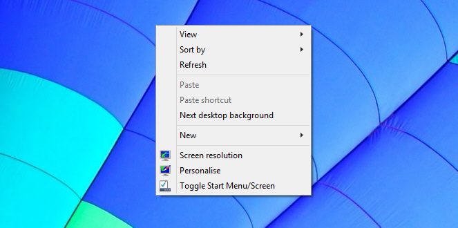
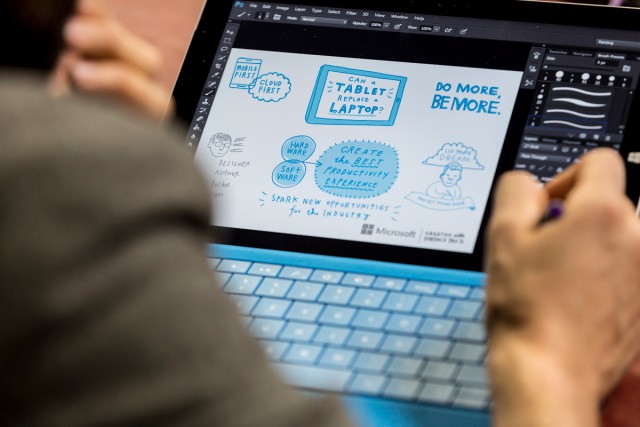


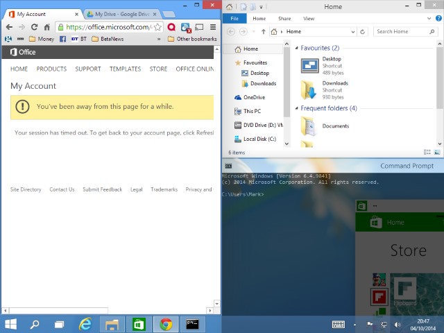
 Running multiple PC programs side-by-side isn’t difficult, but can require a little preparation as you move, resize and reorganise each window.
 ChrisPC has released
  Moonchild Productions has released a major update to its Firefox browser variant for Windows with the release of


 Google has released
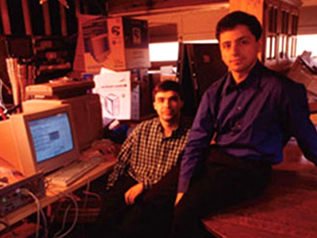
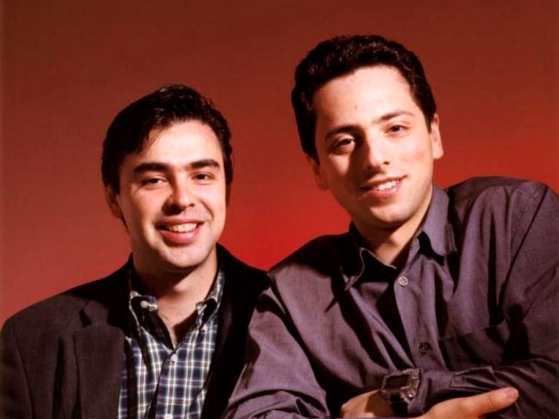
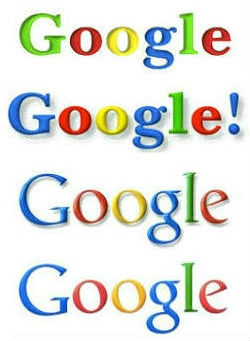 The googol link is unmissable. However, whether Page or Brin came up with 'Google' is debatable. It has been suggested that, while searching for an unregistered domain, a friend of Page spelled 'googol' incorrectly, and Page like the result. The story alleging that the company's first investor, Andy Bechtolsheim, misspelt 'googol' on a substantial check is also in circulation.







 Continuing its run at the top of the charts, Apple is revealed as the most valuable brand in the world. With a massive 21 percent increase over the last 12 months, Apple is now valued at just under $119 billion -- almost double that of Microsoft which finds itself in fifth place with a value of just over $61 billion.
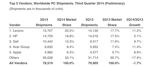
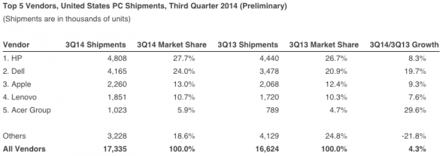
 The PC market is not what it once used to be. Both shipments and sales are in the proverbial toilet. Old devices are still adequate years down the road, and more than capable of running newer versions of Windows, if users wish to upgrade -- many don't. Other types of devices, like tablets, can do the basic tasks just as well, if not better than the PC, and, for many in emerging markets, smartphones are what they buy these days to connect them to the Internet.

 Jyoti is the Founder and CEO of

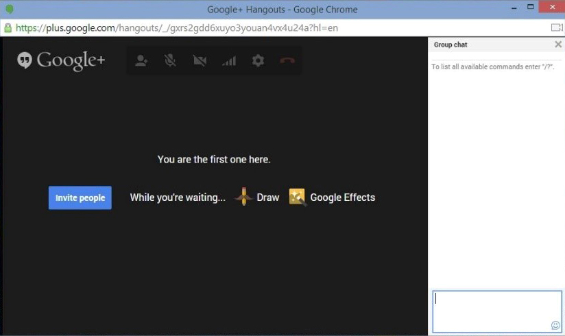
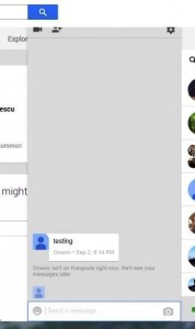 Google seems like it just doesn’t care about these seemingly little things. For example the bazillion emoticons Google paraded so proudly aren't even bug free; the recent tab doesn't remember the ones I use most, doesn't sync across devices, and is sometimes just blank. Oh, and the new emoticons are obviously not present in the weird chat dialog that accompanies Hangout video calls.
 Russel Cooke is a business consultant specializing in Customer Relationship Management. In his free time, he contributes predominantly business-related articles, something he enjoys doing tremendously. You can follow Russel on Twitter
 John continually offers unique insights and a fresh point of view. Along with writing, John has a passion for music. He is the lead vocalist and secondary guitarist for The Family Gallows in Salt Lake City.














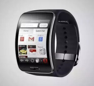 While I do sometimes wear a watch, it is not for telling time. No, I strictly wear a timepiece as jewelry -- a gold Michael Kors watch on my left wrist to complement the gold bracelet on my right. It's funny, even when wearing a watch, I reach into my pocket to check my phone for the time.


![Logitech protection [+] power_S5_WinterWhite_BackRight](http://betanews.com/wp-content/uploads/2014/10/Logitech-protection-+-power_S5_WinterWhite_BackRight-150x150.jpg)
![Logitech protection [+] power_S5_WinterWhite_Drop](http://betanews.com/wp-content/uploads/2014/10/Logitech-protection-+-power_S5_WinterWhite_Drop-150x150.jpg)
![Logitech protection [+] power_S5_BlackGunmetal_Back](http://betanews.com/wp-content/uploads/2014/10/Logitech-protection-+-power_S5_BlackGunmetal_Back-150x150.jpg)
![Logitech protection [+] power_S5_BlackGunmetal_Front](http://betanews.com/wp-content/uploads/2014/10/Logitech-protection-+-power_S5_BlackGunmetal_Front-150x150.jpg)
![Logitech protection [+] power_iPhone5s_WinterWhite_FrontRight_NoPhone](http://betanews.com/wp-content/uploads/2014/10/Logitech-protection-+-power_iPhone5s_WinterWhite_FrontRight_NoPhone-150x150.jpg)
![Logitech protection [+] power_iPhone5s_Winterwhite_BackRight](http://betanews.com/wp-content/uploads/2014/10/Logitech-protection-+-power_iPhone5s_Winterwhite_BackRight-150x150.jpg)
![Logitech protection [+] power_iPhone5s_BlackGunmetal_Front_NoPhone](http://betanews.com/wp-content/uploads/2014/10/Logitech-protection-+-power_iPhone5s_BlackGunmetal_Front_NoPhone-150x150.jpg)
![Logitech protection [+] hand ios](http://betanews.com/wp-content/uploads/2014/10/Logitech-protection-+-hand-ios-600x410.jpg)






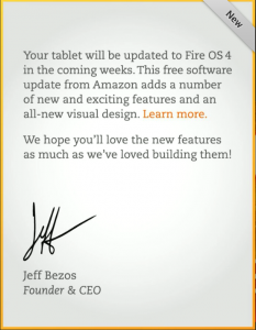 Amazon just recently announced the




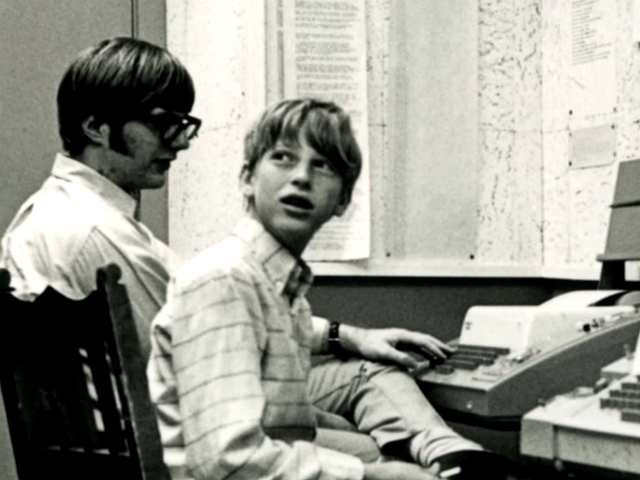
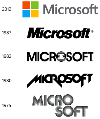 The company name (complete with hyphen), was registered with the Secretary of State of New Mexico by late November 1976. The following year, Micro-Soft opened its first international office in Japan, and in 1979, it moved its headquarters to Bellevue, Washington, since top programmers were generally unwilling to relocate to Albuquerque.

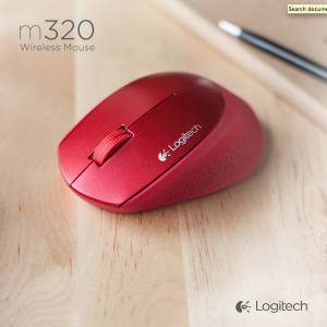 Wireless mice are a dime-a-dozen these days, with new ones from all sorts of manufacturers coming along all the time. But when Logitech releases one then notice must be taken, as it and Microsoft are two of the premiere mouse makers on the market.



 As someone who grew up in the '80s and '90s, I have seen pretty much every Adam Sandler movie. Besides loving his work on Saturday Night Live, I even remember him briefly being on the Cosby Show; one of the greatest sitcoms of all time. Sure, his movies can be stupid, and sometimes flat-out bad, but even his terrible films are funny. Critics universally panned his film Jack and Jill, but it is one of my favorites; Sandler dressed as a woman with fart-humor? I don't care who you are, that is funny right there.
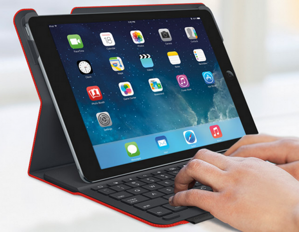
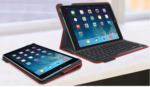
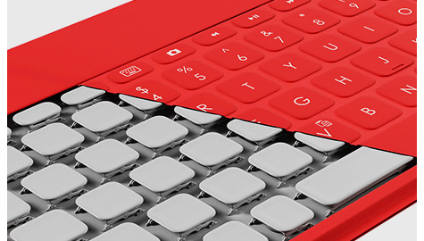
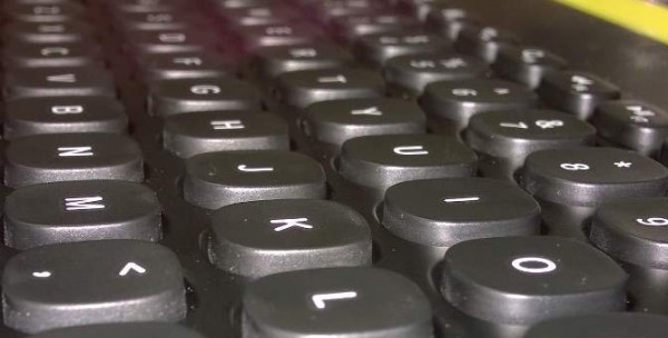
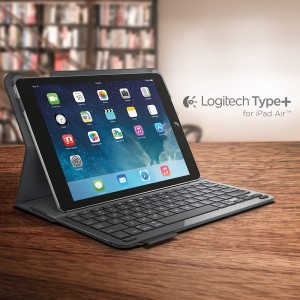 Having the keyboard automatically turn on and off depending on the position of the tablet is huge. I have experienced other keyboard cases that do not offer this, and while it isn't a deal breaker, accidentally hitting keys can be annoying. Not to mention, this auto on/off feature should also conserve battery, as the user can't forget to turn it off when not angled for use. I really like the shape of the keys too, being square and not circular; this is a smart design choice by Logitech.



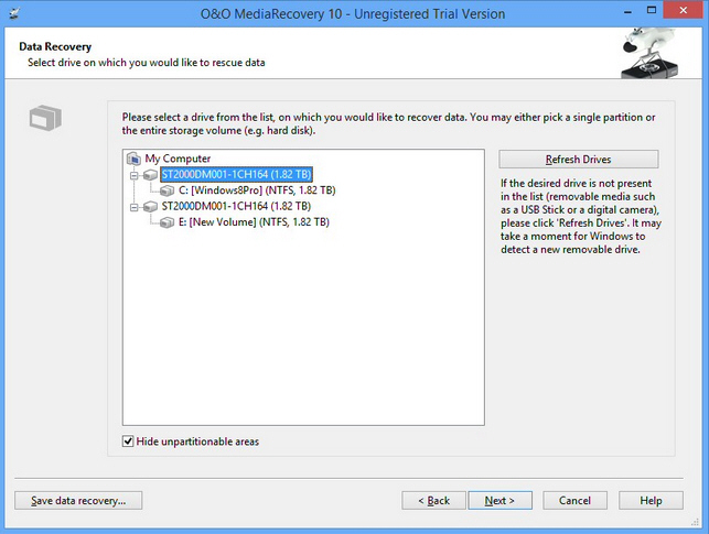
 Berlin developer O&O Software has unveiled