Surface Pro is magnificent. A classic. It's the Windows experience you longed for but were denied. The tablet is a reference design for what -- and what not -- Microsoft OEM partners should achieve. The device is the past and future, pure personal computer and post-PC. Simply put: Surface Pro is jack of all trades, both master of many, and (gulp) none. Capabilities astound, yet quirks abound. But even they are endearing, giving Windows 8 Pro personality and dimension.
For the past five days, I've had the privilege of using Surface Pro, which goes on sale February 9, as my primary PC. That's not enough time to fairly evaluate the tablet, which is why I write a first-impressions review. I'll add much more as my month with the device progresses. For now, I will share my early reactions, while offering context about Microsoft's objectives for the product and how well it achieves them. Unquestionably, Surface Pro isn't for everyone. But it could be for you.
Before We Start
I should begin by giving some personal context. For June 2012, I planned to spend the month using an Android tablet -- ASUS Pad 300 -- as my primary PC. Then, unexpectedly, as May closed, Google and Samsung announced the Series 5 550 Chromebook. I spent the next month on that computer and never looked back.
For February, I prepped for the Android experiment again, this time with Google Nexus 10. But, again, a surprise switch; I got Surface Pro for review on January 31. So the grand tablet as primary PC is on again with different device and one likely to darkly color any future Android adventure.
I come to Surface Pro from a perspective probably unique to most other reviewers -- Chrome OS and working solely in a browser for the past seven months. I'm also new to Windows 8, which will get separate review in a few weeks. My experience with the operating system was brief -- the Consumer Preview on an 11.6-inch Samsung slate for a few weeks in April 2012.
So I bring fresh eyes to hardware and software but with muscle-memory experience using Windows the way we all remember it. Hopefully my unusual starting place brings fresh perspective. I believe so, but you tell me after reading the review.
Which? Pro or RT?
Surface is not one but two tablets, selling at juxtaposed prices, aimed at different market segments and using distinct system architectures. Anyone considering Surface should ask which is better choice, hence why my review starts with question: Which one? Surface Pro stands out from RT in three distinctive ways: Speed, screen and software. I'll explain how in this section and the next.
Surface RT competes with iPad and costlier Androids and like them uses ARM architecture. The operating system, Windows RT, looks like 8 Pro but appearances deceive. Both present two motifs -- the more traditional Desktop and newer Modern UI. But only on Surface Pro can users expect to install and use legacy applications coded for x86 chips. If you have need to run any Windows software, Pro is the only choice. RT users can expect to get apps from the built-in Windows Store -- some of which run in Desktop mode, Office 2013 being one of them.

Pricing matters. The two tablets look similar at first glance, but Surface RT is considerably slimmer and lighter -- about the same as iPad or Nexus 10. Price starts at $499 versus $899 for Surface Pro. Microsoft prices the thinner tablet against iPad and the other meets MacBook Air and Windows ultrabooks. Contrary to FUD spewed by the Apple Fanclub of analysts, bloggers, journalists and other writers, Surface Pro is not overpriced and doesn't compete with iPad. Stated correctly: iPad can't compete with Surface Pro. Performance and broader capabilities simply aren't comparable, which is one among many reasons why the new 128GB iPad, which went on sale today for as much as $929, is overpriced compared to Microsoft's flagship tablet.
Surface Pro specs. 10.6-inch ClearType HD Display with 1920 by 1080 resolution; 1.7GHz Intel Core i5 processor and HD 4000 graphics; 4GB RAM; 64GB or 128GB storage; 720p front- and rear-facing cameras (meaning they're for video more than photos); accelerometer; ambient-light sensor; compass; gyroscope; Wi-Fi A/N; Bluetooth 4; USB 3; Windows Pro 8. Dimensions and weight: 10.81 x 6.81 x 0.53 inches and just under 2 pounds. Price: $899 (64GB); $999 (128GB).
Surface RT specs. 10.6-inch ClearType HD Display with 1366 by 768 resolution; Nvidia T30 processor; 2GB RAM; 32GB or 64GB storage; 720p front- and rear-facing cameras; accelerometer; ambient-light sensor; barometer; magnetometer; Wi-Fi A/N; Bluetooth 4; Windows RT. Dimensions and weight: 10.81 x 6.77 x 0.37 inches and just under 1.5 pounds. Price: $499 (32GB); $599 (32GB with keyboard cover); $599 (64GB); $699 (64GB with keyboard cover).
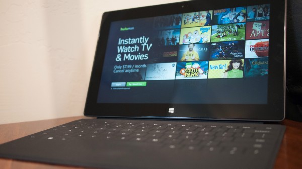
Keyboards. Microsoft offers two different keyboard covers, Touch and Type, which retail separately for $129.99. Type keys are more traditional and physically prominent. Touch Keyboard is more recessed and my preference.
Value proposition. RT comes with Office 2013 Home and Student, while Pro, which uses digitized display, has a stylus. From that vantage point, Surface RT is hybrid device -- touch and keyboard, tablet and notebook alternative -- while the costlier model is more tribrid, by adding the stylus.
For anyone looking for value, the lighter model makes sense. Everyone else, particularly those wanting benefits of touch, keyboard and existing software, should chose Pro.
For those buyers wanting better battery life, Microsoft claims 9 hours (or more) for RT and 4 to 5 hours for Pro.

In retrospect, Microsoft chose wrongly by releasing Surface RT first, October 26 concurrently with Windows 8. Particularly looking at the tepid computer lineup from partners, Surface Pro would have really stood out and sold better than RT -- or so I believe. Also, the market better accepts perceived price cut than increase. Surface RT released now would look like a bargain compared to the costlier tablet.
Scratching the Surface
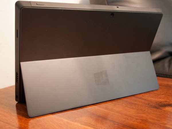
Hours after unboxing Surface Pro, I handed it to my wife. She spoke the words I had thought in first reaction: "Heavy" and "fast". They stuck with me for the past five days, as I adapted to the tablet's heft and its speed spoiled me. The slate weighs 907 gram -- that's the aforementioned 2 pounds, Americans and Brits. Nexus 10 is 603 grams (1.33 pounds). But the VaporMg chasis gives extra sense of heft and also ruggedness. The case is considerably thicker than most other tablets, but tapered such it seems to disappear. The design approach reminds of some Lenovo ThinkPads.
In the hand. The tablet's weight and heft will trouble some users. My concerns dispatched within a few hours. But the real test is to come. Prolonged use over several weeks will reveal much.
Heft is well-packaged. Surface Pro is a luxury car, a classic sportster with defined lines and metal exterior. By comparison, my ARM Chromebook looks and feels like a fiber-glass Ford. Better: Yugo to Aston Martin. There's something Euro-car about the smoky exterior and boxy, slanted sides. Surface Pro's handsome, rugged design is a Siren's call to the hands. To touch, to feel, to caress.
Fast setup. The tablet sets up in seconds if you're a fast typist. Process is little more than powering up, connecting to WiFi, entering in Microsoft Account ID and choosing default or advanced setup (former for me). The process is similar to other portables running Windows 8 Pro. But from there, Microsoft's tablet pulls ahead.
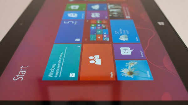
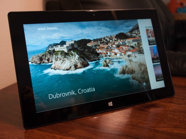
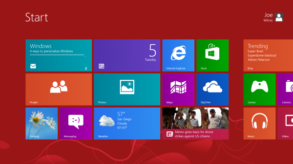
Stunning screen. The display is beautiful -- exceptional for the size class, and that conceding iPad 4 and Nexus 10 have higher resolution; but they aren't digitized. Microsoft maximizes the enjoyment by providing beautifully designed stock Start screen apps. I haven't seen them look better on any other Windows slates (Hey, I hang out at Microsoft Store doing some Windows shopping).
The screen is 400 nit, but feels brighter. That's comparable to MacBook Air (hint, hint again about the competing product).
Performance. Then there is the speed. The beast roars and runs fast. Windows Experience rating is 5.6, held back by the graphics processor. The sold-state drive is 8.1 and 1.7GHz Intel Core i5 processor is 6.9 -- on a scale of 9.9. But overall responsiveness feels like a 10. For sense of speed in the real world, which is the best benchmark: Adobe Photoshop Lightroom 4 installed in less than 60 seconds (before the required reboot).

Real storage space. My Surface is the 128GB model, and I received it with about 90GB free space. I recommend using it for apps and storing data in the cloud. Microsoft SkyDrive is easily accessible from the Start screen. The 64GB model only has 23GB of free space, which won't be enough for data and the demanding apps I expect most users will install. Pay the extra $100.
Big benefits. There's something to be said for maturity. Youngsters tend to believe they know better, that they're more modern. But Android and iOS, even Chrome OS, are new kids in town. By comparison, you can feel the maturity in Windows 8, on Surface Pro with Intel Core. Performance is smooth, software responsive and feeling of solidness everywhere. Software, hardware and services integration is tight -- the best I've seen on anything. Yes, more than Mac laptops or tablets.
Simple example of maturity related to usability: The Start screen presents different options for my Epson Artisan 730 WiFi printer -- including driver update. Windows 8 Pro found the networked peripheral and provides what I need to use it, unprompted.
Surface Pro is the computer you waited for and proves that Microsoft should have designed and sold its own PCs long ago, and leaves me feeling something strongly: Microsoft CEO Steve Ballmer is indebted to former Windows & Windows Live president Steven Sinofsky and should be careful about who's fired next.
You Need to Read This
Surface Pro is the most important platform product to come out of Microsoft since Windows NT 4. The operating system was foundational for what followed, Windows 2000 and XP, particularly. NT 4 represented in-house developers' thinking about what a modern OS should be and the capabilities that should extend to developers. The same could be said of Windows 8 and RT, but more. Microsoft seeks tighter integration between software, hardware and services. Surface Pro culminates all three, providing existing customers a lifeline to the past while extending forward to new digital lifestyle -- anytime, anywhere computing.
Like Windows NT 4, Surface Pro is a transitional product. Microsoft's platform goals are more about Modern UI and doing away with the Desktop motif. But the company has a longstanding tradition, unlike Apple, of ensuring backward compatibility for older apps -- and to a fault. This approach has often held back future Windows development. Surface Pro runs older apps via the Desktop, while offering the familiar keyboard experience many longstanding PC users demand. But tablet size, touchscreen, Modern UI, cloud service integration and other attributes push forward. Windows 8 Pro and this tablet together seek to be the best of the past, present and future. It is a haughty ambition.
Windows 8 and RT fulfill design ambitions Microsoft tried to bring to market in the 1990s. Modern UI derives heritage from the Active Desktop, which the software giant released before its time. Internet pipes reaching businesses, or even consumers, weren't fat enough in the late 1990s, and there wasn't enough quality content. But Microsoft had the right idea. Live titles transform the desktop into a living, breathing thing. It responds to you, anticipates you. I simply cannot express the sheer value, when set alongside aspects of the overall user interface.
The best user interfaces make products more human, more approachable and responsive. The human body doesn't have one UI, but many working together, giving dimension to living -- sight, sound and touch, primarily. The best products are similar. Visuals are important because they appeal to sight, and the eyes are the main tool by which we take in the world around us. Modern UI is beautiful, as are many of the active -- seemingly living -- cues it provides. There, Live titles add richness and movement to Surface Pro running Windows 8 Pro.

But humans are primarily tool users. We look and then touch. Keyboard and mouse are unnatural constructions, even though they are so familiar to a generation of PC users. But touch is more natural and extension of you. There's more intimacy involved with touching something on the screen than interacting with it via keyboard and mouse.
Surface Pro's screen is the most accurate I've ever used. Even touching text in this document hits the right spot every time. Cutting and pasting is easiest on any touch device tested. The little circle that marks the finger's touch looks good and works even better. Dragging it with my finger highlights text. Accurately.
But where touch brings Surface Pro alive is the Start screen chock full of tiles with content in motion. The user experience is far superior to Android or iOS. The desktop looks so alive, so quickly responds to touch, I could swear that it breathes.
Beneath the Surface
More than Surface RT, Pro users will spend time in Desktop mode. Apps and usability across motifs matter much, but more function of software than hardware.
Windows 8 reviews. My colleague Mihaita Bamburic posted a lengthy Windows 8 review in October, while developer Robert Johnson delivered a compelling series:
I highly recommend these four for getting a good sense of what to expect from Windows 8 Pro. My perspective here is more about usability on Microsoft's tablet and how it matches up to the design goals laid out in the previous section.
Apps availability. Microsoft is with Windows 8 where Apple was with OS X in 2001 -- presenting developers and users with dual-motif. But integration between Desktop and Modern UI is much tighter and moving between them smoother than was the Mac environments.
Apple struggled to get developers to create apps -- thanks largely to Windows XP, which released the same year. Microsoft sees similar developer distraction from Android and iOS. If it's any measure, major apps took nearly four years migrating to OS X. Windows has an advantage -- a built-in app store that promises developers payments rather than piracy.
Tragically, the app selection isn't sufficient and won't be for some time. That makes the software you have now all the more important and another reason why Surface Pro is better choice than RT. My colleague Martin Brinkman writes regular column "Best Windows 8 apps this week". On Friday, he reported 27,282 apps available from Windows Store -- the majority of which won't matter much to hardcore Pro users. They'll want productivity apps and real PC games.
I hope that with Surface Pro's actual release more apps will go native. But it's hard to imagine developer enthusiasm when Microsoft misses with Office 2013, which can be accessed from Modern UI Start screen but runs in Desktop mode. The company sets a terrible example for developers and does deep disservice to customers. Office, as the primary productivity program I expect Pro's target market will use, should be fully usable from the new motif. The few native Windows apps Microsoft provides are simply exquisite and demonstrate what Office could have been as Modern UI flagship application.
Some of the Desktop apps turn the stomach. Chrome is butt ugly. I blame Google developers for making no real effort to support Surface Pro, and I understand there is some bad blood because of third-party browser restriction on Windows RT. Surface Pro's magnificent display makes Chrome look all the worse, while Internet Explorer is a gem. Fonts are major reason.
Generally, Google is a lost cause on Surface Pro. The search giant develops beautiful apps for competing iOS but largely ignores newest Windows. How strange is that? I resort to accessing Gmail and Google+ in Internet Explorer 10 on Modern UI. The services stun, they look so good on Surface Pro's screen.
Desktop Mode. Functionally, the two motifs demonstrate fine workmanship -- they so seamlessly mesh. Usability is another matter. Moving from one motif to another is jarring, in part because the one is so exquisite and expansive. Where Modern UI feels alive, Desktop is dead -- dull, uninviting. It's a graveyard, by comparison. I don't want to work there.
While the more familiar motif, Desktop doesn't respond to the user the way Start screen does. Touch is often rejected, rather than welcomed. The touch accuracy I praised earlier is for Modern UI. In the other motif I sometimes struggle to get even the close button to respond. From that perspective, Surface Pro disappoints, particularly since the whole point is backward compatibility to existing apps. Which run where? In the graveyard.

While Microsoft reaches for the future, Desktop can't escape Windows' past. On February 1, I received the Nexus 4 ordered from Google Play for my wife. On Groundhog Day, I prepared her Galaxy Nexus for sale and used it as opportunity to look at Surface Pro media transfer capabilities. Windows 8 Pro easily detected the handset and offered several tools via Desktop mode. I dragged the DCIM folder with photos to the desktop. While looking over pics, I wanted to post one to Google+. The file manager presents "Share" as one default option in the menu bar. Excellent! But the Share feature is for enabling access to other users, not posting to social networks or emailing, which is what I intended. Surely some commenters will bark: "What did you expect? This is how Windows works". Yes, but sharing now means something quite different to many people.
There are reasons then why in the previous section I refer to Surface Pro as a transitional product and allude to Windows NT 4. Microsoft's tablet offers many compelling features and represents a vision for the future, which likely is Windows 9 running on the device. For the present, users must contend with two motifs and sometimes conflicting (and confusing) ways of working. That said, the shortcoming -- quirks, if you will -- give the product personality and dimension. iPad and iOS are flat, manicured landscapes by comparison. Surface Pro and Windows Pro are together the jungle -- rich and lush throughout but not free of barren areas.
The point: I much prefer working on Surface Pro, and even the Desktop graveyard has its charms. But do bring along a keyboard.
How I Surface
Microsoft's tablet challenges me, because I come from a different place than the target customer. As mentioned about 2,500 words ago, I moved from Chromebook, working in a browser for about seven months. Google's motif is fairly contained, with most mouse movement restricted to tabs across the top of the screen. Surface Pro demands more work with fingers going every which way, such as pulling down a thumbnails of open web pages rather than simple tabs.
Modern UI. To my surprise, I find all the movement kind of refreshing, even fun, like using more of my senses -- and fingers as tools -- to get work done. Additionally, I find Modern UI absolute joy to use -- on this machine. Yes, the motif demands more work, such as seemingly endless scrolling left or right. But the design appeals and draws me in. It's immersive and as previously expressed alive.
There is something about Modern UI that is different on this computer. I've spent some time at my local Microsoft Store using Windows 8 or RT on various PCs or tablets. My reaction, like when using the Samsung slate last year, was ho-hum. But Modern UI enthralls here, and I largely credit Surface Pro's bright, crisp display and smooth, speedy performance.
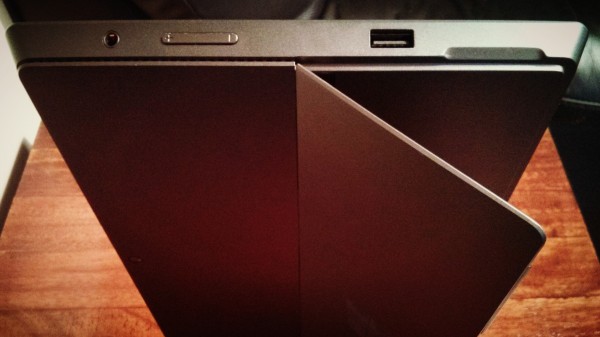
Touch and type. I interact with Surface Pro using fingers on screen or keyboard in both motifs. The tablet has a kickstand that tilts the display back at a satisfying angle. I attach the Touch Keyboard, which gives audible electronically-generated sound when tapped. I adapted to the keyboard in less than an hour of typing this review, which I started writing on WordPress in IE10 almost immediately.
During the workday, Surface Pro rarely leaves the desk, although over the month will go on jaunts to the coffee shop to see what shakes up. At night, I sometimes sit the slate on my lap and work. While the default on-screen keyboard is too large for my tastes, typing more than satisfies. Here we go with another benefit of the screen. I can type just about as well on-screen as off, Microsoft's keyboard is so responsive. No Android tablet or iPad that I've used compares.

I simply can't express the importance of this benefit, which works in concert with another: Surface Pro's screen is viewable from pretty much an angle -- clear and crisp, with no distortion. As a hybrid device meant as tablet and laptop, the latter concerns. Kickstand and Touch Keyboard aren't lap friendly. But Surface laid in the lap is highly functional with touch keys and brilliant display. I can work this way, and so can you. It's superior to iPad or, say, Nexus 10 similarly used.
I interchangeably use trackpad and touchscreen. Microsoft makes a Surface mouse, but I don't need it, and neither should you if you really give touch a chance.
Battery life. I can't get give comprehensive report on battery life. Several discharges in different usage situations will be necessary. That said, while writing this review, I unplugged the power cord at 9 am PST today. Ninety minutes later, set to "balanced mode", Windows 8 Pro reported 55 percent charge left, or 3 hours 5 minutes. At 12:30, 36 percent and 90 minutes remaining. At 1:30, a message flashed across the screen warning just 10 percent charge remained. Fifteen minutes later, with 8-percent warning, and Windows claiming 23 minutes usage time left, I plugged in. Likely then, charge would have gone 5 hours. That's on par with marketed battery life.
Challenges. Being fresh to Windows 8, I don't know fully where usability ends and my ignorance begins. For example, the group chat service we use at work doesn't have a Windows 8 app. So I use IE10. Problem: I get no notifications, and the service disconnects when I work in other tabs. Same can be said for Gmail or Google+. Now matters would be much better if I lived a Microsoft lifestyle connected to more of the company's services and other devices. Start screen would display much of what I need.
Users spending more time in the Desktop graveyard can expect typical third-party apps and services support. As for Metro UI, Surface Pro isn't the problem but application maturity, which will come over time.
Wrapping up, potential users will want to weigh applications against everything else, what's needed or wanted. Surface Pro demands changes to longstanding habits and will jar some users traversing the two motifs. Adapt if you can and be rewarded but expect some usability penalty along the way.
Surface Pro is Jack of all trades, attempting to be many things and doing some better than others. Imperfections glare because the broader experience is so clean -- and fun. There are shortcomings, but returning to the auto analogy they are easily overlooked. Idiosyncratic is the word sometimes used to describe the best, classic cars, which are appreciated more for their beauty and handling.
Surface Pro's shortcomings, like those of classic cars, add character. In a sea of sameness, where so many PCs or tablets are hard to tell apart, Microsoft's slate stands out. If only other device manufacturers made as much effort as Microsoft to truly innovate. By that measure, Surface Pro achieves greatness, faults and all.
Photo Credits: Joe Wilcox


![]()


 While Betanews isn't usually a place for political discourse, I'm going against the grain on this one. It's because I strongly believe the real answer to solving our serious gun crime problem in America rests in something most readers on this site tend to embrace: technology. More specifically, what we refer to as Big Data. I fully believe we have a data problem, not a gun problem. While the debate at large focuses on reaching the same end goal, the fingers point at the wrong solution.
 Derrick Wlodarz is an IT professional who owns Park Ridge, IL (USA) based computer repair company FireLogic. He has over 7+ years of experience in the private and public technology sectors, holds numerous credentials from CompTIA and Microsoft, and is one of a handful of Google Apps Certified Trainers & Deployment Specialists in the States. He is an active member of CompTIA's Subject Matter Expert Technical Advisory Council that shapes the future of CompTIA examinations across the globe. You can reach out to him at
 In with the new and out with the old. Well, almost. Jelly Bean and Ice Cream Sandwich are slowly taking Gingerbread's crown, running on 42.6 percent of all Android devices. The two-year old operating system only has a slight edge, of 3 percentage points, against the two newest sweets in the family, based on the number of devices accessing Google Play during the 14 days ending February 4.
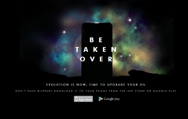
 Both myself and my colleague Mihaita Bamburic found it just froze on the “Touch to start” screen. If that’s a genuine representation of the Z10, BlackBerry has a real problem on its hands. Still a bit of perseverance (and a couple of crashes later) and I finally got it working.
 Windows disc-burning tool
 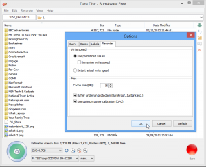 The program’s burning engine has been updated, and the user manual has been rewritten from scratch to reflect all the changes in this new build. BurnAware 6.0 is also now capable of locking the burning drive for exclusive access when burning using the SCSI Pass Through Interface (SPTI). Version 6.0 also promises better optimized data transfer and buffering during the burning process.
 Two days ago
 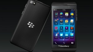 Great news for Canadian BlackBerry fans! The newly unveiled
 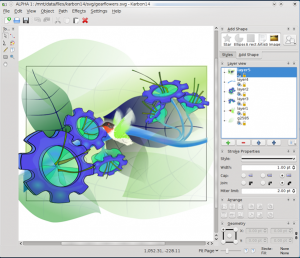 The Calligra team has announced the release of version 2.6 of the
  The publisher of the Dutch edition of Playboy has started adding Layar augmented reality codes to the cover and certain pages inside of the magazine, providing a little interactive treat for iOS and Android smartphone owners.
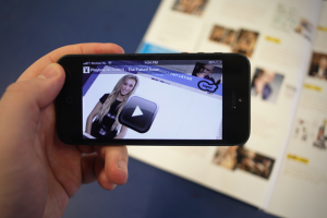 "We saw some other magazines who were experimenting with Layar," Patrick Goldsteen, editor in chief of Playboy NL explains. "This gave us some insights into what we could do with it and we saw some great opportunities to extend the experience of the magazine reader. As Playboy we have a great amount of content but are limited to the 114 pages of the magazine. With Layar we virtually have an unlimited amount of possibilities to publish extra content".
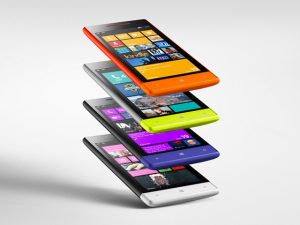 Coming from Android or iOS,
  When you’re creating a presentation, a demonstration, a software tutorial, or just trying to show someone else what’s happening on your desktop, then you could just take and save screen grabs at the appropriate moments. But while that sounds simple enough, it’s not exactly convenient. You’ll have plenty of work to do later in converting your grabs into something meaningful. And even then, the finished results may not be that professional.
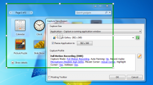 If you need to do more, though, that’s not a problem. The program includes a capable editor which allows you to further customize each slide with new shapes, captions, highlights, images, cursor paths, zoom and pan effects, even audio or video clips.
 It was bound to happen at one point or another. Following the
  Windows Notepad may be easy to use, but it’s also horribly basic, and so it’s no surprise that an entire industry has grown up in providing more powerful alternatives. Some, like
 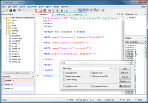 The interface is surprisingly configurable for a program of this size, too. As well as having a central tabbed area where you can work on your documents, EverEdit can display a Directory View to browse your system; an Outline window for easier navigation of lengthy documents; a list of open files, and a command window.
 International television and telecommunications company Liberty Global has announced the acquisition of the Virgin Media for $23.3 billion in cash and stock, creating the UK’s second largest pay-TV business after BskyB.
 Redbox Instant by Verizon has been in private beta for sometime now. In fact, a while back BetaNews brought you an