On June 30, the day after my most recent one-year contract expires with AT&T U-verse, I will cancel the service and cut the cord. Last night, while I watched some last-minute Prime Time before it's gone, Apple commercial "Our Signature" aired. The ad is a concise, tweet-like mission statement that encapsulates all of what the company's product design is about. The spot sums up all anyone need know about the fruit-logo company in 60 seconds.
"This is what matters. The experience of a product. How it makes someone feel. Will it make life better", the commercial begins. Yes. Yes. Yes. This is what I have written about Apple for a decade -- that the company's products and marketing are aspirational. That the design goal simply is to make people feel good, to inspire life will be better for choosing the Apple way.
More isn't Good Enough
The message, for customers and partners, isn't the only one. "We spend a lot of time on a few great things. Until every idea we touch enhances each life it touches". For investors, and also developers, complaining about lacking innovation, Apple demands patience. A few products done really well is better than many. I don't invest in any company, for conflict-of-interest reasons, so gain nothing by suggesting those abandoning Apple stock will regret the decision. Good product design and marketing is about feelings, and no tech company gets this right better than Apple.
Four days ago I returned to my local Sony store the Xperia Tablet Z I purchased two weeks earlier. There is much to like about the device. The 10.1-inch slate is thinner than iPhone 5 and is super light, just 495 grams, such that one-handed use is as easy as a 7-inch tab. The device is waterproof, too. But these benefits couldn't satisfy. I didn't feel good using Tablet Z. There was no one usability problem, just a bunch of little ones. Little things among many, I found the system font to be too light and too much visual inconsistency across apps -- the latter a problem even stock Android presents.
Day later, I bought the 32GB iPad 4, in black. Apple's tab is a brick by comparison, 652 grams. Aspect ratio is less-appealing 4:3, and there is the tired user interface and limited multitasking. Yet using Apple's brick makes me feel good. The content experience is much more immersive, an attribute I identified with the original model and have yet to find in any Android, including Nexus 7 and Nexus 10. Naysayers can complain about specs, but content experience is better on iPad, I say. That's quite the statement from someone who boycotted Apple in April 2012 (but ended in January 2013).
Cheap Talk
Tech bloggers and Google Plusers like to babble about how much better Google apps are on iOS than Android, giving credit to the search giant's good work. What about Apple's due? Perhaps iOS is simply the better platform. Immersion is a key usability differentiator. When reading, I spend more time on iPad than any other device. I prefer Google+ or IMDB on iOS, for example, which draw me in more than their Android counterparts. Every publisher, every app developer should want more people spending more time in their thing. For reading frequency, Android and iOS are neck and neck, according to comScore. For immersion, I don't see how Android yet competes.
Still, Google's platform is the one to beat. Yesterday, Gartner released a new multi-device forecast for PCs, smartphones and tablets. Android wins by volume, with more than 1 million units shipped in 2014, compared to 355,000 iOS and OS X devices. But there is another important measure, which goes back to platform usability, application consistency and user experience. "Apple is currently the more homogeneous presence across all device segments, while 90 percent of Android sales are currently in the mobile phone market and 85 percent of Microsoft sales are in the PC market", Carolina Milanesi, Gartner research vice president, says.
I got a laugh last week reading all the Google+ posts, and a few blogs, finger-pointing at Apple for copying Android. Many of the same posters complain that iOS 7's flat design is plain ugly. Oh, yeah? If the flat design is so unappealing, but Apple copies Google's platform, what does that say about Android? Hey, you can't have it both ways, buddy.
Bumper Crop
Apple innovated best when small and scrappy, when fruit flung against Windows. Now Apple is fat and lazy. iPhone humanized mobiles, but rivals like Samsung make smartphones more responsive, more an extension of you.
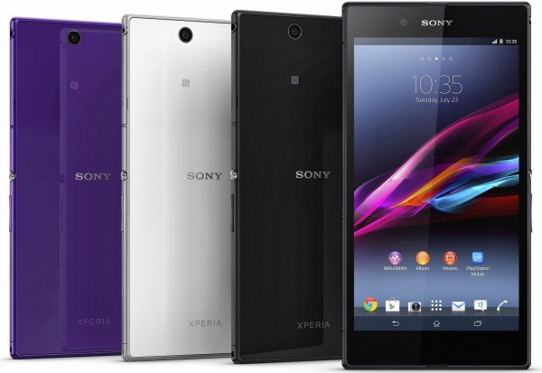
But Samsung isn't Apple's problem. Once-mobile leaders HTC and Sony look to rise and be influential again. They're hungry and innovating. HTC One is a marvel, and Sony is on a roll with the Z series, which today adds phablet Ultra.
The fruit-logo company's mission statement commercial, which signature is "Designed by Apple in California", is a call to its own people, too. Success, not just cofounder's Steve Jobs' death, is major reason why Apple stands on the past rather than truly represents the future. As competition increases, the old scrappy Apple will emerge, I predict. Anyone betting against Apple this summer will be sorry for it come autumn.
Hey, I'm the last person to defend the company. My reputation speaks for itself (or so BetaNews commenters say). From OS X Mavericks to iOS 7 to iPad mini 2 to iPad 5 to iPhone 5S and those things we don't know about, more good feeling will come your way. Believe it.




 Security is a big business on both sides of the line. Anti-virus companies scare customers with doom and gloom if you do not buy the wares, meanwhile, on the black-hat side of the fence, the sale of exploits is a lucrative trade. Now the source code for one of the biggest exploits, known as Carberp, has leaked and cut off
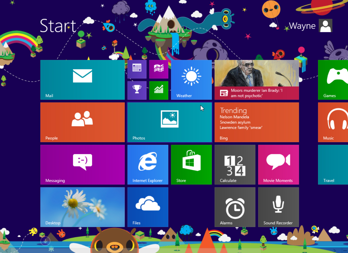
 Despite the fact that both operating systems support Near Field Communication (also known as NFC), users cannot transfer files between Android and Windows Phone devices. The implementation is different on the two platforms, with manufacturers complicating things further by employing branded software to handle any interaction. I've learned this the hard way after trying to
 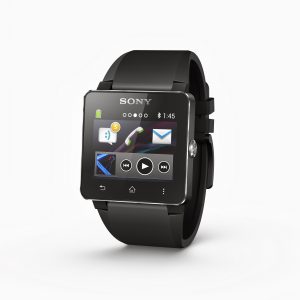 The invasion, or perceived invasion, of the smart watch is one of this year's polarizing tech topics. While
 Modders rejoice! CyanogenMod 10.1 is now available as a final release, nearly two months after the popular custom green droid distribution reached
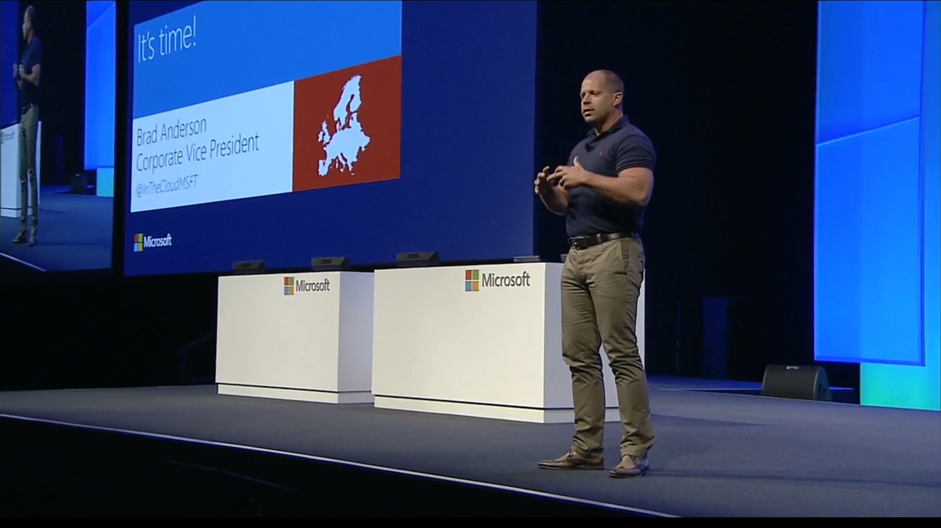
  Microsoft has announced a tie up with Oracle that will allow customers to run Oracle software on Windows Server Hyper-V and in Windows Azure.
 Just when I thought I was out, they pull me back in! Only days after
 Microsoft is looking for a handout it seems. They would like customers to build and share their own games for both Xbox One and Windows 8. With that, the company invites users to sign-up and test Project Spark, an invitation extended today and which you will need to sign up for and await an actual chance to use the service.