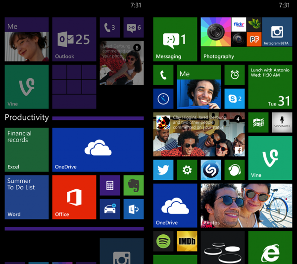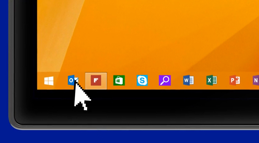
Microsoft continues to try and change opinions regarding its tiled OS, and today the company introduces a new video showcasing three reasons Windows 8.1 is better. It doesn’t say what it’s better than -- Windows 8, possibly, or Windows 7 -- but it does show how you can use Windows the way you want.
The minute long video is fast paced, colorful, and set to a pumping music track ('Sassy Gang' by Mike Sampey and Mark O'Grady). Frankly if you’ve never used the tiled OS before you probably won’t have a great idea of what is going on, but the flashy captions might help you make some sense of things. As for the three reasons? They are, in order, The Desktop ("it comes up automagically!"), The Apps (which you can pin to the desktop or the Start screen), and The Navigation (the ease with which you can switch between desktop and full screen apps).
I’m not sure the ad will convince anyone who has yet to try Windows 8.1 to make the switch, and it’s clearly aimed at a young audience. The 'It' at the start and end of the video ("Just the way you want it") cycles through various styles -- knitted, quilted, meat, leopard skin, fruit, and so on, before ending on a cake with cherries on top. Presumably Microsoft’s way of saying you can have your cake and eat it with the new OS.
I want to try and find something nice to say about this ad, I really do, but I just can’t see what Microsoft is hoping to achieve here. The video is too fast paced to sell the benefits, and I agree with YouTube commenter mossimen who says:
Horrible commercial, got a headache just by looking at it. They should try something more slow and more clear. If people don’t know W8 they don't get what’s going on from a W7 perspective.
And that I think is spot on. If you’re a Windows 7 user this will just convince you to stick with your current OS rather than switching to something that just looks really confusing and less capable.
But maybe that’s just me. Take a look at the video for yourselves, and let me know what you make of it in the comments below. Hit or miss?


