There is no denying that Windows 8.1 dwarfs Windows 8 in every single way that matters. The new operating system is more feature-rich, more suited for tablet use, more suited for PC use and far closer to what a modern OS should be like. The warm feelings towards it are reflective of how Windows 8 was like at first -- let's just say that the standards were low to begin with.
But for some strange reason, Microsoft still does not prioritize having a notifications panel in any of its consumer operating systems. This is an oversight that I thought the software giant would address in Windows 8.1, seeing as it has been a major known problem since Windows 8 arrived. However, once again Microsoft has decided to not include it. And, to be frank, it is one of the worst decisions that the company made this year. I bet not many will miss Steve Ballmer. I sure won't.
Windows Phone 7, Windows Phone 8, Windows RT, Windows RT 8.1, Windows 8 and Windows 8.1 all have shipped, or are shipping, without any efficient way of tracking notifications. This is a step in the wrong direction nowadays. The lack of one would have been fine years ago, when no OS had it, but a notifications center or panel has become an essential part in having a great user experience today. And, no, live tiles and notification toasts don't cut it.
The Half-Baked Implementation
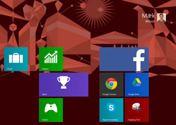
To some extent, live tiles can replace a notifications center. It is certainly possible to do so, but some problems do occur. The live tiles are spread across the screen so the user has to look at them frequently in order to see if there are any changes in their appearance. Some live tiles do not immediately update after a notification sound is triggered, which may confuse the user, while others show no counter at all. And there is very little information that can be crammed inside any live tile.
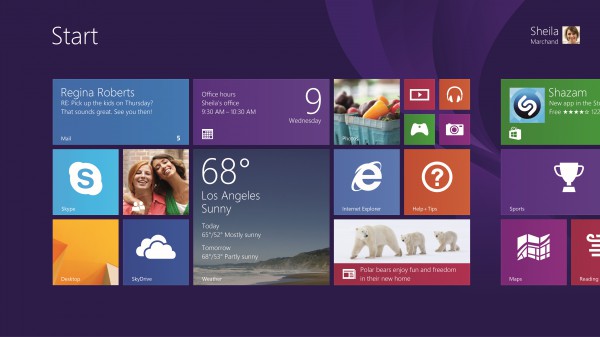
Microsoft has tried to improve this situation slightly by using toast notifications, which pop up on the screen whenever an application receives an update (new email, new status update, etc.). But except when the user sets them not to automatically disappear, they usually go away in less than 20 seconds. That may seem like a lot of time, but when you walk away from the device there is a very good chance that you will miss all of them. And you don't know they had even popped up, because there is no icon in the status bar or any counter anywhere (except in the live tiles, of course). And have I mentioned that toast notifications are not even enabled by default in all apps? Users have to do it manually in the Mail app for instance, on a per-account basis.
Likely for another year or so, I will have to open more than a dozen apps to see whether there is something new that interests me. This is a scattered approach that just does not work well, disrupts my workflow and leads to me wasting valuable time.
How Competitors Tackle Notifications
 In early-September, I purchased a 2013 Apple MacBook Air that, naturally, ships with OS X 10.8 Mountain Lion. Prior to using it, I have been an exclusive Windows 8 and Windows 8.1 user, who had grown accustomed to the fragmentation of notifications.
OS X shows that there is a better way. The operating system has a notifications panel, which is triggered by a swipe to the left on the touchpad or by clicking a button on the taskbar. All notifications, from what is basically Desktop-like software, are listed there, and can be dismissed with little effort. And the icons in the Dock (the OS X equivalent of the Windows taskbar) show notification counters, that neatly complement this feature.
The notifications panel pops up on the active screen where it is triggered from, not solely on the main one. It is a very refreshing approach, after using Windows 8 and Windows 8.1. And it works. It still eludes me why Microsoft has chosen not to implement a similar feature.
Heck, even Google Chrome has a notifications panel even though it is just a browser. But this is hardly surprising seeing as the search giant knows a thing or two about notifications and how important it is to have a unified approach.
On my 2013 Nexus 7, which runs Android 4.3 Jelly Bean, notifications are a pleasure to deal with. They can be individually dismissed from the notifications panel. And they are actionable, which means that I can archive emails without opening the Gmail app, for instance.
Apple's iOS works similarly, in this regard, to Android. Microsoft is the only player that wants to be taken seriously which has yet to rank a notifications panel highly in the priority list. And this will do nothing to help its new products take off.
How Should Microsoft Tackle It?
Interestingly enough, Windows 8.1 is already built as to show or trigger a different feature after swiping from any side of the screen. This either means that Microsoft has to alter the way the OS works right now or implement a notifications panel as an app on the Start screen. The latter approach is simpler, but not better considering that users will have to stop whatever they may be doing to check a notification.
So that leaves the former option as the right one for Windows 8.2 or 9. The way I'd like to see a notifications panel being implemented is by having it show up alongside the charms bar, after swiping from the right side of the screen.
Microsoft should definitely adopt a unified notifications panel going forward, but not just for Modern UI apps. Desktop software could benefit from this as well, if OS X is of any indication. This would be a feature which may convince Windows 7, Windows Vista and Windows XP users to switch, seeing as the benefits would be noticeable and would improve productivity.
Still Not Good Enough
Some of the criticisms that I pointed out about Windows 8 are still present in Windows 8.1 as well, perhaps slightly addressed in the new release -- the Windows Store offers more apps of higher quality, the Microsoft services integration is tighter and the revamped Modern UI is more user and tablet-friendly. But the high learning curve persists and so does the lack of a notifications panel, the latter of which is a feature that I consider essential on an OS released in the second half of 2013. The omission was, perhaps, excusable last year but not this time around.
Some people may like being masochistic and admit to liking the way Microsoft operates, but I do not feel the same way. There is no reasonable excuse as to why we should still have to put up with this shortcoming.
Photo Credit: tadamichi/Shutterstock







 In early-September, I purchased a 2013 Apple MacBook Air that, naturally, ships with OS X 10.8 Mountain Lion. Prior to using it, I have been an exclusive Windows 8 and Windows 8.1 user, who had grown accustomed to the fragmentation of notifications.
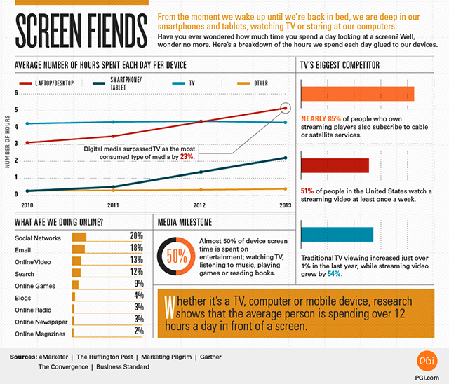
 You’ve probably never given any thought to exactly how much time you spend gazing, gawping, glowering and glaring at screens on a daily basis -- but with TVs, computers, tablets and smartphones being such a major part of our lives, you probably won’t be surprised to hear it’s a lot.

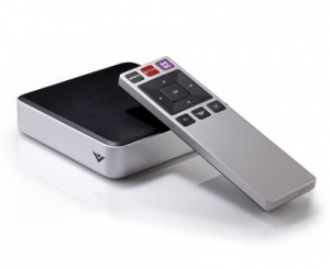 Vizio Co-Star has remained one of the more popular set-top boxes for those looking for a Google TV experience. The tiny device brings along all of the features found in more expensive cousins from the likes of Sony, but with less of the big-name price. While rumors persist of an impending name-change for the search giant's foray into the living room, details of an updated media OS have been tough to come by.
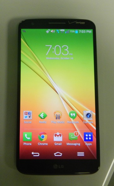 The Android operating system and school of thought are undergoing a major change; a sea change brought on by the Motorola Moto X and its voice interaction. After using it, I remarked that specifications and benchmarks melted away and I was enveloped in the experience. However, not everyone wants to interact with their smartphone using voice. Some people, myself sometimes included, just want to touch a big beautiful display and have the best specs and most bragging rights... and that's OK. People are different as is their usage.