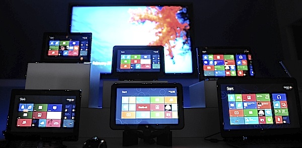
First in a series. Over the past few months I’ve seen several articles and forum postings negatively criticizing the design of Windows 8; from the flatness of the UI to design inconsistencies on the desktop. I’ve also seen articles asserting how difficult the operating system is to use because it’s not instantly intuitive.
While I think there are some valid concerns in these articles about Windows 8, I personally believe that most of what has been written is shortsighted. I hope to prove this over three articles.
My Mini Review
I really like Windows 8. In fact, it is now my ultimate favorite operating system. As a designer/developer I spend a lot of time in the desktop. Over the past several weeks I’ve seen many photos of the new flattened desktop from leaked builds. I’ll be honest: it did not look very good. I was concerned that the design team had gotten it wrong. Having installed the OS recently, I find the new flattened look to be very pleasing on the eye. Instead, the design team did a great job on the new desktop UI. While not perfect (more on this later), it’s a pretty darn great start.
Windows 8 is a complete rethinking of what a traditional desktop operating system can be. What we are used to having in mobile devices (social connections, cloud connected, and access to media content) are now baked right into the OS.
The People app is an aggregation of all the important folks and other contacts in my life across Facebook, Twitter and Google. SkyDrive syncs my important content across devices and allows me to log into my drive online and access the full hard drive (internal and external) of every device on which I have installed SkyDrive. This is a very convenient feature that has already saved me from tight situations.
Not only does Windows 8 bring my life together, it also brings my devices together. I’m sorry but, I do not buy into the post-PC bull crap trumpeted in the Apple-loving tech press. PC-plus makes way more sense to me and is especially evident with how Windows 8 blurs the boundaries between devices in my home by making media and other content accessible virtually anywhere.
Homegroup is one example. It’s been vastly improved and simplified. Joining a homegroup from two devices is as simple as clicking a button, “Join”. Immediately I go to my desktop PC and tablet and am able to see content from both devices. I have a lot of stuff on my desktop and obviously my tablet has limited capacity. So what makes homegroup even more beneficial is that I can use my tablet while sitting on the couch in my living room to access content from the desktop in my office. And if this content is music or photos, I can immediately shoot them over to display on my TV screen through the Xbox.
There’s a ton to like about Windows 8, and I think a lot of consumers are going to resonate with it. Those of us who are techies will always find something about the OS that appeals. But the truth is, the typical consumer just doesn’t care about a lot of the stuff we care about. They want access to their contacts, content and services no matter where they are. That’s what my mom cares about and that’s what my non-techie friends care about.
A Fundamental Cultural Shift That Affects the way we Compute
Windows 8 is not anything like Windows 7 from a big picture. Windows 7 represents the traditional OS: (1) mouse and keyboard centric; (2) siloed applications; (3) non-cloud connected; and (4) non mobile. You can probably add to that list. Windows 8 is representative of a fundamental shift that is happening at a much higher level, a cultural level: the transition from a services-based economy to an experience-based economy.
In a services economy people care about goods but more importantly they care about the services surrounding those goods. For example, company A sells a computer and company B sells a computer. But what really differentiates the two? In a service economy, a potential buyer may certainly see that company A sells a much faster and powerful computer than company B but the consumer purchases from company B. Why? Because company B offers additional services for free on top of purchasing the computer.
In an experience economy services become the stage and goods are the props used to engage the individual in a conversation and immerse them in a story. Services are not enough because they are not as memorable as experiences. In an experience economy, people spend money on services that offer them the best overall experience. Let’s return to our previous example.
In an experience economy, the user chooses to purchase from Company A (where as in a services economy they purchased from Company B) because this Company A, (1) not only provides them with a powerful computing device; (2) offers them amazing services; but (3) stages these services and goods in a fashion that the user is drawn to. Goods and services all remain outside the buyer while for the first-time experiences allow companies to get inside buyers and manipulate them emotionally to purchase their products.
Experiences are inherently personal. Through an experience an individual can be engaged not just on an emotional level, but on a physical, intellectual or maybe even a spiritual level. Experiences remain with the individual for some time to come.
Windows 7 is representative of services economy thinking. OS X is representative of experiences economy thinking. Apple saw the transition to an experience economy back in the late 90s while Microsoft probably did not. When Windows 7 released it appeared Microsoft was finally getting the transition but couldn't execute on it properly. Apple, executed beautifully across their product portfolio and resulting marketing.
With Windows 7, Microsoft offered all kinds of services along with the purchase of Windows 7 such as, free Windows Live Essentials applications like SkyDrive, Movie Maker, Messenger, Live Mesh, etc. So did Apple offer services. But why was Apple’s offerings much more desirable for consumers? Because of the way they were staged. Apple staged the same service offerings as something that improved the livelihood of users. Even more so they staged them as experiences that were extensions of the main computing experience.
In techie terminology Apple advertised these extra products as if they were a significant part of OS X. They were bundled with the OS. For Microsoft, this was not so. Maybe this was a consequence of anti-trust issues but Windows Live Essentials was an extra download and install. Not only that, it was difficult for users to even know they existed!
Windows 8 tells a story that is more representative of a new way of thinking about computing habits and behavior. It is representative of a shift towards an experience economy but more specifically it represents a shift to a new kind of experience economy: a simplified experience economy.
Web developers are responding to this trend in computing by implementing what is referred to as responsive designs. Responsive websites adjust based on the device that accesses the website. Developers create one web design that automatically adjusts the user interface elements for a mobile device or a desktop device. The result for the end user is that no matter what device the user uses to access the website, the resulting experience is appropriate for that device.
Enter Windows 8. The first “responsive” operating system that is flexible enough for users who want to use it on a tablet in a mobile (no keyboard or mouse) scenario and is also flexible enough for users who want to use it in a truly desktop (mouse-and-keyboard) scenario. But what is most amazing is that it is so flexible that if I am on a desktop I can use the mobile interface. Is it perfect? Absolutely not! But it is usable!!
The problem with many Windows 8 reviews: they focus primarily on usage scenarios that are not quite ideal. Using a mouse and keyboard on an interface designed for mobile is not going to be perfect. It’s not always intuitive, but it is discoverable and learnable (more on that in a future article).
The primary usage of the Modern UI is touch. The primary usage of the desktop is mouse and keyboard. Neither scenario is going to be perfect for the experiences they were not designed for (mouse in Modern UI and touch in desktop UI). So let’s stop reviewing the desktop interface as if it needs to be perfect for touch because it’s impossible. And let’s stop reviewing the Modern UI as if it needs to be perfect for mouse and keyboard, because it’s also impossible. Both interfaces are usable regardless. And there is absolutely nothing wrong about that.
What Microsoft has done is meld touch and mouse into two interfaces that require the user to transition between the two at times. This transition may not always be ideal. I get that. Windows 8 is a massive undertaking and even for a company as big as Microsoft, there are not enough designer resources to transition every aspect of the desktop into a touchable interface. That’s why I’m willing to cut Microsoft some slack Windows 8 is 1.0 in this new transition, and it will not be perfect for any of us.
It’s not as easy as You Think
As someone who designs interfaces for business applications, I understand all too well how difficult it is to transition interfaces to a more modern design. Sometimes you are limited by the sheer amount of resources you have at your disposal to handle design and user testing of those designs. The desktop interface is so pervasive and expansive that it will take years before Microsoft can fully transition to touch. The same is true for the company I work for as well.
But what if transitioning those interfaces (interfaces designed for desktop) to touch is not the best idea? What if it’s acceptable for some interfaces to remain primarily mouse and keyboard focused? Content developers like myself and many of you will continue to use the mouse and keyboard.
Content creators will need interfaces that adhere to our needs into the foreseeable future. Windows 8 presents what I believe to be the best opportunity for content creators: an interface that allows us to use content creation apps like Adobe Photoshop, and at the same time allows us to consume content when we’re mobile such as when visiting clients.
This is where the potential of the Surface tablet exceeds anything on the market today. Having a device like the Surface pro where I can slide it into a docking station, connect it to an external monitor and create engaging user experiences in Photoshop or any other number of content creation software, then take the same device into a meeting is a compelling user story. If I can display those ideas in a touch interface when meeting with a potential client, that’s an even bigger win.
Photoshop does not exist on a single tablet today (yes, I know about Adobe’s mobile applications but those are not the full Photoshop versions). But it will when Microsoft ships the Surface Pro.
My point is this: Windows 8 is a compelling story. It represents a change in computing behavior augmented by an even bigger change in our culture: from an experience economy to a simplified experience economy. If reviewers can look at the OS in this light, I think they can present reviews that may actually help be people understand why Windows 8 is architected like it is.
Microsoft’s user experience team nailed it. Although the interface has its issue, they aren't as drastically detrimental as many articles on BetaNews and other sites seem to imply. The UX team of Windows 8 lead by Julie Larson Green has done a fantastic job of user testing. They have vetted out the critical issues that impact the adoption of Windows 8, issues that may cause techies to grumble but will engage the typical consumer intellectually, emotionally physically and possibly spiritually, in ways that are memorable and engaging, but most importantly in ways that no other tablet on the planet can accomplish.
Conclusion
Windows 8 simplifies computing in such a way that Apple CEO Tim Cook’s comments reveals Apple could possibly miss the transition to a simplified experience economy in the same way that Microsoft missed the transition to the experience economy back in the early 90’s. The unification of the desktop and Modern UI is a good thing. Microsoft getting into hardware is a good thing regardless of OEM concerns (I’m looking at you Acer).
In my next article I explain why reviews solely claiming the Windows 8 UI is not intuitive are inherently shortsighted.




 One of Windows’ many annoyances has long been the general inaccessibility of the shutdown and restart controls. Previous versions of Windows stuck them on the Start menu, but now Windows 8 makes them even harder to find by burying them away in the Settings section of the Charms bar.
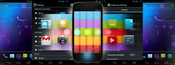
 I like improvements to be found under the hood, not on the outside. With the exception of the CNA wallpaper, there isn't anything else that gives its existence away. That is, until the "control panel" is found. It is located in Settings and it opens up a myriad of configuration options of which I have found the notification window toggles to be the most useful. Stock Android comes with a "Power control" widget that only has five toggles: Wi-Fi, Bluetooth, GPS, Sync and Brightness, and it doesn't cover everything that I need. With the "Notification Power Widget" I can also get a sound toggle that lets me choose between different modes (Silent, Vibrate, Sound, Sound + Vibrate), a torch mode that basically turns the LED into a flashlight (there are apps for it, but it's more convenient), mobile data toggle that makes turning on and off data a breeze without going through the menu and such. I counted 18 toggles to play with. Comprehensive, isn't it?
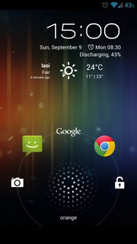 With the battery indicator I mentioned above, another nice feature is the ability to have it in the notification bar. The blue rectangle that displays the battery information can be modified to display a battery percentage, a circle with the battery percentage inside and a few other combinations. Basically having a percentage is reason enough to switch to a custom ROM for me. It should be there in the first place.
 Are you forced to run two or more web browsers on your PC for compatibility reasons? Perhaps your online banking doesn’t work properly unless you access it in Internet Explorer, while for day-to-day browsing you prefer Firefox.
 When you need to share a set of images then you could turn them into a video with something like