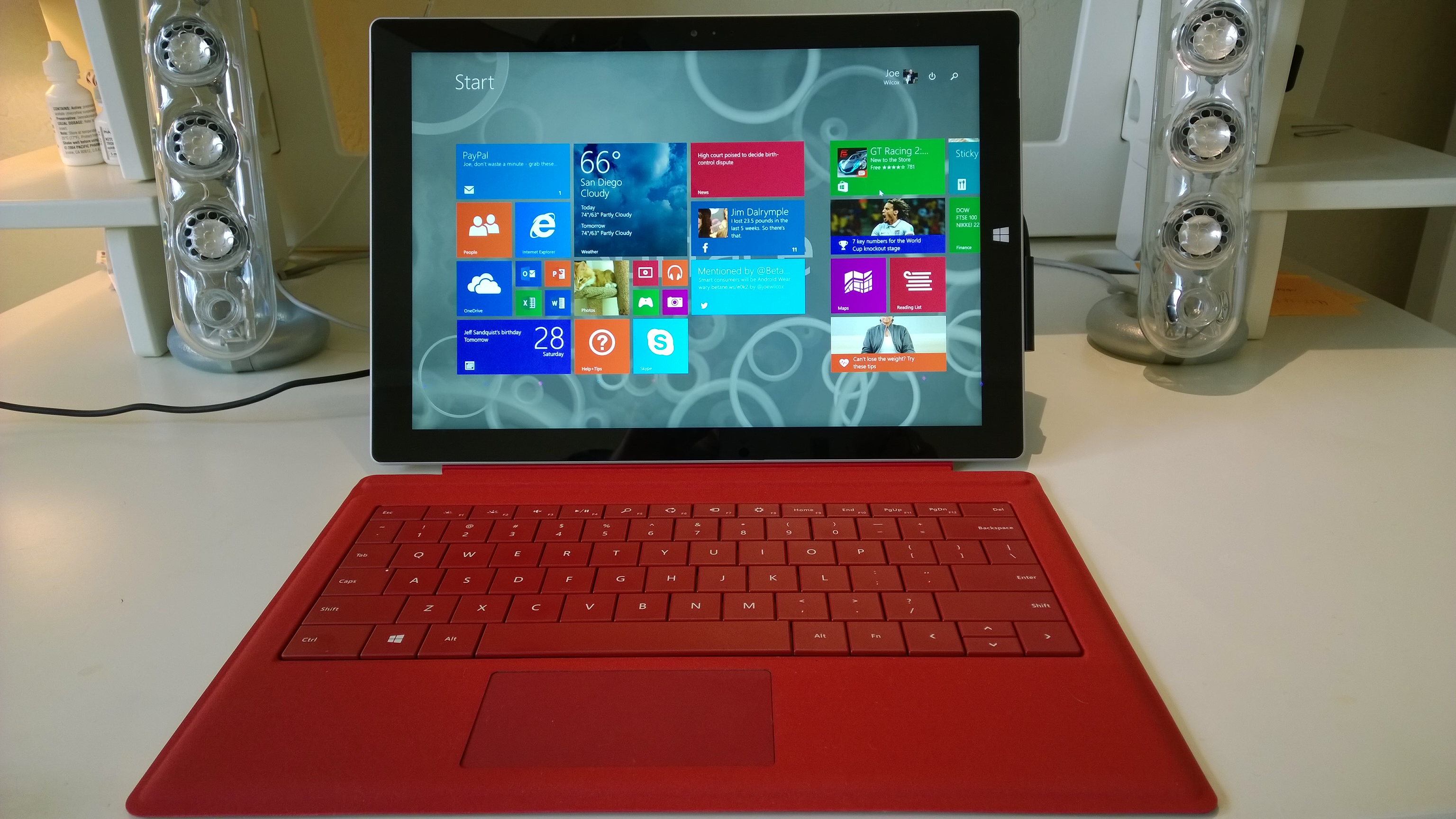
Before adopting the Chromie lifestyle and declaring independence from Apple two summers ago, I primarily was a Mac user. I wrote most of the so-called anti-Apple stories (so some commentary say) on the company's laptops. Chromebook still warms my heart, but for the summer -- and likely longer -- we part ways. On June 20, I walked out of Microsoft Store San Diego with a free Surface Pro 3. But I am accidental thief; that story later.
In April, I wrote about "My two years with Chromebook", giving loads of praise. I might still use Chrome OS as my primary platform today, if not for sudden partial loss of vision -- non-diabetic macular edema in both eyes. The ailment compelled a reevaluation of my computing needs. I purchased a refurbished Surface RT preinstalled with Windows 8.1, because of the free Word, which will ease ebook publishing. I really enjoyed the user experience, much more than the Surface Pro reviewed in February 2013. Updated operating system is major reason. Also, Microsoft's ClearType improved my diminished reading ability.
In early June, the ophthalmologist treated the ailment with shots and reviewed my progress this week. The edema is down about 35 percent in both eyes. Reading and writing are now impaired, rather than impossible, which is quite the improvement even if far from fully functional. Windows' terrific graphics -- on the tablet and Nokia Lumia Icon smartphone -- really help.
Summer Sojourn
With Surface Pro 3 release imminent, I considered the device as laptop and tablet replacement. During summer 2011, I used the first commercially-available Chromebook as my only PC. I decided to experiment again, planning to write about the experience. But Microsoft didn't have a loaner -- colleague Brian Fagioli got that. Enamored by the potential benefits, I bought my own. I sold the Chromebook Pixel that I had purchased from a Craigslist-poster and returned my Android tablet to Amazon for refund. My bank recently offered a no-interest credit card, which will carry the balance not raised from the sales.
I lined up with about 20 other people at 8 a.m. PDT on June 20. Four of the five people waiting in front of me were students -- whom I would stereotype as Mac users. Aside from vision, their priorities resembled mine: Creating content on a device usable as laptop and tablet.
Microsoft Store staff was friendly, courteous, and as discovered later overly generous.
When I checked my credit card activity the other night, there was a charge for Surface Pro 3 and then its refund. Backtrack: As I walked out of Microsoft Store a week ago yesterday, the sales associate stopped me. The point-of-sale system overloaded with all the Surface Pro 3 purchases. She wasn't sure my credit card had been charged. But when I checked the account on my phone, the pending amount listed -- and Microsoft later emailed a receipt.
But there was a problem after all. The charge reversed, and I had a free Surface. Oh yeah! Somebody in this world has to be honest, and a journalist's quest is the honest truth. So I went into the store yesterday to correct the mistake. Sure enough, the co-manager found no payment. He said that when the home office reconciled accounts, the error would absolutely be discovered. So he said at first. When later finding no record at all of the sale, I read something different in his facial reaction. I then wondered if the reversal was deliberate rather than accidental. Did the Microsoft powers that be intercede because of my earlier posting about wanting to use Surface Pro 3 all summer? Unlikely, but one wonders. Anyway, I'm an honest citizen again and eligible for a free Surface case as reward. (Curiosity kills me, wondering what commenters will say to this tale.)
Fresh Feeling
I eventually will write a full review, along with a series of ongoing posts. Generally, I am satisfied with Surface Pro 3 as laptop and tablet a week in. Performance is excellent, and unlike some of the blogger reviewers, I find the keyboard responsive and friendly to touch. My typing speed is comparable to Chromebook Pixel, and I am good evaluator. Muscle memory -- fingers to keys -- compensates for diminished vision as I type. My fingers find the keys just fine.
Windows lets in more light than when I last used it. My computing domicile is fresher and more lively. The differences between Windows 8 and 8.1 are subtle but strongly experienced. While Modern UI is more work than Chrome OS, because swiping takes your fingers all over the screen, the overall experience mostly satisfies this user.
Two nights ago, I wanted to show my father-in-law a YouTube video on his iPad Air. Suddenly, I was befuddled trying to move around the UI, after in just a few weeks becoming so accustomed to swiping. The benefit I hadn't seen before, glared at me. Modern UI is difficult to appreciate on a non-touchscreen. On Surface, the motif lives up to its name. In my book, The Principles of Disruptive Design, I explain about Windows 8.1 and Windows Phone 8:
Both Windows operating systems break free from nearly three decades of skeuomorph software design that Apple pushed to market with Mac OS in the mid-1980s. Three-dimensional icons, toolbars, and other visual elements are examples of skeuomorphism, which seeks to imitate something familiar applied to something else. Apple’s iOS 7 adopts flat as the major design ethic, in a stunning turnabout.
Modern computing screens are 2D, not 3D, making the skeuomorphic approach an anachronism at best and user hindrance at worst. Building on the familiarity of 3D objects made some sense during the early days of PC acceptance but has no useful benefit on websites or devices that use touchscreens.
Microsoft’s “Modern UI”, previously called “Metro”, emphasizes simplicity, reduces complexity, and strips away distraction. The more typical 3D design is busy and tires the eyes, particularly on smaller screens, such as smartphones. For example, Samsung’s TouchWiz UI is exhausting (in my experience), which applies to newest iteration “Nature UX 2.0” used on Galaxy S4.
By contrast, Modern UI maximizes the touchscreen’s utility rather than apply concepts that visually imitate a 3-dimensional, physical experience. The tile approach, particularly on smartphones, fits into a design concept Microsoft calls “glance and go”—the idea being to let users get information they need quickly rather than sift through distracting elements.
By the way, in July, I will update the book after second-quarter PC, phone, and tablet shipments are available.
The flat design really appeals to me. More broadly, Microsoft's content presentation crushes competitors. The Live tiles are, well, lively, and services like Bing, Bing News, and Weather look great -- the visuals pull you in. I never read Google News, but now make daily jaunts to the Bing News app on my Start Screen.
Wrapping up -- because a review someday comes -- Surface Pro 3 is so far tablet enough and laptop enough for me. Sure there are quirks, but generally I am satisfied. Will I feel as such in a month? That's why the long review process, to answer the long-use question.
Photo Credit: Joe Wilcox


 The battle for dominance between Microsoft and Google continued, with
