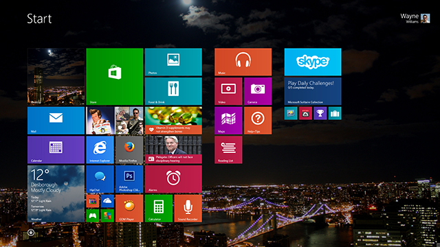
With Windows 8.1 Microsoft has attempted to fix a lot of the things that were wrong with Windows 8, and make the operating system more appealing by throwing a bunch of additional features into the mix. It won’t appeal to everyone, but it is a massive improvement over its predecessor.
If you’re planning on updating your computer to the new OS, or are still on the fence and need a little nudge to join the tiled side, let me take you on a guided tour of what’s new.
Improved Apps
Microsoft has made UI improvements to the Music app, and the Mail app -- which I pretty much ignored in Windows 8 -- is actually really good now. It sorts your mail into categories and lets you manage folders and drag and drop emails around.
There are new apps in the shape of Food & Drink, Health & Fitness, Alarms, Calculator, and Sound Recorder. Reading List lets you save content for reading later.
The Windows Store is finally usable now too -- you can search for the apps you want to install.
Personalization
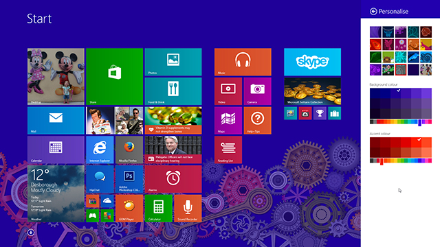
This, for me, is one of the areas where Windows 8.1 really shines. A new Personalize option, accessed through the Settings charm, lets you pick a ready-made background for the Start screen and change the background and/or accent colors. You can also choose to have your desktop wallpaper as the background, so when you switch from the desktop to the Start screen, the transition isn’t so jarring. You can see the changes as you make them, which is useful.
The Start screen now offers a choice of four tile sizes -- Large, Wide, Medium and Small. The new large and small sizes are great and provide more options for organizing your apps. Not all of the sizes are available for all of the apps though. Windows 8.1 automatically detects your screen size and resolution and if you’re running the OS on a big display it will provide more rows.
Tiles can be reordered by dragging and Windows 8.1 makes it easy to select and move lots of tiles around at the same time.
If you really don’t like the Start screen you can now access installed desktop programs and apps in an Apps list. This is like a full-screen Start menu and you can sort the items by Name, Date Installed, Most Used or By Category. Arrows let you switch between the Start and Apps screens, and you can choose either as your default view.
You can also choose now to boot directly to the desktop. Just right-click the taskbar, go to Properties and select the Navigation tab to find the option.
The Start Button
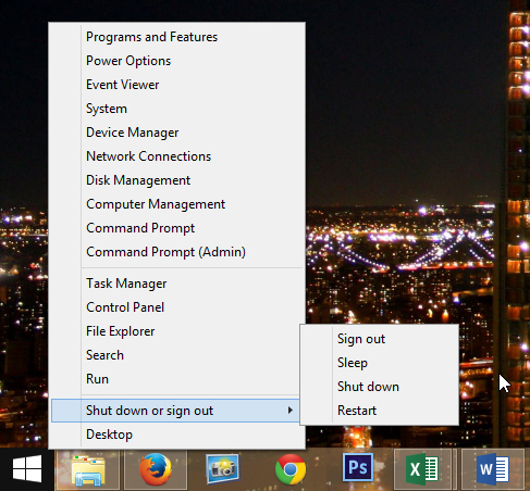
One of the biggest complaints about Windows 8 was the lack of the Start button, although the real complaint was the lack of a Start menu. Microsoft has addressed the first complaint, but not really understood what people were actually asking for. Still, the return of the Start button is a welcome addition and is where you’d expect it to be on the desktop, and appears when you mouse over the bottom left corner in the Start or Apps screens.
Left clicking or tapping the Start button will switch you between desktop and Modern UI modes, while right-clicking on it with a mouse (in any mode) will open a small, non-customizable menu that gives you access to all of the most commonly used options, including shut down and sign out.
Multitasking
The very name "Windows" suggests more than one window. With Windows 8’s apps, you were pretty much stuck to working in the one. You could have two apps side by side, but one had to be big and the other small. In Windows 8.1 that's changed. You can now have them equally sized, and better yet if you’re running Windows on a big screen, and at a high resolution, you can have more than two apps on display at the same time.
SkyDrive
Microsoft’s cloud storage service is baked into Windows 8.1 and when you open File Explorer (the new name for Windows Explorer) you’ll see it as a destination on the left. SkyDrive is now the default save location for your documents, which you’ll view as either a good or bad thing, depending on what you think about working in the cloud. You can course just choose to save files locally.
SkyDrive Smart Files is another useful feature that makes it possible to find the files you want.
Search
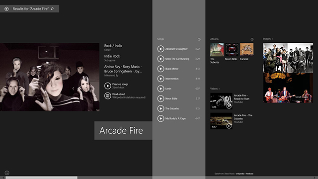
Bing has been heavily baked into Windows 8.1 also. Type anything from the Start or Apps screen and the search box will appear. Windows 8.1 will list any matching apps, settings and files and also display some web matches. Select one of those and the results will open in a full screen.
If you search for a musician or actor, you’ll be presented with an attractive page about them. Searches for singers and bands will also include a list of songs you can listen to. Hit the play button on a track and Xbox Music will open and the chosen song begins to play.
You can search for a web address also and this will open in your default browser.
Internet Explorer 11
Microsoft’s veteran browser has been improved and supports plugin-free HTML5 video, WebGL and the latest standards for closed captioning. It also lets you have up to 100 tabs per window in the Modern UI version, which can now also permanently show tabs and the address bar.
Help+Tips
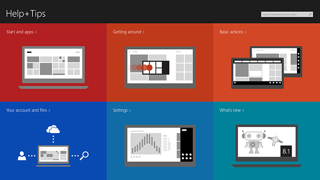
If you’re switching to Windows 8.1 from an earlier operating system you’ll likely be confused as to how things work. A new Help+Tips section provides everything you’ll need to know to master tasks like summoning the Charms bar, switching between apps and closing unwanted ones.
The Charms Bar
This hasn’t altered massively from Windows 8 (although of course there’s the new Personalize option) but one small tweak that I really like is the position of the charms changes depending on whether you summon the bar from the top or bottom right corners. Select the top right, and the charms will appear at the top of the bar. Select the bottom right and they’ll appear near the bottom. Why? So you don’t have to move your mouse very far to select the charm you want. It’s this sort of attention to detail that makes Windows 8.1 so much better than its predecessor.
Summing Up
Of course Windows 8.1 has been tweaked in lots of other ways too, making it more touch friendly, but also less irritating for mouse and keyboard users. It’s a huge improvement over Windows 8 and -- once you get to know it -- it’s better than Windows 7 too, in my opinion at least.
It’s not perfect, and it won’t be for everyone -- I understand that. If you’re happy with Windows 7, XP or even Vista, there may be nothing here to persuade you to switch. But I can assure you, the boot to desktop and Apps screen mean that if you truly hate the Modern UI you can pretty much avoid it entirely now and just reap the other benefits offered by the OS.
If you’ve already converted to Windows 8, then updating to Windows 8.1 is a no brainer. This is the operating system that Windows 8 should have been -- and more.

