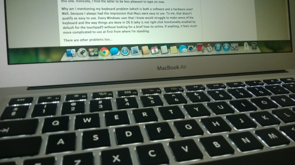
For an exclusive Windows user, the prospect of owning a Mac has been an exciting to-do to cross off my enthusiast bucket list. I have owned two iPhones and one iPad, and have enjoyed all three, but I have never bought a Mac nor have I used one extensively. I have always been curious to see what's on the other side, but some constraints, one of which was Windows-only engineering software, prevented me from looking at any Mac with serious consideration. Luckily, or not, things have changed, and at the beginning of September I bought a new 13.3-inch MacBook Air, hoping to see what all the fuss is about.
I'll admit to being quite passionate about new devices, and always looking to get to know the basics before they arrive at my doorstep. Yes, I too scour the InterWebs searching for the tiniest of details. I just can't help it (and no, I do not believe that I am a control freak). But this time around I decided that the MacBook Air (I'm going to call it MBA from now on) needs a fresh take. Before it arrived, my impressions were that the hardware will not be a surprise (why would it be?) and that the software will take some getting used to. I thought everything was going to be smooth sailing once I settled in... and I was wrong.
The "Upgrade"
The MBA replaces my five-year old business-grade HP 8710p laptop that has served me well, with only two upgrades -- 4 GB of RAM (up from 2 GB of RAM) and an Intel SSD 330 Series (240 GB). The difference between the two is night and day -- the former has a 13.3-inch screen, is light and portable while the latter is none of those things as it has a 17-inch display, is heavy and bulky.
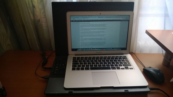
I went for the MBA because my priorities had changed. I needed something portable and with great battery life, which could only mean one thing -- an ultrabook. After perusing the local offerings, the only option that made sense (based on price, performance, battery life, resale value and immediate availability) was, surprisingly, the MBA. The high-end Intel "Haswell"-based Windows ultrabooks had yet to arrive when I pulled the trigger on my first Mac purchase, which also made my decision easier (they're also much more expensive for some reason). I have always wanted one anyway, so my purchase made sense.
Great Looks, Weird Keyboard
The MBA is one of the best looking ultrabooks on the market today. I always loved Apple's approach to hardware design, and this one doesn't disappoint. The aluminum casing has a premium feel, looks clean and is very thin. The same look continues once you raise the lid. The touchpad is big, responsive -- it's probably the bast part in using the MBA and OS X -- and is neatly integrated into the case (more on this later).
Unsurprisingly, the display is mediocre because Apple still uses TN panels that are known for their poor visibility angles; that said I have no qualms with its low-resolution (1440 by 900). I expected this. If you have higher pixel density requirements then you'll have to look elsewhere (Retina MacBook Pro or the latest Windows ultrabooks).
My main and only problem related to the MBA's hardware is the keyboard. I've read countless reviews praising it for the great feel and, generally speaking, just how good it is compared to keyboards used on Windows laptops. I disagree -- it's not that good. The way I type makes the space key noisy to press and depress, the arrow keys are too small and it is the least intuitive keyboard to work with (at least for me). OS X is part of the problem here.
As a European I've been used to localized keyboards which have a Delete and a Backspace key. The MBA's keyboard only has the latter. Adjusting to this wasn't a problem at all, but trying to figure out how to delete things was. Depending on what I'm doing, I either have to press the Backspace key and the Command key or the Backspace key and the Function key. That is unintuitive. I have also yet to get used to selecting items and moving the cursor with the MBA's keyboard, as I'm switching from my HP's full-size keyboard (with a number pad) to this one. Ironically, I find the latter to be less pleasant to type on now.
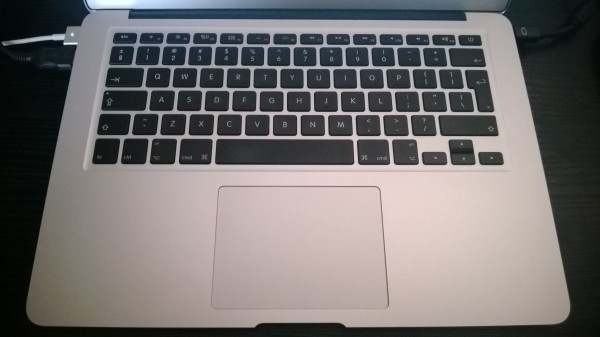
Why am I mentioning my keyboard problem (which is both a software and a hardware one)? Well, because I always had the impression that Macs were easy to use. To me, that doesn't qualify as easy to use. Every Windows user that I know would struggle to make sense of the keyboard and the way things are done in OS X (why is right click functionality not enabled by default for the touchpad?) without looking for a brief how-to online. If anything, it feels much more complicated to use at first from where I'm standing.
There are other problems too...
Dreadful Multi-Monitor Support
Configuring a dual-monitor setup in Windows results in a very pleasant experience. I only have to tell the OS of its arrangement and that's it. I can get stuff done in a matter of minutes. It works almost perfectly. Not so in OS X where the same setup is rendered useless.
Instead of treating the two displays as individual work spaces, OS X makes a huge mess about it. If I am swiping between full-screen apps on the MBA the same thing automatically happens on the external display too, even though the action should only happen on a single panel. I can't watch a movie and do something else at the same time because of it.
The same separation problem (or, better said, the lack there of) occurs when swiping between virtual screens on the MBA -- the action is again replicated on the external display as well. There is no reasonable explanation why this behavior is deemed to be normal by Apple. Mavericks is touted to improve this -- meaning make it as usable as on Windows.
OS X Is Just Different, Not Better
You may find this funny, but I never knew that pressing the close button inside a window in OS X does not actually close the app, just the window. I have also yet to figure out why the "+" button doesn't maximize the window. To me that seems counterintuitive, after using Windows for so long.
Similarly, the presence of the menu tab at the top of the screen, even when the app is not in the foreground, continues to baffle me. Again, it is a way of doing things that I can get used to, but it's not a better one from my point of view.
I also do not understand why I have to press Command + N to open multiple Finder (the equivalent of Windows Explorer) windows instead of clicking multiple times on its dock icon. This method does not make OS X more usable to me, quite the contrary.
Also something weird that I have noticed on OS X -- but never on Windows 8 -- is that some apps just refuse to close upon shutdown, effectively blocking the process. They remain opened, and the only way to close them is via the Activity Monitor (the equivalent of Task Manager).
There are other differences, like how installing and uninstalling apps is performed, the way the dock works, the presence of a notifications center, etc. Honestly, I have yet to have a good understanding of the way OS X is meant to be experienced, even after a month since I first started to use it daily. I guess it's time to start looking more things up to make the best of it (I know, I know).
I like the way OS X handles full-screen apps (well, when I'm not using more than one display). Unlike on Windows, each runs in its own, separate virtual screen without taking over the desktop. It's an interesting approach, and one that I quite like. The only problems that I can think of are that it's easier to forget about running full-screen apps and that it's a bit of a stretch to navigate to the last one with the touchpad. But those are just minor niggles that should not detract from the overall experience.
The Touchpad Puts Touchscreens to Shame
If there is one thing that I absolutely adore on the MBA it's the touchpad. It works brilliantly and I have to commend Apple for a job well done. The gestures support is second to none -- a maximum of four fingers can be used to swipe between full-screen apps, trigger the notifications panel, scroll, zoom and so on. This is the way that a laptop's touchpad should work. And it's very smooth too.
By contrast, likely because great touchpads are difficult to market, Microsoft makes the Windows UI touch-friendly and its hardware partners throw touchscreens at users hoping they get them, without any noticeable benefits in day to day usage. After using the MBA for a month I can say that I'd rather have its kind of touchpad on a laptop instead of a touchscreen. I most definitely would not switch back to a Windows PC that does not prioritize the touchpad experience, because of the MBA.
Boot Camp Sucks
Right after the MBA arrived I tried to get Windows 8.1 up and running via Boot Camp. It wasn't a very straightforward process from my point of view. The USB drive had to be formatted with a FAT32 partition (NTFS is not supported by Boot Camp), and it is best to create it from within OS X. The one that I made for my HP laptop did not work with Boot Camp, even though it worked well before.
After creating the USB drive with Windows 8.1 onboard, I proceeded to install the OS. Surprisingly, I could not initiate it without deleting an existing partition (the EFI one created by the OS X install) -- it was the only way I got the setup to work as it was reporting a vague partition error -- and when the process completed I was left with a Windows 8.1 install that didn't know how to make the best out of the brilliant MBA touchpad. I gave up and returned to OS X, but I plan on repeating this -- and hopefully get the touchpad to work as I'd like it to-- when I have the time to conduct this experiment again.
Outstanding Battery Life
My old HP laptop was only good for about two hours of on-battery use. By contrast, the MBA manages to get around 10 hours of battery life on a single charge which is simply outstanding. Other reviewers will tell you that it's possible to get even 12 to 14 hours of battery life, but my experience has been less fortunate. I blame Chrome, which is a power hog, and multiple opened apps for my lower runtimes.
Due to a mishap, I fractured a bone on my right leg and I got stuck with a leg cast for almost a month. Even though I had to cut back on 90 percent of my desk time because of it, I managed to work from bed without any major inconvenience (such as cables that I can trip on and the like), on the MBA. The excellent portability came in handy, and so did the battery life which made me forget I was using a laptop, and not a tablet. I had planned to test it outside of my home, but the unfortunate circumstances made this practically impossible so far.
The long battery life is a real game changer for me, and this is something that will positively impact the way many people work on the go. The MBA is just the first of the new breed of ultrabooks to deliver in this department. Once you get used to it, it's difficult to go back.
Different But Not Better
Apple's way is not better or easier to make sense of, it's just different and I think that's how people should look at it. Windows has its strengths and so does OS X. Once I get some seat time with Mavericks I'll expand on my (very brief) software impressions, seeing as plenty of users will upgrade from previous iterations.
The hardware is the strong suit of the MBA. That's not to say the software is bad, it just requires some getting used to (which continues in my case). It's an ultrabook that I would definitely recommend to those who don't need to run Windows-exclusive software and have high battery life requirements.


 This has been a week with a lot of news about operating systems. As we near the official release
 In a blog post that looks forwards as well as backwards, Skype lays out details of planned improvements for the desktop and mobile versions of the app. Mark Gillett applauds the technological improvements that have been made over the past year and also gives a