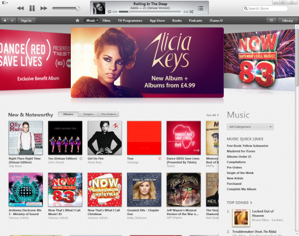
Apple has released the long-awaited iTunes 11 and boy does it look different. The brand new, easier to navigate interface provides a simplified view of your media. The default view shows a grid of albums and you can expand each one to see the songs it contains. There’s a pop-up menu on the left to browse your libraries (Music, Films, TV Programs and Apps) and a button on the right to open the iTunes Store. The Playlists button is located in the bar at the top of the screen. The familiar sidebar on the left is no more.
When you connect an iPhone, iPod or iPad to your computer, a button for it will appear and you can add content to the device by dragging and dropping.
A new feature called Up Next lets you create a queue of songs without having to build a playlist. You can add and remove tracks on the fly.
There’s a new much smaller MiniPlayer that lets you search for songs and manage the Up Next queue. The redesigned iTunes Store home page puts new content at the top of the screen and a Preview History button lets you quickly find any items you looked at previously.
iTunes 11 also offers much deeper integration with iCloud. When you buy something on any device you’ll be able to instantly access it on your PC or Mac. You can even download it for offline use.
Playing with it briefly, I think iTunes 11 looks pretty damn good. What do you think?


