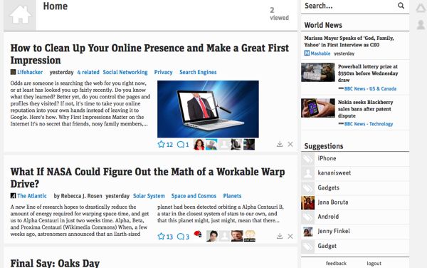
Prismatic, the six-month old app that builds custom newsfeeds based upon your social network interests and behavior, released a major design update to its web-based interface on Thursday.
After Prismatic determines the information most relevant to your interests, it presents you with a feed of stories. Each entry contains three kinds of information: The actual story, the story's "meta information" (topic, publisher, author, origin of recommendation) and the related social information (shares, likes, and the ability to share the story to Twitter, Google+, and Facebook.) In today's update, Prismatic has consolidated all meta information and social information into a single, smaller bar, and devoted more time to the story itself.
Prismatic has also gone against its colorful name and stripped out all colors except black, white, and blue in its design. User avatars are still color photos, and each story's related photo is also in color, but simplicity and readability were the goals, so colored text and backgrounds were banished. It's a tactic that has been employed by web clipping services like Instapaper and Readability, and cloud note-taking app Evernote.
Finally, the service's Facebook-like navigation bar in the right hand pane has been redesigned and simplified to be less confusing. This, Prismatic says, was the most common complaint among beta users. Now, instead of collapsible menus, there is a search field, a "world news" field and a "suggestions" field. Each of the fields is horizontally paginated and responds to left/right trackpad swiping. It's actually quite pleasant to flip through the news in such a way.
A Prismatic representative told BetaNews on Thursday that these design changes are "a foundation to explore and clarify [its] design ideas for navigation and social," and that they will inform the next version of the iPhone app, which will be released at some undisclosed point in the near future.
Interested users can sign up for Prismatic via their desktop browser, or via their iOS device.

