If you asked me two months ago about using a Huawei smartwatch or smartphone, I would have scoffed. Yet, here I am doing just that. Timing on the latter is ironic. On Oct. 15, 2015, I bought a 128GB silver (and white) iPhone 6s Plus using Apple's 24-month finance plan, rather than paying in full up front. Huawei-made, Google-branded 64GB Nexus 6P arrived the next day for review. The following morning (the 17th), I hauled down to Apple Store and returned the iPhone for full refund. That act sums up my reaction to the new Android flagship running "Marshmallow".
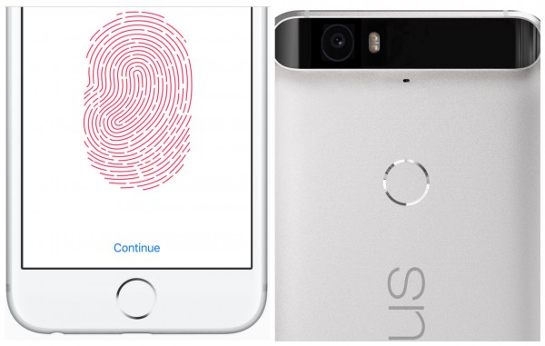
I didn't expect to be so wooed by Nexus 6P, but Google got me by delivering superior contextual experience. This device, and Android 6, is all about context, starting with what for me is the killer function I couldn't part with: the fingerprint reader on the back of the phone. Picking up the device and placing my forefinger on the circular indentation wakes and unlocks the 6P. Wow-way is right! The mechanism beats the Hell out of Apple's two-handed jimmy from the Home button.
Now on Tap
The other got-me demonstrates fundamental philosophical design differences between Apple and Google regarding finger-first interaction. iPhone 6s and 6s Plus feature what the fruit-logo company calls 3D Touch. The mechanism allows the user to apply different levels of pressure to initiate different actions. Apple uses Peek and Pop to describe the interaction, such as pressing lightly to look at an email and a little harder to open the mail app. By contrast, the Alphabet search subsidiary takes another approach that is killer app in the making.
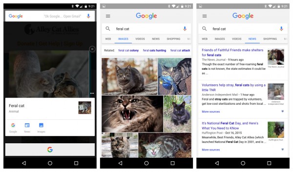
Called Now on Tap, the name is a misnomer. You briefly press, not tap, the Home button and Android 6 Marshmallow brings up Google Now info cards that offer contextual information that is relevant to what's on the screen. Maybe it's an app, email message, or webpage. As an example, I searched for "feral cats", which led me to website Alley Cat Allies. Then I activated Now on Tap by pressing down the Home button (see screenshot left). One option on the card is images. Who can resist feline photos? (middle). I then clicked News (right), and had an uh-oh moment. I did all this on the evening of October 17, only to learn that I missed National Feral Cat Day on the 16th. Well, Hell.
Cute: When Google can't find anything relevant, you see "Nothing on Tap". That, and some irrelevant info and thin presentation, is why I call the feature a killer app in the making. Google will refine the feature over time, while (in theory) contextual relevance improves as Now collects more (gulp) data about you.
Got to say: The info cards are a wee bit small for my aging eyes. Now on Tap could be even better on a tablet. OK, Google, when will you release Pixel C?
Design Ethics
To get 3D Touch, Apple makes you buy a new phone. Google gives Now on Tap to mobiles upgrading to or shipping with Android 6. For the moment, that generally means a Nexus device. Another difference: The limited contextual benefits from Peek and Pop require more user intervention. Now on Tap strips back the complexity by more proactively providing information. That approach better fits the first four of my principles of good design. Full list of what a tech product should do:
- Hide complexity
- Emphasize simplicity
- Make users feel happy
- Build on what is familiar
- Imbue human-like qualities
- Do what it’s supposed to really well
- Allow people to do something they wished they could do but couldn’t
- When displacing something else, offer significantly better user experience
The differing design ethics highlight another important development distinction between the companies. Apple sells devices and claims we live in the post-PC era. Google generates revenue from contextual information services—many of which are related to search. As I have repeatedly stated, post-PC is a myth created by Apple (and others) focused on selling mobile devices. We live instead in the contextual cloud computing era, where content is king and making it available anytime, anywhere, and on any device. No company gets context like Google; it's in the corporate cultural DNA; the company's profit center is contextual advertising, leveraged from search.

Android 6 Now on Tap
Now on Tap is but one example, and Marshmallow is the most contextual version of Android yet and only Nexus devices currently are capable—particularly the 6P and sibling 5X. Stated differently: Google bakes search into its freshest operating system like no version before it. If you wonder why European trustbusters investigate Android, Marshmallow might be reason enough. Whether or not the intention, contextual search integration is so tight, Google might as well give the EU's Competition Commission the middle finger.
Digital Lifestyle
Everything in this review should be treated as first impressions focused on benefits; the companies' marketing highlight 3D Touch or Now on Tap as major benefits. For good reasons. The features make the smartphones smarter, at a time when typical hardware improvements have reached a plateau of innovation.
While this review is not a blood-and-guts head-to-head between iPhone 6s Plus and Nexus 6P, other comparisons are nevertheless difficult to ignore. These are both the flagship phones for their respective digital lifestyle platforms, and the similarities surprise me (as they may you).
Smartphones are highly personal, contextual devices that fit into digital lifestyle platforms. Apple's and Google's are the most alike and the most competitively comparable around iPhone and Nexus, and none of the predecessors are more alike (and different) than the 6s Plus and 6P.
Similarities span physical design, hardware features, and underlying digital lifestyle platforms anchored by the operating systems. When you buy iPhone or Nexus, Apple or Google controls the overall user experience. The distinction is important with respect to the Android device. There are no offending skins or users waiting months (or never) for updates. Like Apple and iOS mobiles, Google gives updates promptly to Nexus devices.
But past digital lifestyle platform differences largely muted buying comparisons. For a long time, iPhones were smaller than Nexuses. More recently, 6P's predecessor, made by Motorola, packs a 6-inch display and physical dimensions are nothing like iPhone 6 Plus or 6s Plus. By contrast, the Huawei-made smartphone is similarly-shaped, with like dimensions, hardware features (except for 3D Touch), and digital lifestyle benefits.
Anyone considering either iPhone 6s Plus or Nexus 6P shouldn't ignore the other device. Unless you are adapted to one platform or locked in by app purchases and other circumstances, these are the only flagships to consider. To repeat: Look at both before buying.
Comparisons
Let's examine hardware features:
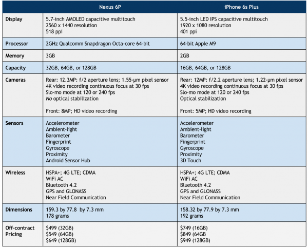
1. Physical size is the same, except that the 6P is 1mm longer. Nexus: 159.3 by 77.8 by 7.3 mm. iPhone: 158.32 by 77.9 by 7.3 mm.
2. Huawei puts a larger screen into that nearly identical enclosure—5.7 inches vs 5.5 for the 6s Plus.
3. Nexus 6P offers higher-resolution screen: 2560 x 1440 at 518 pixels per inch compared to its rival's 1920 x 1080 at 401 ppi.
4. Both enclosures are aluminum.
5. The new iPhone is considerably heavier, however, and you really feel it even compared to the 6 Plus: 192 grams to the Nexus 6P's 178 grams. But the heft makes Apple's device feel sturdier than its predecessor and in my brief usage better gripped in hand. I no longer recommend a case as necessity; I would carry the 6s Plus bareback.
6. Both mobiles come with fingerprint sensors. As already mentioned, I find the placement and functionality to be superior on the back (Nexus) vs the front (iPhone).
7. Rear cameras are 12 megapixels, f/2.2 aperture for the Apple and f/2 for the Huawei.
8. Conceptually, the Nexus should shoot better in lower-light situations, because of the aperture and because bigger pixels, not more megapixels, is better: 1.55 µm on 6P vs. 1.22 µm on 6s Plus.
9. Apple gives you optical image stabilization for photos and videos, Huawei does not.
10. Rear cameras on both smartphones can shoot 4K video at 30 frames per second.
11. Front-facing cameras are 5MP on the 6s Plus and 8MP on the 6P.
12. The Apple uses proprietary Lightning connector and the Huawei industry-standard USB Type-C.
13. iPhone 6s Plus comes with earphones, Nexus 6P does not.
14. The 6P packs front-facing speakers (that sound awesome), while the 6s Plus offers a sideways grill in landscape view.
15. Storage capacity starts at 32GB on the Huawei vs 16GB on the Apple. Sorry, but 16 gigs should be criminal. Other capacities, for both: 64GB and 128GB.
16. Price is a difference, and Google gives greater value. iPhone 6s Plus: $749 (16GB); $849 (64GB); $949 (128GB). Nexus 6P: $499 (32GB); $549 (64GB); $649 (128GB).
17, Both companies offer damage protection insurance. But at $89, Google charges 40 bucks less than Apple for similar benefits.
Final First Thoughts
Nexus 6P's design didn't wow me out of the box. The phone is handsome enough but not greatly distinguished from other devices in the size class. However, after just a few hours handling, I couldn't put down the smartphone.
As my full first-impressions review explains, key benefits are beautifully balanced (which also can be said iPhone 6 Plus). The rear-fingerprint sensor and Now on Tap sold me, as previously mentioned, and better overall contextual user experience.

Click to enlarge
I cannot at this writing comment on battery life, which demands weeks of usage to rightly assess. However, in brief testing, both phones promise plenty of juice to get you through the day and beyond.
Both smartphones are fast enough, but Nexus 6P is the perkier performer. The days of choppy Android responsiveness are over.
I made my choice, and quickly, because of contextual killer benefits. You may feel differently, which is what makes platform competition great—catering to different individual tastes and needs.

