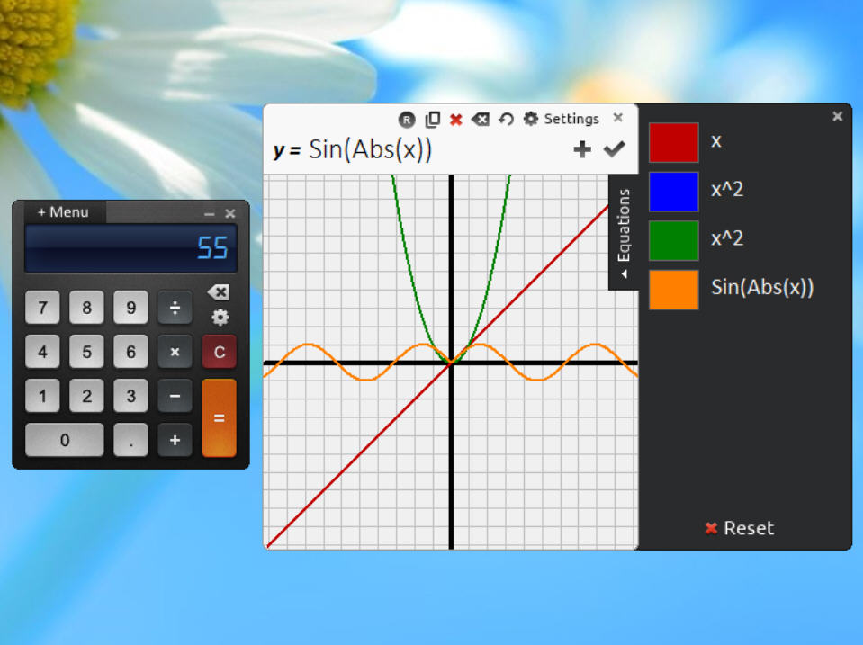
Launch Windows desktop calculator Reor for the first time and it’s tempting to think: is that it? The tiny interface really is stripped back, with little more than a numeric keypad, four operators and an equals button.
But wait. There’s more. And clicking on the Menu button reveals all.
The first surprise is there’s no "menu". Instead Reor takes over your full screen, hiding whatever else you have open to display its various options. And yes, this is just as pointless and annoying as when Windows 8 does it.
Fortunately Reor does at least have plenty of content on offer. In a click you can view scientific, statistical or financial functions, a graphical plotter, lists of physical and mathematical constants, a mortgage payment calculator, unit converter and more. These all have keyboard shortcuts, too, so you can avoid the "immersive" menu in future.
In perhaps a smarter design move, the Reor interface doesn’t rearrange itself to suit the new mode. Switching to "Scientific", say, just gets you a separate dialog with new function buttons -- "Sin", "Cos", "Tan" and so on -- which you select as required.
There are also some unexpected extras. A "wordify" function presents your currently-displayed value as words; the Variables pane stores any values you might need on a regular basis; a full History view gives you access to all the calculations you’ve performed so far, and their results.
Reor’s interface quirks can be distracting, but there’s plenty of power here, and if you’re looking to move on from Windows own Calc.exe then it’s worth a try.

