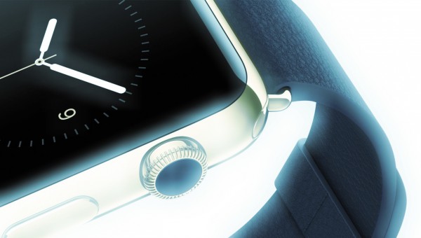
I am reluctant to criticize unreleased Apple Watch because my analysis about original iPad -- given before seeing it -- was wrong. That said, Android Wear, while seemingly sensible comparison that analysts, bloggers, and journalists make, isn't right. When put in perspective of next-generation wearables, I think Apple Watch should be compared to Google Glass.
Be honest. Which looks more innovative to you? The utility of something you see at eye level that provides real-time, location-based information is much greater than something that demands more responsive -- "Hey, Siri" -- interaction and turns the glance and fingers downward. Granted, Apple Watch delivers alerts, and you feel them, but your attention is always to look away.
Google Glass presents plenty of social mores concerns, and it's a pricey purchase. But I expect Apple Watch will be, as well (consider the $349 starting price as just that and requiring iPhone purchase, too). To be clear, I'm no Google Glass fan. I see the device -- and, honestly, Apple Watch, too -- as limited to niche markets.
Before the Apple Faithful starts frothing, step back and open your mind. You have to think beyond the initial products and look to what the platforms can become. Apple Watch and Google Glass are most certainly development platforms. Think beyond wearables to future form factors. Clocks. Connected appliances. Living rooms.
Answer this: Do you reinvent a wearable category on the decline or create a new one? Apple chooses the former and Google the latter.
Platform Potential
Wearables and their underlying development platforms are about one thing: Contextual, information utility; bringing what you want, where you want, and when. Is that a destination Apple or Google is likely to reach first? My money is on the big G, because of:
- Google's wearable market lead
- The real innovation behind Glass
- Google gets context better than anyone
- Contextual utility of Google Search and Now
- Utility of a device placed where the eye looks
- Greater application development platform maturity
There is much to like about Apple Watch's clever user interface design. I am intrigued. Nevertheless, I keep wondering if its fate isn't that of the Power Mac G4 Cube, which miserably flopped in 2000. Cube looked fabulous, and the eyes loved the design detail. But the Mac was pricey, limited, and arrived during a glut of PC sales and start of a recession.
My concern is Apple Watch following a road to ruin. I don't see huge future for smartwatches of any ilk, despite geeks' passion for them. Limited battery life, overlapping utility with cell phones, and the need for a second carried device put the wearables into a niche market. If that's where Apple wants to be, then the watch will do just fine. But if the company wants more from wearables, I dunno. While often a Glass critic, I still see Google going where wearables will eventually become mass-market devices.
Eight Principles
A decade ago, I developed four basic principles of good tech design, which I expanded to eight when publishing my ebook The Principles of Disruptive Design last year. Successful products must:
1. Hide complexity
2. Emphasize simplicity
3. Make users feel happy
4. Build on what is familiar
5. Imbue human-like qualities
6. Do what it's supposed to really well
7. Allow people to do something they wished they could do but couldn’t
8. When displacing something else, offer significantly better user experience
iPhone handily meets all of them. Google Search is another good example. Glass checks most of the boxes, but Apple Watch fewer in part because of No. 8. Often the displacement brings forward a new form factor, which iPhone did with the multitouch screen.
Good example: The CD radically improved on vinyl records: Smaller disc, cleaner and clearer sound, and easier playback. The experience was so much better that people repurchased content they already owned. By comparison, the cassette, which initially looked like a vinyl displacer merely stood alongside. The experience wasn't significantly better but complementary.
Apple's smartwatch and others complement the cell phone -- and even require it. Contextual wearables like Glass promise, but still must deliver, better user experience. In this computing era, any device is in many ways immaterial to the information it provides. How is everything, and Glass is closer than Apple Watch, Android Wear, or other devices in the wrist-wear category.
The wearable that wins will also provide platform development to other form factors where contextual information matters. The point: There's a new platform frontier ahead that's bigger than anything else before it.
Editor's Note: My apologies for violating Betteridge's Law of Headlines. The yes-no question is rarely appropriate here.


