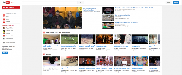
Like Google+, YouTube had a love affair with white space. This quirkiness was only noticeable to those who have large displays. On my 23-inch screen this meant the video-sharing site had only taken roughly half of it to show me relevant content. To get around this behavior, I had to resort to Google Chrome extensions which could center the page.
I said "had" because, thankfully, YouTube is now smart enough to figure out that when we are using large screens it should adapt its look accordingly. It now centers, yes. And, to my eyes, YouTube now looks more like Google+. That is not a bad thing, really, as, from my point of view, there is nothing wrong with the latter's layout.
"YouTube now has a center-aligned look, fitting neatly on any screen size, and feeling similar to the mobile apps you're spending almost half your YouTube time with", says YouTube in a blog post. "You can quickly flip between what’s recommended and popular in 'What to Watch' like Postmodern Jukebox’s Timber, and the latest from your subscribed channels like iamOTHER in 'My Subscriptions', with both options now front and center. Click the guide icon to the right of the YouTube logo at any time to see your playlists, subscriptions and more".
For those who have large-enough displays, the guide icon mentioned above only appears when the YouTube browser window is not maximized. When it is maximized, the layout of the site is similar to the one shown in the screenshot at the top of this story.
Alongside this design change, YouTube has also introduced an improved playlist feature. The guide shows all your playlists now, but also ones you liked in other channels. There is also a new playlist-editing page which makes changes easier to perform.

