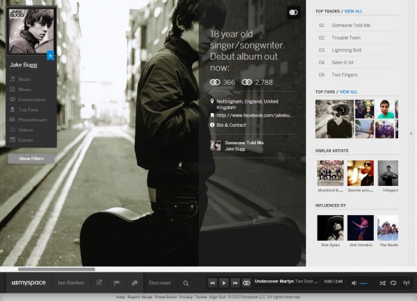
A funny thing happened when I checked my email this morning. I found I had a friend request from Myspace, something I haven’t had for a long time. Even funnier was when I clicked on it Myspace -- or at least Myspace as I knew it -- was gone. In its place was a new sleek, Modern UI meets Spotify, music-based site. A site that doesn't seem to do friend requests anymore either so it's lucky I got that email or I might never have stumbled on it at all (conspiracy theories on a postcard please).
Of course this really shouldn't have come as a surprise, around nine months ago my colleague Wayne Williams reported early news of the update with the headline New Myspace is gorgeous, but who will use it? Like everyone else though I’d read about a Myspace update and not deemed it worthy of brain space. So suddenly finding myself on the new site -- fresh out of beta -- was a bit of a shock.
Not an unpleasant one as it happens. After a bit of reorientation (the site is much more minimalist than in the past and it isn't always obvious how things work) I thought it looked good. In fact visually it's a winner with chunky graphics, tablet-friendly sideways scrolling and a neat floating player at the bottom of the page. There's also a change in emphasis, rather than trying to recapture its pre-Facebook glory days as a one-size-fits-all social network it now focuses on creatives; musicians mainly but also artists and writers. Old Myspace was always good for finding music and the new one looks set to capitalize on that. There are new mobile apps too that allow you to build your own personalized radio station.
Tim Vanderhook, co-owner of the site along with his brother Chris and singer Justin Timberlake, says, "Today more than ever there's this need for a creative ecosystem that kind of caters to the creative community and that's both a social network and the streaming services attached".
There's no doubt that the new site is a visual treat but I'm not convinced that it does anything better than the competition that will tempt me to use it regularly. And with Google and Apple both moving into the streaming market that competition is about to become a whole lot tougher.
By targeting the site at artists the owners clearly hope that fans will follow. This could be a risky strategy but Myspace has the advantage of some 27 million existing users in the US and around twice that number worldwide. Many of those, like me, probably haven't used the site for a while but if they can be tempted back from their dormant state by the new interface they could give it a head start over the competition.
What we have then is a site that's undergone a radical redesign, gone off in a fresh direction with a new focus and, on the whole, seems to have done it well. This should be the big social network news story of the week, but sadly it comes at the same time that Facebook borrows the hashtag feature from Twitter, so poor old Myspace ends up as the bridesmaid once again.

