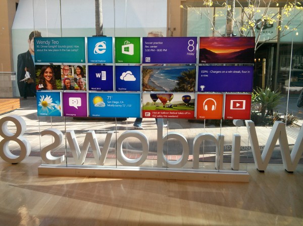
Two words: Surface Pro. For most of February, I used Microsoft's Windows 8 Pro tablet as my primary PC and loved the experience.
I haven't felt so good about using a Microsoft operating system for a decade. Actually, I've never felt like this. Windows 8 Pro is simply amazing when experienced on the right device, and starting point is touch. Modern UI really works for me. Windows 8's visuals are stunning, making a truly satisfying and fun place to work. I enjoy working on Windows 8, which pretty UI beckons me to come back again and again.
Smooth Surface
There is something about Modern UI that is different on this computer, and I can't stress this point enough. A year ago, I spent a few weeks with Windows 8 Consumer Preview running on a Samsung slate, and the experience so underwhelmed. Time spent using other laptops or tablets at my local Microsoft Store is ho-hum, too. But Modern UI enthralls on Surface Pro, which I largely credit to the bright, crisp display, touch and stylus inputs and smooth, speedy performance.
Surface Pro is how Microsoft means Modern UI to be experienced. But distribution is limited to a few stores and a few countries, and there aren't enough third-party devices available either.
Yesterday, IDC confirmed with depressing data what many of us already knew: Windows 8 failed to lift fourth-quarter PC shipments. The analyst firm identified many reasons, with tablet competition high among them. Another: "limited supply of touch-enabled Windows 8 models", which is "out of step with the touch focus of Windows 8".
How Touching
Yes! Yes! Touch is so important to truly appreciate what Windows 8 can do. Modern UI really does feel modern. Microsoft's built-in apps are simply gorgeous and functional. They beg to be touched, gawked. Overall, I find the interface to be surprisingly intuitive. All this beauty makes me feel good. Successful products should make you feel that way, and it's all the more important with something meant to be handled, to be caressed.
Near the end of February, I added Google's first computer, Chromebook Pixel to my repertoire. The device also features a high-resolution touchscreen. But the usability experience between the two user interfaces is shockingly different. Google presents Chrome as the major motif. Modern UI is a full-screen motif that licks the display's edges and presents big, bold elements that are easy to touch.
For example, I find the experience using Internet Explorer 10 to be visually and tactfully more satisfying on Surface Pro than Chrome on Google's laptop. Microsoft smartly places the navigation controls at the bottom of the screen, which diminishes Gorilla arm and puts them closer to the fingers for when people use keyboard and touch -- which is the idea for Surface Pro. Additionally, going back or forward to webpages is easier. Just swipe your finger left or right. Somebody really thought-out this user interface.
Living Machine
Strangely, Microsoft has been down this path before and failed, back when there was neither touch nor Internet bandwidth. I refer to the dark ages of personal computing -- the 1990s. Modern UI derives heritage from the Active Desktop, which Microsoft championed during the browser wars with Netscape. The idea of live, web content was visionary but too soon. PCs didn't have the oomph and Internet pipes to most businesses or homes were too narrow -- and there wasn't enough quality content.
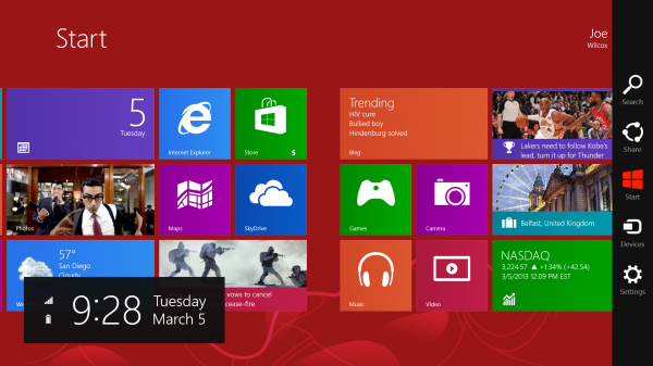
But Microsoft had the right idea. Live tiles transform the desktop into a living, breathing thing. It responds to you, anticipates you. I simply cannot express the sheer value, when set alongside aspects of the overall user interface.

That "anticipates you" aspect is more than displaying content. For example, after I logged into Windows 8 for the first time, the Start screen presented different options for my Epson Artisan 730 WiFi printer -- including driver update. The operating system found the networked peripheral and provides what I need to use it, unprompted.
To my surprise, on the Windows 8 Start screen, I find all the movement kind of refreshing, even fun, like using more of my senses -- and fingers as tools -- to get work done. Additionally, and I must express this again, I find Modern UI an absolute joy to use. Yes, the motif demands more work, such as seemingly endless scrolling left or right. But the design appeals and draws me in. It's immersive and as previously expressed alive.
Tool Users
The best user interfaces make products more human, more approachable and responsive. The human body doesn't have one UI, but many working together, giving dimension to living -- sight, sound and touch, primarily. The best products are similar. Visuals are important because they appeal to sight, and the eyes are the main tool by which we take in the world around us. Modern UI is beautiful, as are many of the active -- seemingly living -- cues it provides. There, Live tiles add richness and movement to Surface Pro running Windows 8 Pro.
But humans are primarily tool users. We look and then touch. Keyboard and mouse are unnatural constructions, even though they are so familiar to a generation of PC users. But touch is more natural and extension of you. There's more intimacy involved with touching something on the screen than interacting with it via keyboard and mouse.
I could never have come to truly appreciate what Windows 8 offers, if starting with mouse and keyboard only. The Start screen begs to be touched, to be looked at, to be appreciated. The intimacy of touch is one of many reasons. Think about it. Would you rather look at a picture of something or someone you love, or touch them?
And Apps...
I kept all the Windows 8 defaults, by the way, and they include using Bing, which I find more than good-enough for day-to-day searches. To be honest, I don't miss Google search at all, even though it's readily accessible. All the bundled apps look great, and are hugely functional. They are the model every developer creating Windows 8 apps should aspire to.
There aren't enough apps, and fewer really good ones -- that meet the standard for quality and vitality of those Microsoft provides. Every Friday, my colleague Martin Brinkman posts the "Best Windows 8 apps this week", which I highly recommend.
Lots of you don't like Windows 8, particularly Modern UI. Perhaps you would feel differently if using the OS on the right device -- touch, for sure. Surface Pro perhaps even better.
Photo Credit: Joe Wilcox

