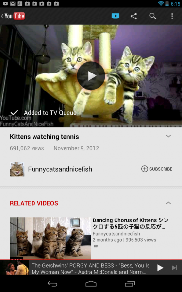
This week, Google brought a little something from ill-fated Nexus Q to Google TV. Even my non-techie wife is amazed, and that's the point. This little something is really big, because anyone can use it and get dramatic benefits.
The new YouTube for Android app installed on smartphone or tablet now acts as a remote control to Google TV, taking interaction far removed and clumsy and making it intimate, fun and easy. If Amazon and Netflix operated similarly -- and the set-top box got Hulu Plus -- I'd cancel AT&T U-verse, baby.
There is so much done right here, I almost don't know where to begin. YouTube updates. You open the app, which prompts with a circle to touch to sync with the TV. That's it! You choose a video and it plays on the big screen.
The Mrs. and I spent the night on YouTube instead of Primetime. First we used my Nexus 7, then she chose videos from hers. The experience is somewhat shared, because the app shows the last video watched regardless who played it. When resuming control, I saw her last watched video on my tablet.
Google TV sadly presents a cumbersome YouTube experience from the remote. But on a touchscreen, the app is easy to use, and finding, selecting and watching videos light-years better. Bringing the two together, and how magnificently Google has done so, changes everything.
But I've seen something like it before, on Nexus Q -- the streaming sphere Google mysteriously yanked before sales started during summer. Android phone or tablet is the remote, which I found to be odd at first, but by the third movie caught on to the benefits.
The YouTube app as remote for the service on the big screen follows similar concept, and a little more. Google designed Nexus Q to be a shared device, such that people with different accounts can play content. There's a little of that concept sprinkled into the new YouTube app.
 Google just needs to go further. Touch on tablet is such a superior way to search for and access content than the clunky remote control. After all, which motif is the app, and others like it, designed for? Hint: Not the television.
YouTube is a tremendously satisfying start. Amazon is an even worse experience right now. Video content presents in Chrome on YouTube like it would on a PC. The remote is painful way to get around Amazon's store. But an app with similar design to YouTube, and touch-friendly, would elevate the whole user experience.
The key point: Touch isn't enough. The YouTube experience dazzles because the app so easily connects to Google TV, the layout looks good on both screens (and navigates simply on the small one) and play, pause or stop is finger-loving good. Heck, the app even puts videos in a "TV Queue".
For the record, I have the Sony NSZ-GS7 Internet Player with Google TV, which has got about the worst remote imaginable. The thing is two-side, requiring constant flipping over, and the touchpad has poor tactile response. What a difference the Nexus 7 makes as remote, or a smartphone, of course.
I like Google TV, but must accept annoying idiosyncratic behavior that's nearly all about the user interface. YouTube is now killer on the device, which could be killer if Google made more improvements like this one. That's above and beyond the new Google TV update announced two days ago.

