
Without a shadow of a doubt Windows 8 is a game changer for Microsoft. It's the operating system designed to take the company into a new computing era where the personal computer is no longer the star of the show, but still plays an important role. Can the latest version of the popular operating system manage to shine against its predecessors on their home turf? And for that matter, should you upgrade?
Windows 8 is a mixed bag before its launch and generating quite strong impressions along the way since Microsoft released the final build to manufacturing. The main criticism: the new user interface formerly known as Metro and the steeper learning curve compared to Windows 8's predecessors; it's not as intuitive as well. That's what the critics say, but what's it like to actually live with Windows 8 for more than a brief period of time?
Managing Expectations Beforehand
When I first laid eyes on the new interface I knew it meant relearning how to carry over a certain number of tasks, and I've used Windows on a daily basis for more than a decade (mind you, I'm young). Unlike most operating systems from the Redmond, Wash.-based company, Windows 8 takes the user interface into a totally new direction that requires a fresh take on how it should be used.
The "Modern UI" might confuse someone moving from Windows 7 and expecting its successor to fit like a glove, which is why the right mindset is to take Windows 8 as an operating system that requires a clean slate.
Robert Johnson wrote a three-article series on Windows 8 that highlights some of the underlying features that new users will have to adjust to and expect when dealing with it on a daily basis:
- Windows 8 is a compelling story
- Windows 8 simplifies computing
- Windows 8 is a graphic shift in computing habits
System Requirements
Windows 8 does not demand higher hardware requirements and will function just as well if not better than Windows 7 on the same type of hardware, which is great news for users that are tempted to upgrade but do not want to bump up the specs of their device. Microsoft quotes the following as the minimum hardware required to run Windows 8:
- 1GHz or faster processor
- 1GB RAM for the 32-bit version and 2GB RAM for the 64-bit variant of Windows 8
- 16GB free storage space for the 32-bit version, while the 64-bit variant requires slightly more at 20GB
- A DirectX 9-compatible video card and adjacent WDDM driver
For snapping apps a 1366 by 768 resolution is needed, but for downloading and running them from the Windows Store the operating system only requires a display with a 1024 by 768 resolution.
In all fairness, running Windows 8 on the minimum hardware requirements will not produce the best results, but since I'm testing it on a 4 year-old HP 8710p laptop with a 17-inch display sporting a 1680 by 1050 resolution, Intel T9300 processor running at 2.5GHz, 4GB RAM and 240GB Intel 330 Series SSD.
For the purpose of this article I will discuss the 64-bit Windows 8 Pro. It's the most feature-complete variant that is currently available to consumers.
Initial Setup
Let's kick off with the initial setup. From the get-go users are greeted with the familiar dialogue that allows them to choose the language, region (country) and keyboard, and gives the option to start fresh (clean install) or upgrade from another version of Windows. I've gone with the former to have as much interaction as possible with the operating system. That means you and I have to install programs on a clean slate of Windows and customize it without any leftovers settings.
Since I do have a router and Windows 8 recognizes my wireless card, I can connect via Wi-Fi to the Internet. From there on, unlike its predecessors, the latest operating system allows users to choose between the type of setup. By selecting "Express", users will get a simplified process, but with "Custom" various settings can be adjusted, such as turning on network sharing, sending information to Microsoft (which is off by default) or configuring error reporting and even allows to choose whether you want to share info with apps.
A new feature required to benefit from the full-fledged Windows 8 experience is signing in using a Microsoft account. Among the benefits: syncing user data and mail and connecting to SkyDrive, etc. It's similar to how Google adds Gmail sign in to Android or Apple to iOS. Using a local account is still possible but will not deliver the best possible experience. It should be noted as well that the computer needs to be trusted before syncing data using the Microsoft account, as to avoid possible security issues.
Windows 8 is actually faster than its predecessor when it comes to installation time, although in all honesty users are less likely to be impressed by that. What's more important is the time it takes to upgrade from a previous version, which Microsoft says is faster.
After the installaton process is finished Windows 8 will ask the user to sign in. Since I chose to install it using a Microsoft account, it requires the associated password.
Hello New UI
The new user interface takes the central role with Windows 8, and the desktop is just like any other app. Microsoft wanted to do things differently, and it shows.
Whether searching for various programs, configuring settings or navigating through the interface, users immediately see some relearning will be required, even to perform basic tasks. Even shutting down Windows 8 can be unintuitive at first, because it feels natural to move the cursor to the bottom left corner of the screen. Like myself, a number of users will complain that they can't shutdown or restart the PC like they can in Windows 7 and that shouldn't happen with a new daring operating system.
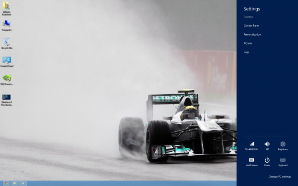
With Windows 8, Microsoft introduces the Charms bar, which can be triggered by moving the cursor to the upper or lower right corner of the screen or pressing Windows Key + C. The menu can be used to search and share items, go to Start which is like pressing the Windows Key on the keyboard, use Devices that for instance can send items to a secondary screen and finally, but not last, use Settings to setup features like Notifications or change PC settings.
The Charms bar plays a key role and as a new addition will take some time getting used to. Judging by the Surface video that Microsoft posted, using the Charms bar is far more natural on a tablet, where it actually makes more sense. Windows users simply are not programmed to operate the OS this way.
The upside of the, quirky, new user interface is that it makes finding programs much easier compared to the old one. Let's say you want to use Windows Update. You simply tap Windows Key, type "Update" then select "Settings" from the right side of the screen and it will turn up as the first item in the list.
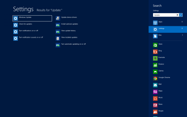
The benefit is easily noticeable. Because the new Start menu does not have a search button, the functionality must already be known to the user in order to take advantage of it. Pressing Windows Key + W takes you right to searching within Settings, but who would have figured it without looking it up?
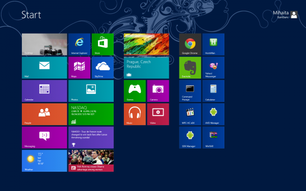
Users familiar with the tiles from Windows Phone will feel right at home. They automatically update, presenting useful information depending on their category. When you receive new mail the corresponding tile will display a preview that shows some details on the message such as sender and the first words in the subject.
Same goes for other apps such as Calendar, that right now shows me that today is the birthday of one my Facebook friends. I have linked my Facebook and Outlook accounts, so info from the first appears in Windows 8.
Another benefit of connecting the two is the ability to chat directly with friends straight from Windows 8 through the Messaging app. If you receive a message, it will be displayed in the upper right corner of the screen as a notification.

For business users Microsoft implemented Bing Finance to keep track of stock prices, use NASDAQ, DOW, S&P 500, etc as well as the ability to receive relevant related news and videos. If it's news that you want then there's an app for that. It will deliver information from various sources and areas, and utilizes Bing Daily in doing so.
I spend a serious amount of time using just the browser because that's what I am used to doing, and not the variant designed for the new UI. I suspect many users will revert back to the desktop one for serious multitasking, and leave the new UI for light tasks at least until the app selection matures. The number of apps is currently limited by the Windows Store, and there's no escaping it, but more on that later.
The issue with the new UI is that users are simply not educated. While a powerful tool, its full potential is muted. Processes aren't immediately intuitive, particularly for old hands with ingrained habits.
Microsoft expects users to guess certain functionality and embrace apps like they would on a mobile device. With time users will manage to find the right balance in using Windows 8, but Microsoft could have made it all so much easier.
Windows Store is still in its Infancy
Windows 8 features its own digital store that delivers applications designed for the new interface, as well as for the desktop. It's a concept that the company "borrowed" from mobile operating systems, but fear not as it's a good idea.
Having an app store within Windows makes it far easier for users to search and install applications that are designed to work for the new UI. If concept works brilliantly on other platforms, it can works just as well here. Another upside is that Microsoft or any other developer can update apps without any issues and correct bugs down the road without any hassle on the user's end.
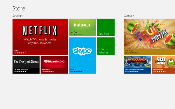
But being new is its main disadvantage. Two of the most popular apps that can be found are Evernote and Skype, but there's no Twitter, Facebook or Google+ app, and many users expecting to find either at the moment will likely be disappointed. As an example, same goes for browsers, which have yet to make an appearance inside Windows Store.
Granted, things will improve and that is what users will have to understand in order to embrace Windows 8 now and not regret the decision, but it's still a problem that should be pointed out.
In all fairness apps selection affects Microsoft Surface and other Windows RT-powered tablets more than desktop computers since so-called legacy applications do work on the latter but not the former.
The Desktop is (mostly) Unchanged
But it's no longer the centerpiece. Take away the old Start menu, remove the translucency effects from Aero and adapt to Microsoft's current design language, it's still similar to the desktop that most have and surely still love and use.
What is immediately noticeable: implementation of an Office-like ribbon throughout the interface, and that is not necessarily a bad thing. In my own experience, I revert to the keyboard for file operations, and I only find myself using the ribbon actions in rare occasions.

One thing that I have noticed: while I've been using Windows 8 for a long time, I'm still not used to seeing the new UI after pressing the Windows Key. This is something that new users will have to look forward to, but it gets easier over time to adjust and not go straight for bottom left corner of the screen and click. It's the new way of doing things, but if I can get to keep my beloved desktop I'm fine with it.
A difference compared to the previous versions of Windows is the way the operating system handles browsers. Let's take Chrome for instance; in the new UI I have to sign in to my Google account but when switching to the desktop version I have to repeat the same action. It's a minor niggle at first when setting Windows 8 up, but easily overcome afterwards.
Implements a Control Center
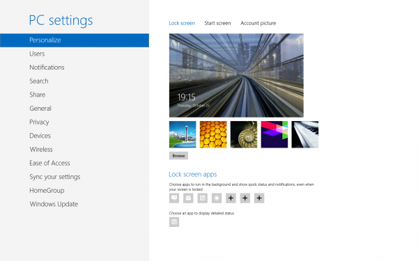
Microsoft included more comprehensive customization options with Windows 8. By using the Charms bar and selecting "Settings" then "Change PC settings" users can swap the background of the new locksreen, add widgets to it from the installed apps or change the way notifications are delivered even for individual apps, etc.
The latter will come in handy when programs deliver continuous notifications that interrupt users from carrying on with the daily routine. For instance if you're a heavy user of Facebook messaging, who constantly engages in conversations and have the popular social network linked to Outlook, the ability to disable notifications for the Messaging app will be useful at times.
The "Change PC settings" menu basically acts as a control center similar to what you find in smartphones and tablets. Similarly, it allows users to reset Windows 8 to its default, unaltered, state which should be useful in a number of occasions.
There is even an Airplane mode that again is borrowed from mobile devices, and simply disables all forms of wireless connections. This, again, will impact tablets more than desktops as I personally find it hard to imagine that someone not using portable devices will want to disable Wi-Fi for instance using Airplane mode and not the physical toggle.
Better Performance
Windows 8 is surprising to say the least because it actually outperforms Windows 7. This may not sound like an important trait, but considering that its predecessor was already fast to begin with outdoing it is no small feat.
Apps designed for the desktop open faster, but that also has something to do with the solid state drive that I have. From a personal perspective the ones that are compatible with the new UI still open a tad slower than what I would expect them to considering the Intel SSD and processor that is still decent enough to run more demanding applications.
From my own testing, RAM usage is down in comparison to Windows 7, which is a welcomed improvement as it allows applications to have more breathing room. It could still be improved by cutting down on running services, the number of which has grown from its predecessor.
I do have to point out that Windows 8 is still rudimentary to say the least in the page file department, which is allocated based on an old criteria, instead of peak commit like Mark Russinovich suggests (and he works for Microsoft). In a time when SSD drives perform best with more free space the company keeps using the same method as it did with Windows XP.
Redesigned Task Manager
I am a heavy Task Manager user ,and I use it on an hourly basis -- whether to kill apps, check RAM memory usage and disk usage speed per app or keep track of running apps. In light of previous versions, the redesigned Task Manager provides more useful information, and in a number of ways (such as the Performance tab) it bears a strong resemblance to the SysInternals Task Manager.
Users can now disable, enable and get an indication as to the performance issue of apps enabled to start with Windows. It makes more sense to have Startup placed within the new Task Manager as users will likely find it easier.
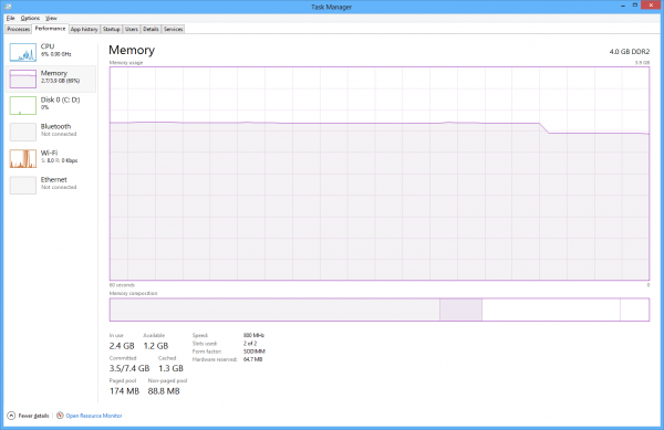
There is an app history that gives an indication as to the CPU time, network bandwidth and data used by individual application, as well as a new method of displaying processes. Divided between Apps, Background processes and Windows processes, it delivers a better way to categorize running processes while making a clear distinction of their nature.
What Else should You Expect?
One of the first things that users will notice is the ability to pause and stop file transfers, while also getting a simple graphical history of the file copy speed. It's a minor feature that is nice to have, and an indicative of the SSD or HDD performance.
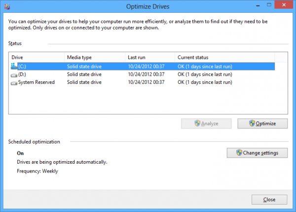
Windows 8 now comes with the Optimize Drives application that builds upon the previous one, which only managed to improve performance of conventional hard drives by defragmenting. The new one is able to optimize SSDs as well, which is great for SandForce-based drives that need it periodically. Intel has yet to update its SSD Toolbox to support Windows 8 so in the meantime Optimize Drives can do the job.
Microsoft also includes SkyDrive, which is its own cloud storage service. The service can be used to backup data and manage the one already uploaded; it delivers previews of all the files stored while also offering the ability to edit them if there is an appropriate application already installed.
The Reader app allows to view PDF files, which is probably a first for any Windows operating system and a nice addition for users that only installed third party apps to view them.
The Bottom Line
As with any new operating system that is designed to be groundbreaking instead of a minor evolution, Windows 8 has its kinks, with the most significant being the new user interface -- it is a powerful tool, albeit one that is poorly explained by Microsoft.
While the UI can help perform a number of tasks faster than before it requires a rather steep learning curve for users of previous Windows versiosn. From my own experience the habit of performing different actions, such as shutting down or pressing the Windows Key to search for apps, is going to seriously affect the initial impression that Windows 8 gives users.
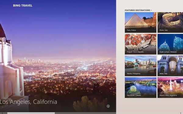
The problem is user education, like I previously mentioned. Microsoft doesn't go out of its way to teach users how to use the own operating system, and considering its nature as one aimed at various types of users Windows 8 functions should be better explained beforehand.
The adjacent Windows Store is less likely to make it any better until the app selection matures. That will be less of a problem one year from now when developers will no longer under-prioritize it, but at the moment users looking for as many apps in the Windows Store as Apple's App Store or Google Play will be disappointed.
Once past the above (if only), Windows 8 is an operating system that has little to no faults. It's faster than its predecessor, which is something that couldn't be said about Windows Vista, and actually improves in many areas over Windows 7.
I particularly like the included apps, which provide useful functionality and allow me to use the browser less than I would normally do. The new interface, while controversial and poorly explained at first, delivers a gratifying experience after a period of time. The key is knowing how to operate it.
Microsoft account integration is pretty neat, since I do not have to configure anything after the initial setup to get Outlook, Facebook integration and Calendar to sync locally. That in my opinion is a major advantage which will be noticd by Microsoft services users, but at the same time will mean nothing to Google users. And this brings me to my next point.
Who is Windows 8 actually for?
Instead of delivering a new operating system that is designed with user-friendliness in mind, Microsoft made major changes. They look better suited for tablets rather than traditional computers and will be felt by all users, though for a significant part of them it will be less of a problem...
The most important question that you should ask yourself is whether you're ready for it or not.
My colleague Wayne Williams gives "Eight good reasons to upgrade to Windows 8," to which I replied with "Eight reasons why Windows 8 Is NOT for you," and while we both disagree there's good advice for would-be upgraders.
Windows 8 is not the operating system for the less experienced user that is unwilling to put up with the steep learning curve. Nor is it designed for those that have trouble readjusting to a new and different way to operate an otherwise fairly user-friendly piece of software.
Windows 8 makes most sense for users that have no problem adapting to the new user interface, can see past the learning curve and the initial immature selection of apps. It's more suited for early adopters rather than everyone, although there is much to love and it will likely improve considerably over time. So while Windows 8 may be aimed to please everyone, it's not for everyone. Yet.

