Change doesn’t happen overnight at Microsoft, but when the Redmond, Wash.-based corporation simply announced the new Outlook mail service yesterday, it was a big surprise. But surprise attacks can prove advantageous, and six hours after the Outlook team announced the service via Twitter, a million people had signed up for it.
What You Get
Microsoft calls Outlook a “modern email experience” and naturally there is a need to find out if it’s better than before and how it compares to its arch rival, Gmail.
The new Outlook focuses on three main areas:
- Cleaner interface
- Social networking connections
- Web apps
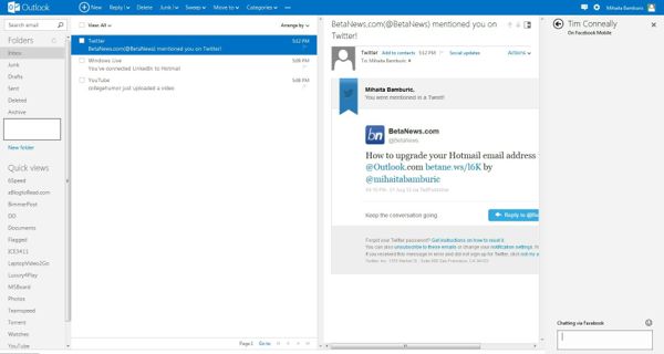
The visual changes come to align Microsoft’s e-mail service with the design language found in Windows 8, a visually streamlined experience which is also found on their website and on the Bing search page.
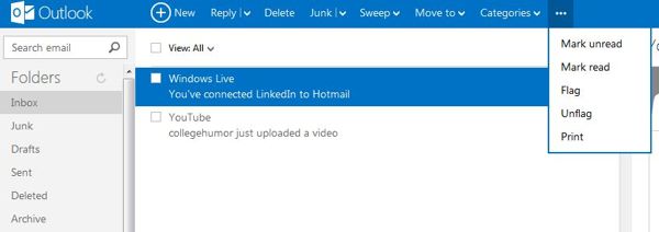
Microsoft takes the "less is more" approach in Outlook by adopting two dominating colors, white and blue throughout, which removes the cluttered visual effect in Hotmail. You can have up to four tabs in Outlook, with a clear but subtle distinction between them.
On the left side there is the Search, Folders and Quick views panel, which has gained the Search tab compared to Hotmail, but other than that it hasn’t changed considerably. The placement of the search bar is better than before when it was on the right side of the screen; now it’s more intuitive and easier to find visually.
The biggest bonus of Outlook is the increased responsiveness added to the new interface, which is up to par with what Gmail offers at the moment. Switching from Inbox to Photos in Quick views no longer presents the lag which plagued Hotmail. It’s not instant, but it’s as good as Gmail is, which comes as high praise for Outlook’s interface.
The email list tab has changed as well, now coming with three buttons; unless an e-mail is selected that’s how the interface appears. After selecting an e-mail you’re presented with the usual tab of Reply, Delete, Junk, etc. The placement of the Mark read/unread button isn’t deemed as important in the new interface, which is an omission on Microsoft’s part because whenever multiple emails are selected Mark Read comes in handy if there is no need to read them. It’s something that I personally use when receiving emails that I do not need to read after looking at the title.
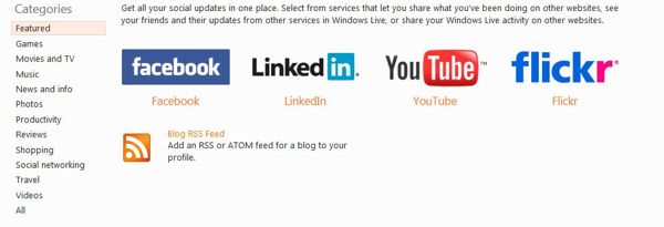
The Reading pane has a different appearance as well, but there is no apparent interface change. What’s changed is the introduction of a fourth tab, addressed to social networking. You can see Facebook updates, connect to LinkedIn, YouTube or Flickr among others. There is no Google+ offered momentarily which can be a problem if Google+ users would want to hypothetically switch to Outlook overnight. Furthermore, a similar feature is available in Gmail as well, named "Preview Pane" through Google Labs, in the Settings menu.
There is another problem when presented with the choices on connections, as the page still looks dated by having the old interface design. Granted, Outlook is a preview at the moment, but an inconsistent one at that.
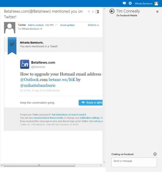
Also, while you have the possibility to expand the Messaging tab, currently there is no way to collapse it, and it only closes partially. It’s an oversight on Microsoft’s part and a noticeable one when more screen estate is what the user wants, or if there are no connected accounts.
Skype and SkyDrive
Microsoft claims that Skype support will be added later on and it will be interesting to see how it works, but despite stating that it’s currently connected to Google and Twitter there is no possible way to do it at the moment (services don’t show as connections), as it will probably be added soon with the rest of the connections.

When connecting Facebook to Outlook it comes with the possibility to import the email addresses from your Facebook friends and it allows chatting with your Facebook friends as well via its chat system, but there’s probably more to come in the future.
Outlook comes with "Sweep" which is basically similar to what Gmail offers already through "Filter messages like these," but it’s not as simple to use, and in order to sweep mails Outlook needs to go into menus, unlike Gmail which can do it without switching. It doesn’t allow you to create a rule directly from the menu after selecting an email, and it can only be created manually. Gmail does it more easily and intuitively than Outlook, which is a strong suit for Google’s email service, and a weakness for Microsoft if it wants Gmail users to switch.

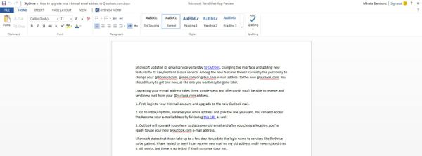
Web Apps is a strong suit for Outlook, as it allows viewing documents online and even editing them on the cloud, without having to download or use Microsoft Office on the computer. It works well, but it still has limitations. For example, it doesn’t render the documents the same way as Word does, but you can send them to Word, Excel or other Office programs depending on the type of file. When opening with Microsoft Office, there is a prompt asking for Windows Live credentials, then you can edit and save the file online. For some reason, even though I’m able to connect to Skydrive, Microsoft Office doesn’t recognize my Outlook credentials at the moment.
It works by uploading files onto SkyDrive, but there’s another hiccup as well. SkyDrive, like other Microsoft services, (including parts of the Outlook interface,) haven’t been updated to reflect the new design language Microsoft has taken, and it looks like a rushed change more than a definitive improvement. Furthermore, the initial impression matters more than the latter and because Outlook is very popular at the moment and it has an impression to make. It has to reward the six million plus users who jumped on immediately.

Finally, Outlook claims to offer the user "control" over the his personal information, by claiming to not deliver personalized ads and "industry leading spam protection" and "rock solid account protection," but it doesn’t differ from what similar email services claim. It’s reassuring, but nothing to write home about.
User Concerns
Outlook started as a preview and Microsoft is committed to further improvement through user feedback. The company’s effort is substantiated by their Reddit post, aimed to get people interested in its new email service as well as making it easy to provide feedback on how to make it better.
The user concerns mainly focus on IMAP support and captcha. One user stated on Reddit that "The captcha is impossible. I decided I was happy with Gmail after the 3rd failure," while another said that "I too took many, many goes to pass the Captcha - and my eyes work just fine! Case sensitive is crazy, especially as the letters are so distorted," with the Outlook team acknowledging that "Our CAPTCHA is case sensitive, so you might have run into that."
"Gmail is 8 years old now, and we think it’s time for something new," that’s how the Outlook team started their Reddit day and one user points out something that must be going through everyone’s mind when comparing Gmail with Outlook: "They keep saying that it's better because gmail is 8 years old, but in my opinion, that makes me more likely to stick with gmail. I've been using it for 8 years, I'm familiar with it, I know it, and it's the email address tied to everything I do online. I need a better reason than 'it's new and shiny!' to want to go through all the hoops of changing my email address."

More feedback focused on the functionality brought by Outlook compared to Gmail, with one user wittingly stating: "I cant believe how 'silly' you would have to be NOT to include all the functionality of your biggest competitor at the start. Do you guys not sit down and say well gmail does all of this we have to do better, or just dont bother looking at the competition and release a product with some bits better and others worse - who the hell is gonna switch for less features? Goddamit you guys invented drag and drop almost and cut/pasting from other things - how can you not include this!"
The replies haven’t stopped coming, with another user commenting on why Outlook wants users to switch "Hey guys, who cares if it doesn't have all of these conveniences?! You should switch... you know, just because!"
In case you were wondering, there’s also this: "Summary of this entire AMA: 'Thanks for the feedback, we will consider it'". It shows to point out that Microsoft’s first experience with Reddit feedback did get them plenty of it, but it also managed to make Outlook pale in comparison to what users think of Gmail, which according to them still has better functionality.

And this is how Outlook can be summed up: it brings nice, new features, but it doesn’t considerably differ from Gmail to justify a switch. Microsoft showed a good effort so far, but it needs to work on the rough edges in order to deliver a product as good as Google offers through Gmail.
To Summarize
- The interface is better. In fact, it could compete with the best in terms of design.
- Social integration is a work in progress; Twitter, Skype and Google+ are not implemented.
- Web Apps are a welcome improvement to Outlook, but they need to work in tandem with an updated SkyDrive.
- All the products involved with Outlook must emphasize the same design.
The final product should correct the wrongs of Hotmail and speaking as a user of both services, I can wholeheartedly say that Microsoft’s effort with Outlook is commendable, but I wouldn’t recommend it over Gmail at the moment.




 Let me preface this article by saying I’m a long time Gmail fan. I signed up as soon as an invite came my way, and have used it as my primary email service ever since. Although I now have an