Google's first consumer electronics device is a baffling beast. Its industrial design shames Apple TV, Roku and other cloud-connected set-top devices, while the user interface will confuse some people accustomed to a single remote to scan content on the big screen. Nexus Q is all about the cloud and smartphone. The TV's role is viewing, and little more. Price is another matter -- $299, same as Apple TV at launch more than five years ago. But that device sells for $99 today, and, granted, offers far fewer options to delight videophiles and audiophiles.
Nexus Q's promise: Your content anytime and anywhere there is a cloud connection -- and your friends' and families', too. Google calls the device the "first social streaming media player", and there's truth in the claim. But many of the basic streaming and control functions can be achieved simply by connecting your smartphone to the television. If you're going to use the handset as remote anyway, you could just as easily use it as source. That said, Nexus Q is delightful and its concepts represent a leap forward for media player industrial and user-interface design.
For some people, that leap will be too far ahead, and I wouldn't be surprised if the return rate is higher for Nexus Q than other devices in this category. Price is one reason, as it raises expectations about the user experience, which is very good once you get used to it. Many people won't get that far, methinks. Along with price, there is the smartphone-as-remote concept and choice -- other devices that offer much less pizzazz but will be good enough for most people.
Assessing UX
Before explaining what that means, let's step back and talk design and user experience. In 2004, I first posted my four principles of good tech product design, which I expanded to six about two years later. It's by these tenets that I measure devices like Nexus Q. A successful product:
1. Hides complexity
2. Emphasizes simplicity
3. Builds on the familiar
4. Does what it's supposed to do really well
5. Allows people to do something they wished they could do
6. When displacing something else, offers significantly better experience
Nexus Q easily fulfills the first two, almost to a fault. Setup is so simple some people will be confused. They'll expect it to be much more difficult. You connect the power plug and video or audio source; download the Nexus Q app from Google Play; connect via Bluetooth; name your device and connect to the Internet (either by Ethernet or WiFi; I choose hardwire).
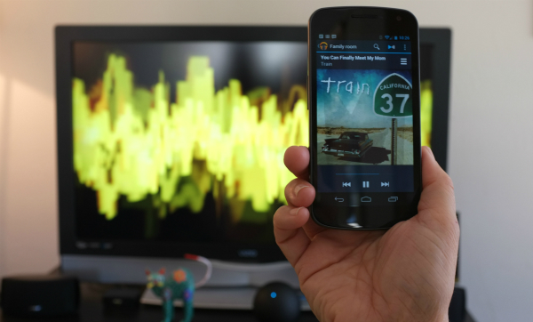
Then the confusion begins. What to do next? Clicking the Nexus Q app shows my device and its name, but where's the content? Apple TV presents a single storefront on the big screen. Nexus Q is more about the one in your hand and disparate apps to access content -- Play Movies & TV, Play Music and YouTube. You interact with the smartphone, not the big screen. For people accustomed to accessing content on their phone -- and I know lots of Millennials for whom it is primary device -- the concept should resound. But for most everyone else, the phone-as-remote and small-screen interaction is more likely to befuddle and disappoint. That said, I'm convinced anyone willing to give it a try for a time can be satisfied; more on that in a few pargraphs.
There's sense to the approach, for its simplicity and for where Google wants the center of gravity to be. The search and information giant assumes, and rightly so, that our digital lifestyles revolve around cloud-connected mobiles, increasingly more than PCs. For people who largely use smartphones to consume content, Nexus Q is a great fit. They can tap the play button to view or listen on their device or tap again to play on Nexus Q. Should they have more than one Q in the household, they can choose among them (since I have but one, I couldn't test this feature).
Not For Everyone
The approach, when used, emphasizes simplicity, hides complexity and builds on the familiar. For some people. For those folks whose lives don't revolve around mobiles and are accustomed to a single remote accessing content on the big screen, Nexus Q is more likely to be complex and unfamiliar.
The point: The media streaming device isn't for everyone and may not be for most people. More perplexing: I suspect that the people for whom Nexus Q would be most familiar and appropriate are younger with lower incomes (like students or those fresh out of college); for them $299 may be too high, while they can get similar benefits elsewhere by spending much less.

There's another sensible reason for making the phone the remote. Nexus Q is meant to be used without a TV, too, for those folks using it just to stream music. Your music isn't stored locally but in the cloud. You have to access it somehow, and Google wisely chooses the smartphone. The approach also resonates with social sharing. The Nexus Q owner can allow guest access so that other people can queue up their content and even control the playlist. Personal phones act as multiple remotes that extend Nexus Q capabilities and take it where no other competing consumer cloud device goes.
Then again, for people who don't need or want this capability, phone-as-remote actually adds complexity, and inconvenience. Family members can easily share a universal remote, but who is going to give up his or her phone -- if it's available at all -- to play content? That's because content ties to each person's individual Play account and individual Google ID. I've got more than 12,000 songs in my Google cloud, but my wife can't access it all with her phone. She and I can play our content but not each other's. So if I'm not home, she can't play my music or watch my rented or purchased movies.
I think. The Nexus Q app supposedly supports Android phones running Gingerbread and above, but, for now, the app really only works on Jelly Bean (that changes on product release, Google promises). My wife's Galaxy Nexus has Ice Cream Sandwich. As such, I couldn't test the social sharing functions or determine the extent of content availablity from multiple Play accounts on one Nexus Q.
OMG
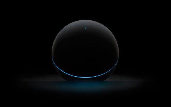
Nexus Q is a feat of engineering that puts Google in the same class as Apple, and really in some ways above. The sphere-shaped device is beautiful, in part for its simplicity and the way its circularity contrasts with rectangular consumer electronics devices alongside where it sits. Thirty-two LEDs circle the sphere, using color to let you know, say, whether Nexus Q is connected to the Internet or not. The sphere rotates around the LEDs to control volume, while a tap mutes sound.
Google describes the enclosure as "die-cast, precision machined zinc bottom housing...injection-molded, interactive balanced top dome with precision bearing and satin touch coating".
Beauty also is functional: Bluetooth, near-field communication, optical audio and micro-HDMI are among the connection options. Nexus Q is primed for digital audiophiles and videophiles -- all without adding more clutter to your dorm room, studio apartment or media space.
 Full specs: OMAP4460 (dual ARM Cortex-A9 CPUs and SGX540 GPU); 1GB RAM; 16GB NAND flash memory; 25W class D amplifier (12.5 watts per channel); micro-HDMI (type D); TOSLink Optical audio port (S/PDIF); 10/100 Ethernet; banana jacks; WiFi a/n; Bluetooth; and Android 4. Diameter is 116mm and the device weighs 923 grams but feels heavier, perhaps because of the die-cast metal exterior.
Google offers a set of Triad Bookshelf speakers and banana-plug cables tailored for Nexus Q. They sell for $399 and $49, respectively. So to outfit your Q the way Google envisions costs $747, which is pricey for the functionality provided given there are plenty of good enough alternatives costing much less.
Still, given the industrial design and connectivity options, I can only assume Google has bigger plans for the device, such as making third-party entertainment apps available. Hey, Nexus Q does run Android, after all. I could easily see Q for people wanting to cut cable's cord. But that's a future value proposition many people might not want to invest in today.
I like Nexus Q enough to shell out $299 but that works for me in part because my music is stored in Google's cloud, I watch YouTube videos and Google Play is fine with me. However, if you've got content elsewhere, Q isn't for you. Choose another device, such as Roku or Google TV, to get content from Amazon and other cloud providers. Nexus Q is, for now, only for Google Play and YouTube.
What you get impresses. Usage is straightforward almost to a fault and, as aforementioned, through one of three apps -- Play Movies & TV, Play Music and YouTube. My start: Renting "21 Jump Street". The process is familiar though I must acknowledge confusion at first figuring out how to play it on Nexus Q. Sometimes simplicity is confusing. Second tap of the play button switches from phone to Q. Google's movie selection is quite good, and I find exploring and searching for films much easier and more satisfying on the phone -- thanks in part to touch and proximity -- than on the big screen. Music playback or YouTube is easy. There's not much to describe, it's all so simple. By the way, HD video streaming is great -- best of class -- and audio super satisfies.
Again, you will need the Nexus Q app first and for now it's only available for Android. If you own iPhone or iPad, wait until Google releases the promised iOS app.
In the week since first using Nexus Q, I find myself preferring the apps to access content and now watch more videos on my phone than before. So Q changes my behavior and immerses me more in Google content and digital lifestyle.
Wrapping up, I like Google's sphere, but recommend caution, emphasizing again: At its introduction, Nexus Q isn't for everyone and probably not for most people. There is much innovation and industrial design to like here. But Google needs to offer more content before the media-streaming sphere is ready for the masses. At $199, Nexus Q would be an easier-to-justify purchase, even to put a couple in the home. Bottom line: What's right for me, might not be for you.

