 May 9 is, in a way, a watershed day for Android -- and that's not necessarily a good thing. Many developers I communicate with repeatedly say they confront the same quandary: Android or iOS first? Maybe they choose to develop for iOS, only to ask: Android or iPad next? Google is a software developer, too, and this day put its priorities in order with a stunning iOS-first update. The new iPhone app for social network Google+ is stunning, breathtaking, immersive and makes the already great experience on Ice Cream Sandwich seem outdated -- although some of the best visuals migrate to iOS.
In a way, Google sets the wrong example for its development partners by putting iOS ahead of Android. But why not? The iOS install base is larger than Android (365 million to 300 million at last reveal); countless analyst surveys show that iOS device users are more connected and engaged; and fragmentation isn't a problem since the majority of the iOS install base is on the newest version (versus about 5 percent of Androids). Google wants Plus to succeed in a big way, so improving the experience everywhere should be a priority. But iOS first, for the next big thing, is the priority.
From another perspective, the move is rather genius, even if pricks like me complain as I do above. Google likely will get more free marketing as bloggers and journalists -- and that's not just the Apple Fan Club of apologists -- drum on about the visually stunning iOS app. Buzz would be considerably lower for an Android app. Vic Gundotra, Google senior vice president of engineering, says that "the Android update is coming in a few weeks (with a few extra surprises)". So there's another chance to beat the InterWebs and in doing so generate some more free Google+ buzz. As marketing, the iOS-then-Android approach is brilliant.
Bleeding Edge
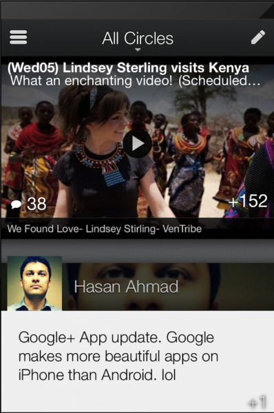
The visuals are so strong they're almost overwhelming, and I can't but wonder if Google borrowed a little something from Windows Phone and the Bing mobile app. Google+ for iPhone (version 2.0.0.5888) uses full-bleed photos and then some. Pretty much everything about Google+ bleeds the edge of the screen. The effect is immersive. You just want to scroll and scroll -- and you will since so much less content fills the screen now. It's a trade-off that works best when there is a smaller number of people in the selected circle.
"We’re embracing the sensor-rich smartphone (with its touchable screen and high-density display), and transforming Google+ into something more intimate, and more expressive", Gundotra says.
He emphasizes: "Full-bleed photos and videos are cool. But you know what’s really cool? Content so immersive it remakes your mobile device into a rich carousel of beloved memories and breaking news. That’s the Google+ experience we aspire to, and today’s release helps us get closer".
Companies so overdo the marketing hype, it's startling for an executive to express something seemingly so that actual is not. Gundotra remarks:
Today’s update pays special attention to fun and performance:
- Conversations fall into view as you move forward and backward in time
- Optical cues (like parallax) help the mind linger on individual posts
- Important actions like +1 now float atop the stream, making it easy to endorse all your favorites
The end result -- we hope -- is an app that brings you closer to the people you care about, and the stuff you’re into; an app with sense and soul.
I can't disagree. "Sense and soul" is about right.
 A Fool and His Android
The timing has me laughing at myself (although many of you already do; hey, I read comments). In February, I grudgingly gave up Verizon Galaxy Nexus, used since late December. My Verizon bill for the one account turned out to be half that of four other lines on AT&T. I just couldn't justify the expense. So I sold the phone, paid off my Verizon early-termination fee and chocked up the loss on the device to my Christmas money.
I then returned to AT&T by buying a black, 32GB iPhone 4S. Contrary to some BetaNews comments, I'm fairly platform independent. Rather than go Android again, I spent time using Siri and getting up to date with newer iOS apps. Then something unexpected occurred. Two weeks ago today, Google started selling Galaxy Nexus HSPA+ direct. Two months of iPhone 4S was enough for me. I bought another Galaxy Nexus, which I covered by selling the Apple smartphone (yesterday for $500 locally).
I'll be clear: Google+ is my preferred social hangout, and the tight integration, along with other things Google, with Android 4 hugely appeals. I received the phone Friday only to get to Wednesday and this -- Google+ getting a huge, enticing makeover for iOS. But not Android. I'm a klutz for timing.
By the way, I briefly tested the new Google+ app on an iPad late this afternoon. To be clear: It's not native iPad but works as you would expect from any iPhone app. Tiny or 2X.
If you haven't used Google+, the iPhone app is good reason to try. If you Plused and gave up, there's reason to go back. Facebook is suddenly so last century compared to this user experience.
Something else, well two things: Immersive is a word often used to describe using iPad. Google brings it to iPhone, and hopefully soon Android, and in a big way. What app is more appropriately immersive than one where you engage others.
That other thing: Google is betting big on mobile, which it should as a leading cloud-to-device provider. You may have thought you knew this, as did I, but Google+, in context of other recent product and service redesigns, foreshadows much more: Sensors, screen and soul.

