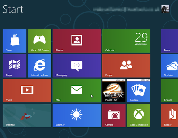
What is Metro, Windows 8's new user interace motif, really all about? Does it fill all the needs of Windows users? Is Metro for consumers or for businesses? What does this all mean for the legacy desktop? These are some of the questions I hope to answer.
First let me say that I do not dislike Metro, and I don't want to give the impression that the new user interface is somehow terrible or a mistake. Microsoft has put a lot of work into Metro and some of the reasons for it does make a lot of sense. My perspective though as a programmer is based on the fact that the majority of software I have written over the years has been for businesses and not for consumers. Metro may very well be a success with consumers, but what about businesses?
For a start at answering that question and to appreciate what Metro is all about, you really have to watch the following two videos (with slides) from Microsoft's BUILD conference for developers:
When you watch the videos, the conclusion is obvious. Metro is definitely geared towards consumers. Why?
What Influences Metro Design?
When Microsoft uses terms like "beautiful", "fast and fluid" and "immersive" to describe Metro, doesn't that sound more consumer-oriented than business oriented? The three influences at the core of Metro are:
- Modern design -- Bauhaus
- International typographic style -- Swiss design
- Motion design -- Cinematography
What does this actually mean? In simpler terms these three actually mean:
- Function is more important that appearance
- Fonts (type) and icons must be extremely clear, crisp, simple and legible
- Movement, especially with type, can exude emotion
Some people who see Metro applications for the first time, may notice certain features that are totally different than ones experienced with desktop applications on Windows 7:
- First is the use of a lot of open space.
- Second is the tendency towards user interface elements being very flat, rather than 3-dimensional.
- Third is the size of user interface elements tends to be much larger than with desktop applications.
- Fourth is the fonts seem to be overly simple to the point of not standing out.
- Fifth, transitions (effects) seem to be a key part of Metro. When you swipe the side of the screen (touch only) and another app takes over, the screen goes through an image transition (effect).
- Sixth, there seems to be a lot of movement in Metro.
If you watch the videos noted above, you will quickly see why this is so.
Personally, I find that while all of this is nice and exudes a bit of emotion, once you get used to it can be a bit fun. It also strongly says "Metro is for consumers". The motif is for tablets, and Metro targets consumers. Likely there will be many apps that consumers will enjoy when Windows 8 is finally released.
Metro Is Wanting When It Comes To Many Business Tasks
Why would I say this? In one video the speaker comments about Adobe Photoshop and explains that "Chrome", as they now refer to the legacy desktop, has a purpose and something like Photoshop really does better as a desktop application. Despite using terms like legacy on MSDN for desktop application development, they are also saying here that the desktop is superior to Metro for certain things, like Photoshop.
The speaker even makes the bold statement that basically the mouse is still the most accurate input device there is for computers and that the keyboard is still the fastest way to input text. Metro is geared towards touch, rather than using the keyboard and the mouse. This may explain why open space in Metro apps, with large user interface elements (ie. buttons) are the rule.
Even the name Metro comes from the idea of easy to read signs when traveling. This is the influence for the very clear type, open space and easy to read interface elements in Metro. The problem with this though is that the design used in travel serves one simple purpose. People are in a hurry when traveling and signs must be large and easy to read or the point is lost. When traveling on the highway, a large clear sign is vital. But a business user working on a computer is not in a hurry and using space effectively on a computer display is vital to productivity. True, font or typestyle clarity is still important, but this has always been the case.
The use of motion, while great for exuding emotion, in business software can often get in the way. This is one reason many Windows users turn off things like transitions (effects) so that the display is more functional, rather than one big animation. Actually the principle of functionality and movement sometimes conflict with each other.
One thing I really don't like in Windows 8 when running desktop apps is how when you scroll in a listbox or listview control, that when you reach the top or bottom of the list, the entire window bounces up and down. Does the user really need this bouncing effect to tell them they reached the top or bottom of the list ? Windows 8 and Metro have been designed to exude a feeling or emotion when using it, but doesn't that sound more like trying to exude emotions like in a movie, rather than working on a computer? Does a business user really need this bouncing effect?
Kinetic Typography
To appreciate what I am saying, try the suggestion the speaker in one video mentioned. Go to YouTube and do a search using the words: "kinetic typography".
The videos I watched were a lot of fun, but how does this translate into doing work on a computer. This may be fun for consumers, but surely it gets in the way when doing work. Yet this is a key influence on Metro, according to the speaker.
So What Should a Business Do?
As a programmer, personally, I would suggest that businesses simply design software that works for them, even if it goes against the design philosophy of Metro. If your software requires using space effectively (like Photoshop does), then stick with building desktop applications for Windows 8. This will also provide backward compatibility on all your computers that use Windows XP, Vista or 7. The mouse and keyboard just cannot be beat when it comes to accuracy and speed of user input.
If there are advantages of building a Metro application (ie. touch on a tablet), then consider the principle of functionality as more important than some of the other principles of Metro design. If a 3D-look for user elements improves the experience, then use it. While leaving more open space than desktop applications, still try to use space effectively. Avoid all the fancy transition effects, since they look nice initially, but in the long run they get tiresome. Fancy effects do not make software better or more productive.
Use commonsense when designing software. If it makes sense, serves a real purpose and improves productivity, then build it the way you prefer, rather than feel forced to follow the Metro design style. If anyone questions your choice, then simply point out the first principle of Metro design, which is functionality. Also remember, functional does not mean it has to be bland or without design. Button controls that are 3D rather than flat, may stand out better and serve a purpose. Colors have meaning in the real world, so use colors effectively in your software. Don't be afraid to emulate something from the real world either, even if it does not fit into the Metro style of flat and bland.
In all the years I have worked on software for businesses, one thing stands out: Ease of use and functionality have always been vital. Color when used effectively can significantly improve the ease of use in software. One should design software so it does a task well and so it can quickly be learned. Don't feel forced to design software that looks and feels like everyone else's software. Design it for a reason. Use common sense. Be practical. If it works well use it, even if it does not look like a typical Metro application.
 Chris Boss is an advanced Windows API programmer and developer of 10 year-old EZGUI, which is now version 5. He owns The Computer Workshop, which opened for businesses in the late 1980s. He originally developed custom software for local businesses. Now he develops programming tools for use with the PowerBasic compiler.


 Is your business getting good value from customer relationship initiatives, or are you even able to quantity it? Gartner says unlikely. Only half of all Fortune 1000 companies are expected to see a positive return on investments in social CRM through the end of the year. The findings call into question the effectiveness of using the social web to further business objectives, or whether companies even have the capability to measure success.
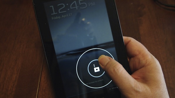
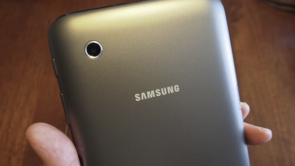


 Ashampoo GmbH has launched a free, cut-down version of its Windows optimizing and tuning suite.
  Symantec has released the first 2013 public betas of
 These is two related capabilities would make tech headlines everywhere, if introduced by Steve Jobs. They also add the kind of human responsiveness that once set iPhone apart from every other handset.
 Siamak Masnavi received his PhD in computer science (from University of London) in 1992. Since then, he has worked as a research scientist and technical author for IBM and Canon, respectively, and as a software developer for Symbian, JPMorgan Chase and PricewaterhouseCoopers. He has also done some work as a freelance journalist for publications in United Kingdom and Russia. Since January 2009, he has been writing apps for iOS, webOS and Android.