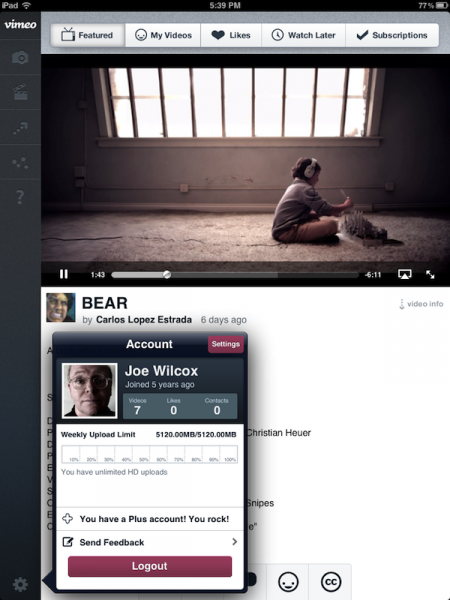
 That was unexpected. This evening I tried out Vimeo for iOS 2.0 and much prefer the Android version released last month during Consumer Electronics Show. Conceptually, Vimeo for iOS offers more, so I expected to appreciate it more. Instead, I find the Android app to be cleaner and more intuitive on a tablet. Then, again, I'm not the target audience.
The new Vimeo app's big stand-out benefit is native, iPad support. The other explains why I'm perhaps tripping over perceived complexity: The app's approach and capabilities are more like Vimeo's website, where I have spent scant too little time over the last 12 months or so. If you frequent Vimeo on the web and often use features there, you might just love the app on iPad. You're the audience the video-sharing site wants to reach.
To be clear, the user experience differences I observe with Android pertain more to tablets. I find the phone apps to look and feel similar enough.
Vimeo released the app earlier today during Mobile World Congress 2012.
"We’ve taken what we learned while creating our previous apps and applied it to the updated iOS to improve overall design and usability", Joseph Schmitt, Vimeo lead mobile developer, says. "We’re especially pleased with the awesome iPad user interface, which the Vimeo community has eagerly awaited".
I assume that community will appreciate the iPad UI more than me. The Android app feels more fluid to me, and the iOS app more cluttered and, well, in my face. Those attributes reflect something about platform differences, closer ties to Vimeo's website and emphasis on video discovery and social sharing -- both of which are hugely desirable benefits. No doubt, after a couple hours, Vimeo for iOS 2.0 will fit me better.
Definitely, if you use Vimeo lots -- whether to watch or post videos, or both -- this app is for you. Discovery tools, like at the Vimeo website, are exceptional. The app provides quick access to all the vitals about your uploads and what the heck you've been watching. Taking cues from the website, users can view from or save to their Watch Later queues, Like or access Liked videos, comment and share clips as well. Sharing options reflect some of the services where Vimeo is popular. Facebook and Twitter are givens, as well a Tumblr and WordPress.
Like on Android tablets, there is video-editing capability, something I'm definitely interested to try out but didn't have time to this evening. Users can tap into the Vimeo Music Store from the editor for adding soundtracks to clips. Of course, content creators can upload videos, including those in HD, from the app.
Vimeo is smart to finally support iPad. "We’ve seen mobile traffic triple since we launched our original iPhone app in early 2011", Schmitt says. I'm not surprised. According to comScore report "2012 Mobile Future in Focus", which released last week: "By the end of 2011, iOS was driving 60.1 percent of all connected device traffic in the US from iPads, iPhones and iPod touches. In contrast, the Android OS accounted for only 32.4 percent of traffic".
More remarkable: "A breakdown of tablet traffic by platform indicates that iOS has a substantial lead, driving 90.4 percent of all tablet traffic in December 2011". So absolutely, iPad is where Vimeo should want to be, while improving the iPhone and iPod touch experiences -- and making them more familiar to those people frequenting the website.
Vimeo for iOS 2.0 requires iOS 4.3 and above running on iPhone 3GS, 4 or 4S or iPad.

