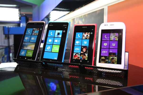
Well, that's what many of you say.
Last week I asked: "Are you bored with Windows Phone?" Simple reason: Windows 8 and Windows 8 on ARM share in Metro a similar tile-like user interface, and I had seen some user complaints about being bored with WP 7.5. I asked the question in anticipation of Windows 8 Consumer Preview, which Microsoft promised to release by month's end.
Given the UI similarities, WP users are a good measure for assessing Metro's viability as the new window to Windows. Windows 8 will bring the most fundamental change to the UI since the graphical user interface adopted for version 3.0 and then revamped for Windows 95. Such change comes with risks users will resist, stalling adoption or leading some customers to adopt something else (with Mac OS X near top of list).
Maybe my post rallied the fanboys or represents a broad base of Windows Phone users. Whichever, neither or both, you give a rousing endorsement to the tile-like UI.
"I have a had windows phone for a few months now, and I love it", Jesse Dobson comments. "The simplicity is cool, but I mostly like the phone because of the live tiles, social network integration, Windows Live services integration, the Xbox 360 Companion app, and, most importantly, Zune music pass!!" Many of these same features/benefits are expected with Windows 8's Metro UI.
Jason Kohlhoff loves "Metro, and I can't wait for Windows 8". He and his wife have the HTC Trophy.
Perhaps not meaning to, reader Carlos Ribeiro da Fonseca makes a point that is central to the reason why I posed the "boring" question:
Yup, the tiles look boring. On paper or, well, the Interwebs. But that's because you can't show anything 'live' in a static image. On the actual phone, the tiles change, a lot. In fact, if one isn't careful, they can change too much and the home screen can become quite a mess. If anything, they're the complete opposite of boring.
"Are you mad?" Dinesh Pabbi asks, in all caps, no less. "Metro is so good to use and looks absolutely beautiful".
R Walrond, who develops Windows Phone apps, unsurprisingly isn't bored. "I switched to WP7 because I was bored of my iPhone (plus it was much easier to develop for). I don't understand the complaints about the tiles. They come to life with content all the time at least on my Samsung Focus".
Rodney Jones:
Windows Phone is visually, technically, and intuitively awesome to use everyday, even after a year with the device. The apps have the best aesthetics of any platform, and the live tile system works great, and displays the info I choose instantly. Windows Phone's design concept is perfect, and could never be boring because of its natural disposition. Those who say otherwise simply have not used WP!
"'Boring' is certainly not the word I would use, but 'comfortable' is", Eric King comments. "I've had my WP7 for over a year now, and I can't imagine wanting to switch to either the iPhone or Android interfaces".
"I've had a Samsung Focus since October 2010 and I love it. I did buy my teenage daughter an iPhone 4S and honestly I hated setting it up", David Cornelson writes. "I wouldn't trade my Windows Phone OS for anything and certainly not an iPhone. I have the Lumia 900 on pre-order too".
Nokia announced the Lumia 900 Windows Phone in early January. The smartphone is expected to go on sale in March, and Microsoft started taking preorders about two weeks ago. Most readers responding to our poll plan to buy one.
Carlo Mendoza is "not bored at all". I've had an HTC HD2, but have been running WP7 on it a little more than a year". He's "very excited to get Lumia 900. It's only going to get better with Apollo & Windows 8. I see it from the 'Data/Information first' perspective, which is really what the Metro user experience is about in my opinion".
Frequent BetaNews commenter "woe" isn't giddy with enthusiasm and breaks from the largely favorable comments:
The question should be: "Are you bored with Metro?" My answer is yes. When it came out on the Zune is was pretty cool. Microsoft moves as fast as a glacier, because here we are how many years later and its on everything they own finally.
Metro is boring. It was different and new yes, but plain and boring. It is fast -- because its so simple. Simple colors on a simple single-color background. No 3d effects or raised effects, so it's fast. Smart move in terms of a smartphone, since you don't have to waste CPU/GPU cycles on the fancy GUI features -- but boring. In some places, like the calendar on Windows Phone Metro is boring and ugly.
I have recently seen Windows 8 server screen shots, some of the NIC teaming dialog boxes and they were all Metro -- YUK!!!
Okay, so only most of you say Windows Phone isn't boring. Will you have the same opinion about Windows 8? I'll ask the question again after you have spent some quality time with the Consumer Preview.

