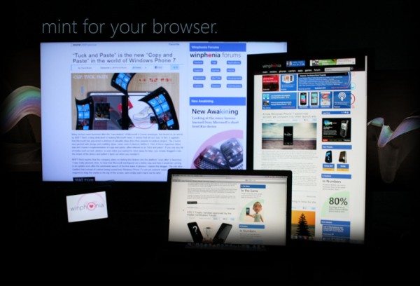
The now shuttered Winphonia.com news site
Since its announcement, I’ve been an avid fan of Windows Phone. So much that I even created a dedicated news website when it first emerged (Winphonia.com -- no longer active). This was all without ever having held a WP7 device in my hands or even seeing one in person. One of the aspects I genuinely like about Windows Phone is the fact that you can simply glance at the home screen, or the many hubs, and see all of life’s important events with just a peek.
I personally know people who’ve call it non-functional, or too simplistic, or even archaistic. But those people have not done their research. What I see is a phone that lets me tack on all of life’s significant events and priorities in a place where I’ll see it in the forefront.
Feel My Android Pain
I’ve been using an Android 2.1 device that was free with a new 2-year contact for the past year, and it has been an absolute pain to use every day. The battery habitually dies after 9 hours of very minimal use, and this is with all network connectivity (including the actual phone signal) turned off. I sometimes turn my network on to make calls or to listen to voicemail -- otherwise, my phone is used as a calendar and music players for those long commutes to work and school.
Almost everything I do on my phone requires opening a new application, and waiting a painfully long time to accomplish even little tasks, such as searching for a contact or sending a quick text message. The “glance and go” nature of Windows Phone 7 solves all of my smartphone pain-points and would make all aspects of my technologically driven life so much better. One specific component that would make my life much-improved is the Windows Phone start screen. Being able to pin what’s most relevant in my life for easy access, anytime, seems like a gift from the heavens (assuming Microsoft CEO Steve Ballmer is a god -- in which case, developers would clearly get special treatment).
Tasks I perform on a daily basis include constantly checking and adding to my calendar, calling specific people who are dear to me, sending out a mass text to members of my school club (The college’s Human Service Club), checking the weather in the morning, looking for directions when I’m in the city, reading text messages and checking in on social networks, reading RSS news feeds, and listening to music while riding on the subway to school and work.
I do drive, but I avoid using my cell phone for safety reasons - something WP7 would change, thanks to voice to text.
My phone plays a vital role in the daily aspects my life, but not being able to simply glance or quickly accomplish simple tasks, coupled with the sluggishness of my device, often makes staying in contact, informed, entertained, and sometimes motivated, a chore.
I want to join the "Inner Circle"
After being an avid fan for over a year, I decided to attend the Inner Circle Windows Phone event in New York. There, I finally had a chance to hold and actually play around with several Windows Phone devices. I held the Titan, Radar, Focus S, Omnia W, and even a phone made by Fujistu that isn’t being released in the U.S. -- all of them were a joy to use.
Not merely thanks to the hardware, but by and large thanks to the beautiful software that powered these devices.
It was sort of funny, I assumed I knew all the little gems I’d be treated to -- smooth transitions, beautiful Metro design and the lightning-fast speed of the OS. It was a logical assumption after spending countless hours watching WP7 videos on YouTube and keeping up with WP7-related news and reviews; even running my own news site about the OS. I suppose the really funny part, though, was that after a year of being “in the know”, I came away even more impressed after holding one in my hand.
The Hubs of My Life
The operating system was incredibly fluid, and in that moment I imagined what I’d do if this were my phone.
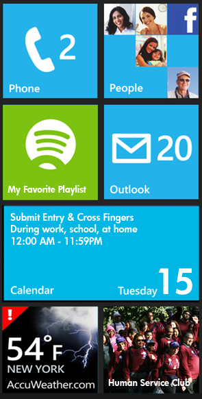
I realized that a Windows Phone would not only improve my productivity, it would also save valuable seconds of life thanks to this glance-and-go philosophy. Assuming I had eight tiles to work with, I’d definitely include a calendar tile. That way, I’d simply glance at my phone to see what I have to get done next and where I need to go.
I would create a group and include all my club members there, so I could send them mass text messages without the hassle of texting each person individually or going back and forth between contact windows. I’m a huge music fan, so I would definitely create a playlist of my favorite songs in Spotify, and pin that playlist to my home screen for easy “tap and go” access to my tunes during my morning and nightly commutes. Currently, I can’t even use Spotify on my Android 2.1 device because Spotify does not work on it, even though I pay a monthly subscription for access to the application.

What my Windows Phone home screen would be
The AccuWeather app would also be on my start screen; I currently have the option of using a weather widget on my Android device, but this has proven to drain the battery even faster, so I don’t use it. In comparison, WP7 has wonderful battery management, so this would not be an issue.
Of course, there would be a tile for people, emails and text messages. The fact that WP7 would allow me to manage all my dialogue with the people I care about really interests me. I may sometimes speak to a friend on Facebook, and then text him or her a week later -- completely forgetting intricate details about our Facebook conversation. The threads feature in WP7 -- seeing all my conversations exchanged with one individual, at a glance, would immediately solve that problem.
Okiedoke, so that’s 7 tiles so far; calendar, group, music playlist, weather, people, email, and texts. My last tile would be the Xbox Live tile, or maybe a pinned Evernote todo list. No, wait, Microsoft Office would be pinned. Scratch that, Runkeeper. No, the BetaNews website would likely be pinned somewhere on my start screen. Hmm, that or a pinned map of the place I need to get to at 6pm tomorrow. The possibilities are simply endless, and that is what I love about Windows Phone and Microsoft’s concept of glance and go.
An additional aspect of “glance and go” that intrigues me is the ability to switch between open applications by simply holding down the Windows button. The large still-screenshots of the open apps make life so much easier, instead of having to work with a dozen tiny icons that all look the same.
Lastly, in terms of literally being able to glance and go, Bing Scout would really come in handy when I travel to uncharted areas in the city looking to find the nearest (and most wallet-friendly) places to eat. The same with Bing music; no more searching for a lyric I heard on the radio when I can simply let my phone decipher what’s playing.
I am genuinely a fan of Windows Phone and the beauty of “glance and go,” and I look forward to the prospect of someday having one improve the “little” and “big” things in life.
Editor: Travis Brown was one of the 12 finalists in BetaNews' "Win Windows Phone" contest. If we had another phone to give away, he would be a winner.
 Travis Brown is a New York-based website designer, artist and photographer. He also curates Spacedex, a site that tracks astronomical phenomena.

