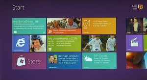
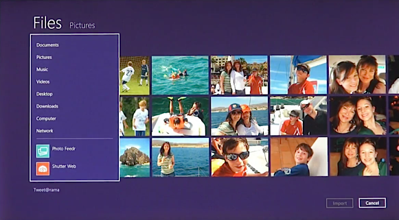
 The new operating system, which is expected in developer beta in about two weeks, will take not one but two approaches to main user interface. Windows 8 will come with the streamlined, touch-friendly Metro and quasi-traditional file system. It's quasi because Microsoft is replacing major elements of Windows Explorer with the Office Ribbon.
Earlier this week I expressed my horror learning of the Ribbon's role in Windows 8, which quelled my excitement about the Metro user interface. But Microsoft has set the record straight, and I'm feeling good about Windows 8 again. You should too.
Before continuing, an apology. Steven Sinofsky blogged about the two-UI approach about 27 hours ago. You should be reading this post on Wednesday. But in the aftermath of the atomic bomb dropped by the Justice Department yesterday -- its civil suit to block AT&T's acquisition of T-Mobile -- I missed Sinofsky's post. I was behind writing and editing all day and didn't check my RSS feeds until late evening, when I saw his post.
"We started planning Windows 8 during the summer of 2009 (before Windows 7 shipped)", Sinofsky writes. "From the start, our approach has been to reimagine Windows, and to be open to revisiting even the most basic elements of the user model, the platform and APIs, and the architectures we support. Our goal was a no compromise design".
What Sinofsky means by "no compromise":
1. Maintaining Microsoft's longstanding single-most important operating system design tenet: Backwards compatibility. That any new version of Windows must provide support for existing applications and APIs. The approach has long held back Windows, I contend. But Microsoft has a huge install base of customers, the majority businesses, for which dramatic platform changes can be costly and disruptive.
Sinofsky writes: "The role of the Windows desktop is clear. It powers the hundreds of thousands of existing apps that people rely on today, a vast array of business software, and provides a level of precision and control that is essential for certain tasks. The things that people do today on PCs don’t suddenly go away just because there are new Metro style apps...We knew as we designed the Windows 8 UI that you can’t just flip a bit overnight and turn all of that history into something new. In fact, that is exactly what some people are afraid of us doing".
2. Pushing Windows forward for newer-class devices, such as touchscreen tablets. Metro UI will be new, without all the legacy baggage for those customers looking to leap ahead. The approach is Microsoft's way of pushing the Windows experience forward while providing a safety net for legacy applications and processes. Customers can live in the future or the past, if they like -- or straddle between them. This is Windows 8's split personality.

Sinofsky explains: "Why not just start over from scratch? Why not just remove all of the desktop features and only ship the Metro experience?...We believe there is room for a more elegant, perhaps a more nuanced, approach. You get a beautiful, fast and fluid, Metro style interface and a huge variety of new apps to use...If you want to stay permanently immersed in that Metro world, you will never see the desktop—we won’t even load it (literally the code will not be loaded) unless you explicitly choose to go there! This is Windows reimagined".
3. Providing developers with tools necessary for both user experiences. I'll be watching the execution on this one, as surely will be many Microsoft customers and partners. Microsoft will have lots more to say about developing apps and how the two UI experiences will mess together at the BUILD conference, which starts September 13.
Sinofsky briefly explains: "This is an ambitious undertaking -- it involves tools, APIs, languages, UI conventions and even some of the most basic assumptions about a PC...Developers can target the APIs that make sense for the software they wish to deliver".
I'm truly excited about the Metro UI and see it as a potentially huge step forward in user interfaces. It's the kind of innovation that makes Apple's newest Mac OS version, Lion, and the forthcoming iOS 5 look dated. It's also the kind of innovation that would get huge blog and news media coverage if done by Apple but is too much ignored because Microsoft is the developer.

