
The cardinal rule in good user interface design: Keep it simple, stupid. Windows 8 will break that rule in the worst ways, unless Microsoft customers and developers knock some sense into the company's product managers. They'll have their chance next month, at the Windows BUILD conference.
In early June, I sang Windows 8 praises, posting: "It took 4 min 34 sec to get me really excited about Windows again". The video introducing the new user interface stunned me, as it did many other people. Finally, Microsoft achieved the kind of simplicity, elegance and good taste more typically associated with Mac OS. But beneath the breathtaking desktop is a file-system nightmare: The Office Ribbon is taking over Windows.
The Ribbon is one of the most cluttered, complicated user interface elements introduced by Microsoft or any other operating system developer. Looked at one way, the design element exposes deep-buried features people might want to use in Office they might never find. But the actual presentation is a cluttered, tightly-packed mess of visual cues and varying-sized objects.
Love It or Hate It
I was expecting that the Windows 8 UI demoed two months ago would be pervasive throughout the operating system. Today's blog post by Steven Sinofsky, Windows & Windows Live president, shows something else going on: The Officification, really the Ribbonification, of Windows.
Sinofsky brilliantly managed Windows 7 development, and its successor was looking good, too. But Sinofsky is old-school Microsoft -- the generation of managers obsessed with Excel spreadsheets filled with statistics used to justify why choosing to do this instead of that. He presents seemingly good reasons, based on how people use Windows, for moving functions from, say, the right-context menu to the Ribbon. That fundamentally is what long has been Microsoft's problem designing user interfaces: Putting intellect before emotions about products people use or become attached to emotionally.
The Windows UI shown off in June evokes a positive emotional response; praise was widespread nearly three months ago. The Ribbon evokes emotions, too, as seen from responses to it in Office 2007. People seem to either love it or hate it, with few in-between. Favorable feelings should be the only ones Microsoft should want. I'm not feeling too good about the screenshots. Are you? The Mac Fanclub of bloggers and journalists will be laughing at this turn of design events. Microsoft heaped some variant of the Ribbon motif onto Mac Office 2011, but users can turn it off. Office 2007 and 2010 users aren't so lucky.
Officification of Windows
The Ribbon becoming the main motif for interacting with the Windows file system has big implications. Julie Larson-Green, corporate vice president of Windows Experience, led the team responsible for developing the Ribbon for Office 2007. Soon after its launch, Sinofsky brought her to the Windows & Windows Live division (not its name then). The question everyone should ask: Is she going too far here? My answer is yes with the Ribbon and not far enough with the desktop UI previewed in June.

For years, Office used the file system standard, logistically and visually, set by Windows. Now Sinofsky's team is making a radical change of putting Office in subjective position. Such action likely reflects a change in which product is seen as more important long term, Office or Windows. Some reasons:
* Windows is subject to the whiles of the PC market. During second calendar quarter 2011, PC shipments were sluggish in mature markets but good in emerging ones, according to Microsoft.
* Revenue for the Business division -- 90 percent of which comes from Office -- exceeded Windows & Windows Live by more than $1 billion in calendar Q2 ($5.78 billion to $4.74 billion, respectively). Income: $3.62 billion for Business and $2.94 for Windows & Windows Live.
* Office fits into Microsoft's cloud, which has lots of growth headroom as customers swap out running their own servers for cloud datacenters or simply supplement functionality with them.
I'm just dying to see how the cluttered Windows Ribbon is going to work on touchscreen tablets for navigating Windows. The tile desktop UI seems well-suited to a touchscreen, the Ribbon is much less so. (Want to see? Open Office 2010 on a Windows 7 slate.)
Simplicity beats Uniformity
Microsoft's other objective here is clear: To have uniform and fairly consistent motif across all its desktop products -- and so the Ribbon is popping up elsewhere, such as some Windows Live applications. But uniformity is impossible with the Ribbon. The motif is clearly designed to draw out features specific to the software application. Capabilities exposed in Word differ from those in Outlook, even, Windows Live Movie Maker or Windows 8 much more.
Meanwhile, the added complexity shouldn't be that hard to see, particularly if contrasted against the breathtakingly simple desktop UI demoed in June. The Windows 8 Ribbon is a stunning return to complexity Microsoft had been moving away from and has been promising to abandon since its October 2003 developer conference.
Microsoft will make Windows 8's file system look more like Office 2010. Which best describes your feelings about the software's Ribbon motif?
Simplicity is the hallmark of good design, and it's the appeal of so many Apple products. Minimalism defines the approach of Jony Ive, Apple's chief of industrial design. In February 2005, I wrote for Betanews "iPod Shuffle: Apple understated". I cataloged how minimalist design -- from iPods to Mac laptops to retail stores -- is a defining characteristic of Apple products then, and it's still true today.
Simple design often evokes good feelings. Most product decisions are based on how people feel about the thing, even if they start with rational reasons such as low price.
Microsoft had me hooked on Windows 8 in early June. Today, my enthusiasm is, as they say, pushing up the daisies.




 Users of some of Google's SSL-encrypted services in Iran were the subject of man-in-the-middle attacks earlier this week, the search giant
 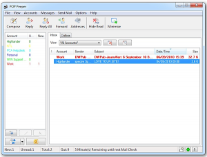 Mortal Universe Software has updated its free email preview tool,
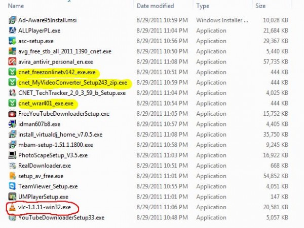
  Last week, we heard a report that CNET's Download.com had recently

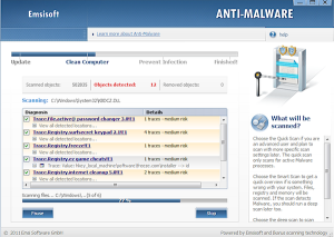 Austrian security company Emsisoft has launched a public beta test of

