By Scott M. Fulton, III, Betanews
Download a 14-day trial of Notion 3 music composer, plus 10-day trials of IK Multimedia plug-ins, from Fileforum now.

On the surface, this is a review of a music composition product entitled Notion 3, from Notion Software, priced at $249 suggested retail, born out of the original VirtuosoWorks product produced in 2005 by music professor Dr. Jack Jarrett, and which produces realistic orchestral sound from precisely notated sheet music on a standard Windows-based PC or Mac. But if you've never composed music before, and even if you don't plan on doing so in the future, I urge you to read on anyway, because this is about the business that we are all engaged in.
This is a story about a software company managing the process of starting all over again, putting its past behind it and crafting a completely new product. Notion 3 is billed as an upgrade (Notion 2 owners can purchase it for $8), but it is entirely new.
When Microsoft first announced the tremendous changes it had planned for Office 2007, including the premiere of the innovative ribbon, it was turning its back on over a decade of adherence to the spirit -- though typically not the letter -- of the Common User Access guidelines. This meant retraining millions of users on a completely new way of working -- a process that is still going on in many enterprises, even now. Microsoft knew that to embrace the future, it needed to change. But managing the transition, to this day, has been difficult.
Hear an MP3 clip from the funk-symphonic score that Scott created with Notion 3.

Notion is not the dominant music composition product -- though market studies have yet to be made official, it's probably the #3 product in its category. The top two are bona fide professional music composition market leaders -- Sibelius and Finale -- trading off with one another like Coke and Pepsi. By contrast, the original Notion had been positioned as a beginner's product, a step up from something called "Music Printer Plus" that seemed about as likely to dethrone one or the other market leader as Print Shop Deluxe was to knocking off QuarkXPress.
What Notion had going for it was two things: a surprisingly agile sound reproduction system that reproduced a respectable sounding studio orchestra, and a front end that was not only easy to learn, but educational for those who wouldn't know a fermata from a marcato. But against these two giants -- the proton and neutron of the composer's world -- Notion 2's market penetration had pretty much run its course by the middle of this year.
Thus the bold decision to redo everything. Notion Music would replace the sound system and the user interface, and both would have to be worlds better.
"It was a hard decision, to tell you the truth, that we didn't take lightly," said Lubo Astinov, Notion Music's product manager, in an interview with Betanews. "We pondered on it for a few months before we finally decided to go ahead and switch. But basically, we decided in one swift move to go to a new code base...and take everything that we could from Notion 2 in features, rebuild them onto the new code base, and on top of them, build an abundance of new features. We tell people that Notion 3 is indeed a new product; it's not an update, it's a new piece of software."
With Notion 3 only having been released late in September, the jury is still out as to whether the product has even begun to achieve the market penetration it needed. So it's premature to talk about the Notion 3 "success story." But just as the recent evolution of Microsoft Office has been about pulling off a successful remodeling job while keeping all its users comfortable -- a process which isn't over yet -- the Notion 3 story is about rethinking everything, and challenging old "notions" about how a very complex piece of software should work.
The people leading the discussion for Notion were musicians first who became developers later. Astinov is a studio guitarist skilled in many styles, including jazz and flamenco, though he's also composed production music for PBS programs. He was a graduate of the Berklee College of Music where Dr. Jarrett taught.
"Mostly the discussion was driven by, 'Where do we need to be?'" Astinov told us. "We had to lay out a plan of not only, 'How do we get there?' but, 'In what time can we get there?' We realized that those were the goals that we set two years ago...that we needed to embrace a code base that is more flexible, easily updatable, and easily manageable."
Lesson 1: Rebuild the code base to be taken apart
Years ago, a point release for software suggested a completely replaced code base. But as the "engines" of applications became precious intellectual property for their publishers, point releases eventually became new life support systems for old code. Sure, there were new feature sets, and sometimes a revised and updated look and feel. But under the hood, you'd often find a living, breathing, single-threaded creature of the pre-OO era, not so much a component as a mashup.
"We needed to have a more general way of controlling elements, a more...well, [Notion 2] was object-oriented before, but [we needed to] really utilize the power of generalized object-oriented languages to their extreme, making sure everything is nicely structured, utilizing best software development practices, to create an architecture that is easily updatable, easily changeable."
Sometimes, the problem with the "engine" mentality in a development shop is that it creates an artificial barrier between what can be changed and what cannot be touched, lest the ghost of past developers haunt their sleep. In the new reality of software, even past the RTM date, problems and bugs crop up that deserve to be addressed immediately. If those problems exist within an untouchable zone of software sanctity, customers come to view them as defects endemic to the code base rather than as unforeseen circumstances curable with minor surgery.
"Although we had a brilliant team working on Notion 2, and it achieved what it set out to achieve, developing a software product is always a learning in progress," remarked Astinov. "You learn as you do it, and a couple of months later, you come back and you say, 'You know, I wish we coded that differently.' Then little by little, we came to the realization that, it would be harder to update the Notion 2 code base, fix all the problems -- whether they're design problems or coding problems in the software -- and get to where we want to be at the same time with allowing us to quickly enhance the software for future features."
Next: Building the user experience down...
[FULL SEC DISCLOSURE:] Notion Music supplied Betanews with a not-for-resale copy of Notion 3 for our review, without pre-condition. Betanews also received an earlier copy of Notion 2 for comparison purposes. Scott M. Fulton, III is the author of this article, and as always, is solely responsible for his content. The opinions expressed here do not necessarily reflect those of Betanews or any of its other editors or contributors.
Download a 14-day trial of Notion 3 music composer, plus 10-day trials of IK Multimedia plug-ins, from Fileforum now.

Lesson 2: Build the user experience down
A more complex piece of software tends to become used in a more complex fashion. Years ago, CorelDraw was a miracle of software design, incorporating as many functions as possible into mouse gestures and shortcuts, enabling illustrators to develop streamlined methodologies for complex operations into natural, everyday practices. But in recent years, the need to tack features onto the side of the box or the Web site resulted in that product suffering from the "feature bloat" that has afflicted so much of installed software prior to the advent of Web apps. Dialog boxes have never been conducive to creativity.
Part of the inspiration for Microsoft's ribbon feature, which premiered in Office 2007 (and which nobody really calls the "Fluent UI" anymore), was the need to get complicated menus out of the user's way, and bring choices forward. That having been done, Office 2010 Beta 1 has a revised ribbon that contains palettes of choices occupying just as much space, if not more, than the old drop-down menus. And while the 2007 edition was focused around keeping you focused on your page, the new File menu (the new name for the BackStage button, which replaced the Office button, which replaced the File menu) completely encompasses the entire open window.
Maybe these features truly are improvements in some senses, but they are not exactly true to the original spirit of the Office 2007 redesign, and in some respects are actually backsliding towards Office 2003.
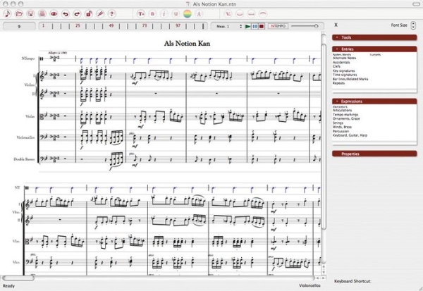
The original Notion UX was based on a well-received graphical feature called the Sidebar, which was positioned like sidebars in Office apps and Web browsers today. Here, the original Jack Jarrett design was clever for its time, gathering together only the tools necessary to change and develop the score (the active document) into categories, while keeping functions related to managing the program relegated to the menu bar and classic toolbars. Sidebar categories were not intuitive (Tools, Entries, Expressions, Properties), but their clusters were operated independently of one another so that you found yourself able to combine these functions like open pots of paint. "Tools" usually referred to things you do to or with notes, while "Entries" referred to things you do to the staff or to a measure. "Expressions" contained the articulations and accents you place on existing notes, especially with regard to particular sections of the orchestra; while "Properties" let you make adjustments to existing elements (and it was here that you converted notes in time with the current signature, into tuplets that were timed in thirds rather than halves or quarters).

The tried and tested user front-end of Notion 2, which was completely replaced in September 2009.
On paper, it was simple, direct, and effective. By no means did the Notion 2 sidebar feel outdated or outmoded, and in many ways, it actually achieved one of Office 2007's original objectives: getting clutter out of the way of the open document. But it wasn't always consistent -- for example, I never quite got the hang of time and key signatures being "Entries" but tempo markings being "Expressions." And when a score became complex, the steps one took to get things under control took way too long.
"In Notion 2, if the user wanted to insert an element into the score, he would go and navigate this tree structure, choose his element, and put it in. But what we realized was that, while that's certainly easy to do, it's also time consuming," explained Notion 3 product manager Lubo Astinov. "You basically have to take your eye away from the spot on the score that you were working on, move your eye towards the sidebar, choose the element there, then go back and find that place. It may not seem like a lot, but it really is a time-consuming, frustrating thing to do."

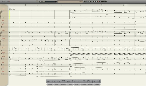
Hear an MP3 clip from the funk-symphonic score shown in this screenshot from Notion 3.
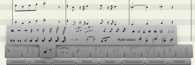
In Notion 3, the sidebar is completely gone. In its place is a unique, symbolic palette along the bottom, where categories of score elements are represented by the symbols themselves. Now, you have to know pretty much what these symbols mean, especially in the context of the other symbols around them. For example, that dot in the fourth category from the left doesn't mean "extend the duration of a note by one-half," but rather "apply a staccato to a note" to make it play more briskly; and that sweeping arc is a slur, not a tie -- although it looks exactly like a tie. But the division of palette categories is indeed more consistent: Notes and rests (including alternate notations) appear together, tremolos and arpeggios and glissandos are all together, and the accents you give an electric guitar (more on that later) are gathered together.
All of this does not immediately spell "easy." What it does is spill onto the table all of the elements of scoring in a one-level menu rather than a nested tree structure, like tokens in an old board game. The learning curve, as a result, is higher for a novice user, especially one who will find himself hovering over all the symbols and learning what they're called through their tooltips.
For most applications in the last decade, getting over the learning difficulties of configuring documents has been accomplished through wizards (series of dialogs which lead users by the hand through choices) and templates (blank documents whose styles are pre-set). Notion 2 was conventional in that regard. But the plethora of templates shipped with Notion 2 were replaced with just seven in Notion 3.
Removing this truckload of templates, Astinov told us, was a carefully reasoned design decision -- a counter-intuitive one reached after the team studied how composers of various levels of acumen used the product.
"We went through several notation applications, and we had user tests with people setting up a score," he said, "and what we realized was that while it certainly is aggressive to have 300 templates in your score wizard, it actually adds to the clutter and makes things far more difficult to navigate, search for, and create...than if you simply create a score from scratch the way we have it, the graphical way, in Notion 3."
Notion's designers tested two groups of users: professional musicians with notation software experience, and folks with no prior experience in any music application. Both groups were observed using Finale, Sibelius, and a beta of Notion 3. They were asked to set up a score for a small chamber orchestra, and both groups were twice as fast in accomplishing their goal in Notion 3 without any templates or wizards at all, than they were with Finale and Sibelius.
Their discovery was this: In the interest of making the program seem easier, wizards and templates and other hand-holding tools have the side-effect of making users slower. They also fail to teach the user anything about the typical use of the product, by bypassing it the long way around. So even though the Notion 3 palette seemed steeper, climbing to that level and staying there was actually much faster and more productive.
Lesson 3: PC games are UX prototypes
If only applications were more like games. Seriously, the most innovative user input experiences have always come from games -- as time goes on, games only grow more and more ahead of the curve.
"Game interfaces were on the forefront of our discussion here, when we were designing things like the palette, for example," said Astinov. "We really liked some of the novel menu systems that some of the game designers were implementing in their games, and certainly that feel of one element controlling their menu inspired us to think about the main entry palette."
One of the design iterations considered by the team was circular, where the mouse movement zipped through a Rolodex-like presentation of options. "We didn't go with that because it turned out not to work very well on corners. Game design was one of the things that we considered...because oftentimes in games, people are trying to concentrate a lot of usage into one small area."

The designers eventually settled upon a simpler, perhaps less cool, but certainly functional palette design. It does achieve its objective of keeping your eyes focused on the score, the way a dashboard of a car keeps your attention fixed upon the road ahead. In practice, I've noticed some small difficulties, especially the palette's ability to obstruct the bottom-most staff of an open composition. I've also noticed a bit of a "dead zone" that exists just around the perimeter of the palette -- something that might not be so noticeable in a game where you're controlling troop movements, but certainly a hassle if you're programming those bass instruments that typically fall in the bottom of a grouping.
But while Notion 2's design was based around looking like a conventional application in the interest of not confusing users, Notion 3 went completely off the board, noting that games intentionally advance new designs in the interest of fun all the time, and players embrace them for doing so.
Next: Users' expectations change the nature of an application...
Download a 14-day trial of Notion 3 music composer, plus 10-day trials of IK Multimedia plug-ins, from Fileforum now.

Lesson 4: Completely separate text commands from visual inputs
Most applications, in the name of "accessibility," invoke keyboard "shortcuts" as an alternate means of maneuvering through the menu or control system. But perhaps you've noticed this but never fully appreciated it: Each keystroke is a token for where your mouse pointer would go, if you were using the mouse. So in many ways, commands are not truly alternatives or even really shortcuts -- you can visually follow the same menu and dialog box locations you would have clicked on anyway.
While Notion 3's designers were gleaning ideas from PC games, one member of the team ended up..."borrowing" a method from a dark corner of game design, literally by accident: the cheat code.
The result was a facility called Express Entry, which Lubo Astinov told us "was not actually done intentionally. There was never really a design discussion about it, or anything. [Our senior programmer, Ben Singer] just made that as a shortcut for quickly accessing elements while the code was being written, and more or less, this was kind of an accident. As we started using it, I said, 'You know what, let's keep that!'"
Although Notion 3 does carry over a number of single-keystroke shortcuts from version 2 -- such as the 3 key during note entry to bring up a sharp, or q for quarter notes and e for eighth notes and the like -- these shortcuts are independent of the palette. There are a few conventional Ctrl + menu bar commands for managing elements of the program, though you'll rarely use them.
In addition to these, Express Entry pretends that there's a little invisible command prompt open someplace. So rather than imagine the spot on the palette where something is located and try to recall the key that brings up that area, you type a whole command, which can often be all or part of a word. For example, to bring up notation on the cursor that lets you place a pizzicato marking on a string instrument staff (plucking the string rather than bowing it), you would type 'pi -- the apostrophe key, followed by the command. Nothing visual happens at all while you're doing this, but once the command is accepted, the pizz. marker appears over your cursor, so you can stamp it where you want it. The 'norm command lets you stamp the location where the pizzicato section ends.
By acting like a cheat code mode, Express Entry violates all the rules that typical users would expect. Personally, I don't use it much...not yet, at least. But I see where a professional composer may be more interested in getting his "pen" to work right, than perusing the palette in search for something he knows he needs now.
Lesson 5: Seize initiatives now -- don't wait for a Service Pack
Since Notion 3's release in late September, there have been four major fixes distributed through the application itself over the Net. It has needed these fixes -- Notion 3 was not perfect coming out of the gate. It's had obvious glitches, which I reported to Lubo and the team; and other users have asked for minor enhancements, especially to the user interface.
The team has responded to these glitches and requests not by gathering incident tickets until they accumulate to a big enough pile deserving of a Service Pack, but by issuing patches and additions immediately.
"What I wanted to do from the beginning was a very dynamic and very close QA cycle that is tightly related to development," Notion 3's Astinov told us. "This is something that Ben and Evan [Ruiz] wanted to do in their development process internally here...Almost every week, we will have a new build. But in testing that build, I will check out the revisions and start testing the new editions, new features, keep up with any possible regressions that might have occurred from the code."
Astinov calls this process parallel QA -- essentially, a much tighter cycle between committing a change to the code repository and deploying it in the field. In one sense, it's a workflow innovation; in another, it's an unfortunate necessity of modern business: "We used to have a really large QA department back in the Notion 2 days; we don't have that luxury right now. There's really not that many people who do testing, but that kind of forced us into that parallel QA process even more, so we are always on top of what is being changed and what is happening, and we have direct communication lines to the developers when something goes wrong."
Lesson 6: Trust the user
One of the major problems that marred the release of Notion 2 was when users discovered a rather aggressive third-party copy protection system for securing the instrument samples. Indeed, it was the power of those samples that made Notion 2 sound...pretty good. Better than "passable." But the persistence of this little scheme in memory proved to be a performance drain on the entire operating system.
It's gone for Notion 3, replaced with a modern key-driven software activation system. But the problems haven't exactly been eliminated, especially for folks like me who think they're being cautious and "modern" by installing their applications "As Administrator." While Notion itself is fine with that, it comes shipped with two outstanding add-ons from IK Multimedia -- one that provides a beautiful programmable reverb, and another called AmpliTube XGear (please forgive the naming) whose job is to accurately simulate a bastion of interconnected amplifiers for rock, jazz, and hip-hop musicians.
Since both IK Multimedia plug-ins are installed during the single setup process, they inherit the "As Administrator" permissions from Notion. But since their software activation is keyed to those permissions, it creates a situation where you if you installed Notion 3 as admin, you have to run it as admin also. If you don't, the AmpliTube plug-in will insert white noise into the soundtrack automatically every 10 seconds.
That pretty much negates the whole purpose of restricted user access -- keeping a potentially vulnerable application from becoming exploitable. I'm not the only user who encountered this little problem, which I'm told Notion and IK are currently working to eradicate.
As with Notion 2, the close-mic instrument samples in Notion 3 are particularly precious intellectual property. Without them, all of the hard work expended in making the user front-end workable, would go down in smoke. But the real key to protecting those samples is presenting them in a format that only Notion 3 can use, not by encasing them in a paranoid protection scheme that polices everything the user does. Unfortunately, the music software industry has historically been prone to piracy; so putting producers like IK Multimedia in a position where they can trust the user more, as we're suggesting, will require some more work on the users' end as well.
Next: The joy of composing...
Download a 14-day trial of Notion 3 music composer, plus 10-day trials of IK Multimedia plug-ins, from Fileforum now.

The joy of composing
I am not a professional musician, but I've always considered music a part of the artist side of my life. My most productive work in that arena was a wedding suite I composed in 1989, first for my friends and then revised for my own ceremony, using a composition program for the old Atari ST. It must actually have been somewhat good because my wife still thinks so -- and she was my editor before she was my wife.
There is a special place in my heart for symphonic music. An orchestra is, in itself, a unique and nuanced instrument, whose tonality and rhythm and timbre all exist over and above each of its individual instruments. So even though I've composed music for real and electronic instruments before -- small arrangements, jazzy ensembles, string quartets -- I never really had the personal opportunity until the advent of Notion to attempt a composition for anything that truly sounded, or even approximated, a full orchestra.
The beauty of Notion 3, therefore, is the ability to pick up an orchestra the way one picks up a guitar or a saxophone, or sits down to a piano. It's a way of handing an orchestra to someone and saying, "Hey, try this!" with the same carefree and eager gesture as my mother -- an art teacher who loved music -- would have handed someone an autoharp or an harmonica. Since so much of the music that has lived in my head for years has started out symphonic, Notion gives me the freedom to avoid boiling the melody and the rhythm down to something that will fit on four or six instruments, or however many the band or sound card can faithfully reproduce.
And yes, Notion contains parts for instruments you wouldn't normally find in a symphony orchestra, like a screaming electric guitar (screaming courtesy of AmpliTube XGear, which once you figure it out, is a scream in itself). But there have been any number of movies recently whose entire presentation to the audience, I feel, could have been enhanced with a complete rethink of the orchestration, courtesy of Carlos Santana.

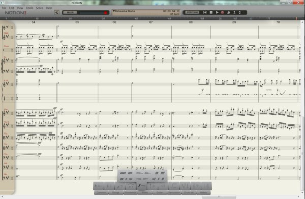
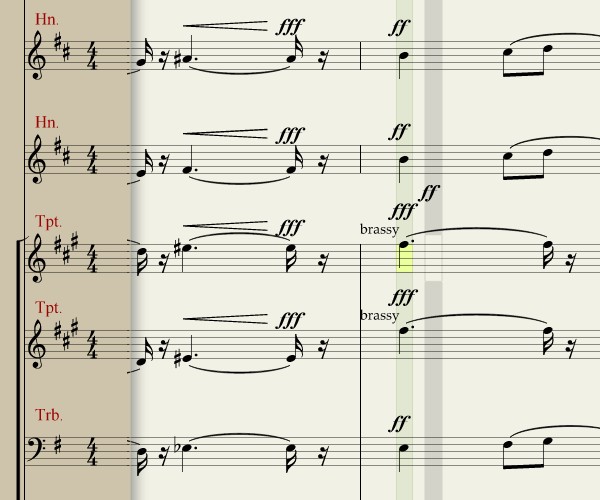
A new type of cursor: Here in the composition screen, I'm about to replace a fortississimo (fff) with a fortissimo (ff). Everything in a symphonic score is synchronized vertically, so the shaded bars represent points in time. The olive-shaded bar is the area I'm about to change, and the yellow brick points to the specific instrument (Trumpet 1). The grey bar is my mouse pointer now, and the "ff" is the symbol that replaces my pointer arrow. When I click on the score, I move the olive bar to that point; if I click Play, that's the part I hear. And if I press the A key, I hear the note under the yellow brick. The grey bar shows me where I can move the olive bar, and where I'm about to insert my new ff dynamic.
Hear an MP3 clip from the funk-symphonic score that Scott created with Notion 3.
The sound snippet I've included here for download is about 30 seconds of a demo reel I produced using a score using pieces of a composition from Notion 2, that I spruced up using Notion 3. The first theme you hear is something I believe I started humming to myself one day while watching a piece of the PBS documentary "Carrier" with the sound turned down, on account of my wife talking on the phone. Months later, the theme crept up in my mind again as something I wished could have been used in a particular movie, the identity of which I'll keep secret for now, but which folks who know me well will be able to guess right away -- I was disappointed by the score, and used Notion to challenge myself to see whether I could replace it.
Since my work started in Notion 2, I was able to learn something valuable about not only musical scores, but any type of electronic document that has been tailored to suit the quirks and nuances of its native application. Because Notion 2 was also a sound system, managing the nuances of that sound system required "massaging" the score, if you will, to balance the instruments. That included over-weighting the dynamics of entire instrument sections just to make Notion 2 sound better than just "good," though if you were to print the resulting score, it would confuse a real-world conductor.
Notion 3's score format has also changed, so bringing over a Notion 2 project requires a file import. That import leaves the over-weighted balances exactly where they were -- so with respect to the printed output, it's a mostly accurate import (the new format was confused by the old fermatas, but such small adjustments are easy to fix). But the result sounded...perfectly horrible, as though the horn section were collectively suffering an asthma attack, and buzzsaws were tearing through the violas.
"That was one of the inherent problems in Notion 2," Lubo Astinov admitted, "the balance of the sounds was completely ridiculous. It hurt many scores and many users, because they were basically -- and we were doing it here -- over-exaggerating dynamics to get the desired sound, which should have never happened. You don't do that for a real orchestra; you shouldn't have to do that for a Notion score as well."
The first part of the solution involved going back through the project and toning down the dynamics to something more realistic, which in some cases literally meant bringing fortissississimo (ffff) back down to as low as forte (f). The entire piano range (soft) was suddenly opened up, because now it was actually audible.

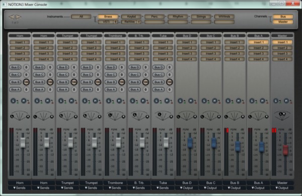
The second part involved utilizing the new sound mixer panel, which replaces Notion 2's "mute/unmute" dialog with a completely graphical representation of a real studio channel mixer. Add-on effects such as AmpliTube, and VST effects plug-ins from the outside world, "attach" to this panel as though they were filter components. You can then route the sound from one instrument through one of these plug-ins, or group several instruments (for instance, the whole horn section) into a bus that leads through a filter.
This very tactile approach to sound mixing runs almost completely opposite of the wholly symbolic approach to composition presented by the Notion 3 palette, almost as though you're using a different program altogether. Nevertheless, the mixer provides very granular, explicit functionality, replacing Notion 2's generalized functionality, and matching N3's level of detail in scoring. If I were applying a more holistic approach to the application's design, I might have imagined an other-worldly "mixer palette" that works similar to the scoring palette. But a studio musician might have found such a device foreign.
To this day, Notion is not a "perfect" program, if there is such a thing. Lubo Astinov audibly winced when I told him I was using standard Realtek integrated audio on my test system; relying on ordinary components such as this has been the cause of many troubles. The most pressing problem I've encountered thus far has been the sound system tripping over the score and losing synchronization of measures, a problem we've traced back to AmpliTube set to "oversampling" by default -- a setting that's not obvious to a novice. Every so often, N3 still trips over the score even with this setting turned off, especially if it has to share memory with other applications (for example, this word processor I'm using now, or anything that relies heavily on the .NET Framework).
But the program itself amazes me so much that not even these problems have become headaches -- it still feels miraculous, at least to me, that Notion 3 is capable of doing as much as it does. If I were a professional musician, making a living from my score, I might need an aspirin or two. (I might also invest in a real sound card.) For now, I manage to find enough inspiration from the quality of what's possible that the act of using this program continues to be a joy.
One wonders how many people throughout the history of written music would have been able to bring themselves to an artistic par with Ludwig van Beethoven, or Jean Sibelius (the real one), or Dmitri Shostakovich, or Jerry Goldsmith, had they the same access to an orchestra that minds their commands the way Beethoven's orchestra-in-his-head minded him. How many untried artists with un-nurtured talents were left waiting, and how many such artists may become inspired today with such power at their control now?
Imagine what brilliance is possible when we hand the world an orchestra.
[FULL SEC DISCLOSURE:] Notion Music supplied Betanews with a not-for-resale copy of Notion 3 for our review, without pre-condition. Betanews also received an earlier copy of Notion 2 for comparison purposes. Scott M. Fulton, III is the author of this article, and as always, is solely responsible for his content. The opinions expressed here do not necessarily reflect those of Betanews or any of its other editors or contributors.
Copyright Betanews, Inc. 2009


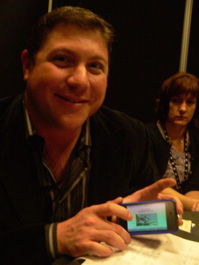
 It was an impressive demonstration, once they got it working: H.264 video streaming wirelessly (and slowly, at least during the caching sequence) using Microsoft's Silverlight video streaming, to an Apple iPhone. It's all the more impressive when you realize that Flash video still has not made its way (permanently) to the iPhone, not for any technical reasons we know of...simply because Apple wants to control the video channel for streaming media to its devices.
 "So we've worked with Apple to create a server-side based solution with IIS Media Services," Goldfarb continued, "and what we're doing is taking content that's encoded for smooth streaming and enabling the content owner to say, 'I want to enable the iPhone.' The server will dynamically make the content work -- same content, same point of origin -- on the iPhone. We do this with the HTML 5 <VIDEO> tag, in many ways."


