By Scott M. Fulton, III, Betanews

 If, as Google says, a Web browser is not so much an application but a platform upon which a new class of applications may be built, then that platform must provide support. It needs to give its users the ability to accomplish tasks, and to devise new and better ways to accomplish them better. For as we all know now, "browser" is an inappropriate word for the thing we use to communicate with the Web using HTTP, because the Web is becoming a space for everyday applications deployment. Especially in the content industry, active work takes place within the browser, much more so than passive amusement.
To that end, a browser may serve either as a springboard or a plank. Despite Google Chrome's achievements, the crucial element of support remains missing. For all the spotlight we've given Chrome for being the fastest Web browser on Windows, it does not yet serve the purpose of supporting users and helping them to make their online tasks more efficient. This is why Google's expert tuning of its V8 JavaScript engine for Chrome is so important, because the browser has truly evolved into a JavaScript platform rather than an HTML platform.
For everyone I know who has, over the last year, made the switch from Microsoft Internet Explorer to any other browser, the reasons have had less to do with security than in the past. People who are compelled to switch are tired of how slow IE has become, and the sinking feeling that it's getting slower -- a feeling which Betanews confirmed this week with actual facts. If you're the manufacturer of a competitive browser, and you have the opportunity to offer your customer a free alternative that's close to 21 times faster overall than IE, and your brand is not only one of the most recognized in the world but the only one analysts believe can truly challenge Microsoft, you'd think there would be an exodus of mass proportion.
There has been no such exodus. The reason is because, despite the number "4" on the version currently under development, Chrome gives one the feeling that it's never been finished once.
In a way, it doesn't make sense to have a JavaScript engine that's as good as it is, running a platform that is so minimalistic. As the manufacturer of any set-top box can tell you, a viewer's entire experience in front of his TV can be ruined if the functionality of the program guide isn't solid. A browser user's bookmarks list is the counterpart of the program guide; it's "what's on," and it's also how to get there.
Not that a list of folders and bookmarks is anywhere near as informative as an STB's program guide. But for years, Firefox has had the good sense to enable users to open the bookmarks list in their sidebar, to open and close it with a keystroke (Ctrl-I) and scroll through it using a scroll bar. For IE8, Microsoft added an appealing and versatile Favorites menu that opens with the same keystroke (as part of an effort to win back refugees to Firefox). This menu starts off life as a pop-up, but can then be pinned to the left side as a sidebar. Then it too can be switched from Favorites (bookmarks) to RSS Feeds and browsing history. It's a versatile feature that Microsoft has thought through, and that performs well.
SEE THE FIREFOX/CHROME SHOWDOWN FROM THE TOP:
- Firefox 3.5 vs. Chrome 3 Showdown, Round 1: How private is private browsing?: Firefox 3.5 (1), Chrome 3 (0) after 1 heat
- Firefox 3.5 vs. Chrome 3 Showdown, Round 2: Are bookmarks outmoded?: Firefox 3.5 (2), Chrome 3 (0) after 2 heats
- Firefox 3.5 vs. Chrome 3 Showdown, Round 3: Finding a place for more tabs: Firefox 3.5 (2), Chrome 3 (1) after 3 heats
- Firefox 3.5 vs. Chrome 3 Showdown, Round 4: Finding a place for more tabs: Firefox 3.5 (3), Chrome 3 (1) after 4 heats

In Chrome 3, the Bookmarks Bar was only part of the New Tab screen, and was actually provided by a Google Web page. With Chrome 4, the Bookmarks Bar becomes a feature of the actual program (along with curious re-additions such as an actual button for the home page, a recent Google discovery). But the complete list of bookmarks is only available through an "Other Bookmarks" menu on the right. Clicking on this button pulls up a drop-down menu, whose folders in turn pull up other pop-up menus. So you're not perusing a folder tree as with Firefox or IE; instead, you're scrolling through pop-ups. And you're scrolling slow...ly... because these are classic menus; there are no scroll bars. So if you have a long bookmarks list, you're not going anywhere fast.
That I'm no fan of Chrome's bookmarks system is nothing new -- I first called attention to this last June. Back then, Chrome 3 was on the "beta" and "dev" tracks, while Chrome 2 was the version declared stable. Here I noted that Firefox 3.5 was more adept at searching for stored bookmarks by various criteria than Chrome, the browser from the company that's supposed to be known for search.
But I'm not exactly the only one screaming for functionality out here. Our own Fileforum features reviews from testers over the months who have explicitly asked why Chrome seems to be all chassis and no interface. "It's as useful as a chocolate fireguard," wrote madmike; "very bland, short on features, but competent," wrote bobad; and, "I wish they could make it look and act like Firefox," wrote CyberDoc999.
Next: Shelving basic functionality under "Other..."

Shelving basic functionality under "Other"
That the Google Chrome user might only keep eight or so Web sites on her New Tab page, plus a handful of "Other Bookmarks" in a menu that should never grow large enough to have to be scrolled; that History is a separate page and not a function you can use side-by-side with other pages; that Chrome lacks the ability to even add the searching, researching, and translating functionality that Google makes for its own Toolbar for IE and Firefox; and that the button for the home page is a new feature that's just now being tested, are all indications that Google only projects its browser will be used lightly and occasionally, by folks who'll do a Google query, read the result, and come back to Google. If that's truly the case, one wonders why Google actually bothers making its underlying JavaScript engine as good as it is -- effectively mounting a V8 engine to a tricycle.
In fairness, Mozilla Firefox also lacks that functionality. But Mozilla knows how to help users make Firefox more functional: through a wide array of add-ons, along with a developers' community that's nurtured and educated in the ways of making proper software without so much initial trial-and-error.
Plug-ins and add-ons to Chrome do exist, and forums such as this one have cropped up in anticipation of a burgeoning market in these things at some future date. But for now, the theme of these sites appears to be stuck with themes. Even now, when skinning of some applications has become an art form that has brought forth its own grass-roots competitive "Olympics," Chrome themes are a throwback to the Netscape Navigator era, sometimes comprised of celebrity photos cropped so that their faces fit just inside the tab area, decorated like the bedroom of some Disney Channel star.
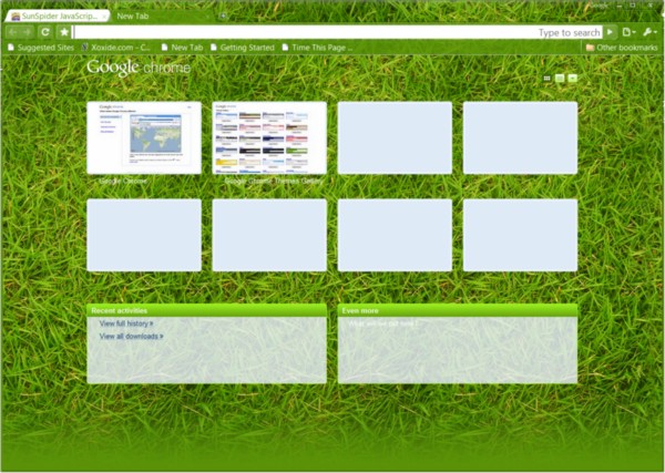
Tell me you'd actually intentionally make your own Web browser look like a just-fertilized lawn.
While Internet Explorer is dog slow, and now slower by the month, version 8 has functionality and, for the first time in IE's existence, a reasonable degree of versatility. It also is relatively stable -- crashing is not its problem. Crashing is a Firefox trademark -- to this day, the "stable" version crashes on average 1.5 times per day for me, a fact which this "Firefox user" is not proud to share.
Yet even though it does exhibit greater stability, Chrome lacks the functionality that makes it adaptable to users' everyday purposes, and that enables them to take it beyond the realm of "general purpose" into "heavy duty." Google's complete inability to make that jump, to get the clue, to provide evidence of having listened to the smallest portion of tester sentiment, bewilders me completely as to whether the company has any realistic notion of what "beta" means anyway.
With Mozilla, the newest code is developed under a private track, which only means that the developers aren't taking comments from the public about it, even though it's publicly available. When it's developed enough to demonstrate in public, then it enters the "beta" track, which Mozilla code-names "Shiretoko" for 3.5 test code and "Namoroka" for 3.6. When Mozilla delays the rollout of a new build to the stable channel, it gets groans and moans from folks like me...but it's generally because real beta testers have found real problems, or have advised some really good ideas.
A full-featured browser chassis capable of running thoroughly debugged JavaScript add-ons that won't crash, and that contain the basic functionality that Microsoft and Mozilla discovered as far back as 2005, coupled with the proven superior V8 JavaScript engine, would clinch the alternative browser market in maybe one year's time. But that year has already passed for Chrome, which is already gaining a reputation as a browser that makes up for its performance superiority with slow and cumbersome functionality. As long as Google continues to not get this message, then we all need to face up to the fact that Google isn't exactly open, is it?
SEE THE FIREFOX/CHROME SHOWDOWN FROM THE TOP:
- Firefox 3.5 vs. Chrome 3 Showdown, Round 1: How private is private browsing?: Firefox 3.5 (1), Chrome 3 (0) after 1 heat
- Firefox 3.5 vs. Chrome 3 Showdown, Round 2: Are bookmarks outmoded?: Firefox 3.5 (2), Chrome 3 (0) after 2 heats
- Firefox 3.5 vs. Chrome 3 Showdown, Round 3: Finding a place for more tabs: Firefox 3.5 (2), Chrome 3 (1) after 3 heats
- Firefox 3.5 vs. Chrome 3 Showdown, Round 4: Finding a place for more tabs: Firefox 3.5 (3), Chrome 3 (1) after 4 heats
Copyright Betanews, Inc. 2009


 Early in the summer, IPTV startup Myka delivered an
 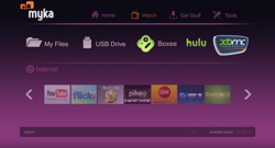 In case the name didn't already give it away, the Myka ION is equipped with an
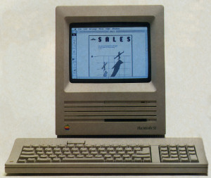
![Apple's 're-invented' Lisa, model 1 (1983) [Photo credit: ComputerHistory.org]](http://images.betanews.com/media/2642.jpg) A High Tech associate eventually found it back at the store and drove it downtown, but in the meantime, we sat pondering what this new thing was going to do. "Lisa," we'd concluded, must be a code-name and not the final brand. Somebody thought it would eventually be the Apple IV anyway, but the High Tech manager had heard from Cupertino that the Roman numerals had been declared history after "III."
A High Tech associate eventually found it back at the store and drove it downtown, but in the meantime, we sat pondering what this new thing was going to do. "Lisa," we'd concluded, must be a code-name and not the final brand. Somebody thought it would eventually be the Apple IV anyway, but the High Tech manager had heard from Cupertino that the Roman numerals had been declared history after "III."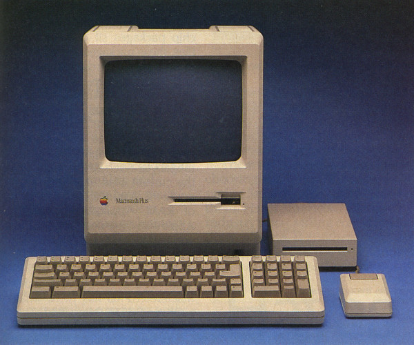
 The initial sales figures for Microsoft Windows 7 after its worldwide launch on October 22 are still being tabulated, but the early estimates sound very promising: According to industry analysis firm NPD, unit sales for Windows 7 software SKUs in the US were 234% higher -- better than triple -- the unit sales for Vista's launch, and US revenue from Win7 software sales was up 82% over Vista's launch.
 During one of the more noteworthy weeks in Europe's modern history, as the 27 member nations of the European Union prepare for a newer and more centralized executive authority, the EU will also be making way for a powerful regulatory authority for telecommunications: the Body of European Regulators for Electronic Communications (BEREC). This is the name for the new European Telecoms Authority; and whereas in the US, there remains considerable debate over whether the Federal Communications Commission can and should have regulatory authority over Internet transactions, in Europe, the debate has officially been settled: BEREC will have authority to propose regulations for telecommunications in all forms, including the Internet.
 In keeping with its lower price point, the Droid Eris has a lower resolution HVGA display in comparison to the Droid's WVGA screen, and a slower processor running at 528 MHz.
  In Join the Band, you can play along with any song you choose on a virtual drum set or piano keyboard. I thought the piano did a fine job when I banged out "Chopsticks" on it.