By Scott M. Fulton, III, Betanews
 The question has been asked, who really needs to use Microsoft Office these days? The answer is, anyone who is in the business of professionally generating content for a paying customer. Word 2010 may not be the optimum tool for the everyday blogger, and Excel 2010 maybe not the best summer trip planner, just as a John Deere is not the optimum vehicle for a trip to the grocery store. But in recent years, Microsoft is the only software producer that has come close to understanding what professional content creators require in their daily toolset.
So far, the improvements we've found from actually using the Office 2010 Technical Preview released Monday (as opposed to the ones Microsoft told us about) can mainly be described as usability enhancements -- tools that appear to be responses to how people actually use the products. Compared to Office 2007, which threw out the old instruction manual with regard to how applications should work, Office 2010's changes are subtler, slicker, and less ostentatious. Of those we've noticed in our initial tests, here are five which we feel will make compelling arguments for at least some users to upgrade:
5. Embedding Web videos in PowerPoint presentations. Technically, it's possible to embed a YouTube video into a PowerPoint 2007 presentation, but you need a third-party plug-in to pull it off. Otherwise, PowerPoint is only geared to play locally accessible files, essentially using a Media Player component.
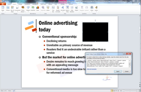
One of the very few functional changes to PowerPoint 2010 is the addition of a mechanism that enables you to embed YouTube and other videos into a presentation the same way you'd embed them into a Web page: by copying the HTML <EMBED> code directly in. PowerPoint 2010 (gauging from the Technical Preview) will allow you to preview the video in-place without having to view the presentation as a slideshow first, which demonstrates the depth of functionality Microsoft truly intends for this component -- apparently an in-place Adobe Flash object. It will be even nicer when this feature works; in our tests, the new component often did not locate the video online and looked for it in the "My Documents" directory instead.
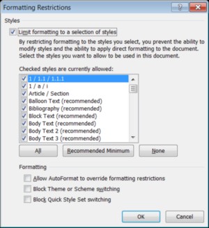 4. Restrict Editing command in Word 2010. Many publishing organizations use Word as their principal tool for editing textual content, which means collaborators shuttle multiple documents between authors, editors, and proofreaders. Microsoft's collaboration tools are supposed to enable only certain parties to make changes. But in the publishing business, formatting codes are the keys to the final formatting of a production document, and if someone who has access rights can change those paragraph formats, even accidentally (which is easier to accomplish than you might imagine, thanks to customizable document templates belonging to each user), the entire production process can be held up, sometimes for days, while formatters work out the kinks.
This simple tool may go a long way toward preventing these kinks from popping up. On a per-user basis, Restrict Editing (located in the Developer panel, which is not displayed by default) can prevent named individuals from making certain types of changes to a document, even if he's generally permitted to make changes. Among the available restrictions are changes to styles, which creates the possibility for a safeguard that publishers can use to prevent authors from changing manuscripts willy-nilly to suit their tastes. (Can you tell I've been in the editing business?)
Next: Does Scott get his #1 Office 2010 wish?
 3. Document properties at a glance. In the old days of Word, the Document Properties dialog box was what editors used to maintain control over versioning -- which version of a document was being edited based on how many editing cycles it had passed through, and when it was last modified and saved. Versioning control in Word has improved dramatically since then, but many publishers' control and validation processes have not.
For editors who have to work with these publishers, it was a pain to discover that the designers of Office 2007 had buried Document Properties in an odd location: in the Office menu (the big round button, which has been replaced in Office 2010), under Prepare, followed by Properties and then Advanced Properties. (Nothing advanced about them, really, it should be "Basic Properties.")
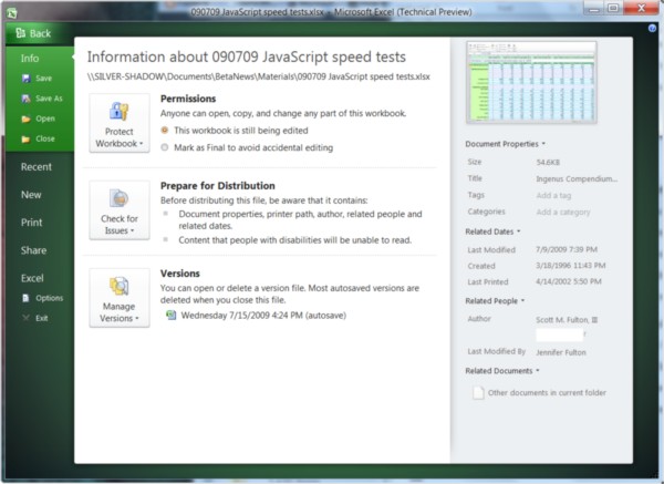
With the BackStage feature in all Office 2010 components, a document's basic properties shows up on the front page -- no excavation necessary, no "advanced" dialogs. You'll also find there the most basic and necessary features that Office 2007 buried under its little-used Prepare menu; in fact, I'm fairly certain that many folks will think the "Check for Issues" feature is new, when it actually premiered in the 2007 version.
2. The Share menu takes center stage 'BackStage.' Office 2007 introduced something Microsoft was fairly excited about at the time, called the Publish menu (under the big Office button). Its projected purpose was to enable any number of possible options for preparing a document to be received by multiple people, whether through SharePoint or Microsoft's Document Management Server, or to a blog post someplace. But Microsoft's "Johnny Appleseed" approach to the notion of publishing (a blog post and DMS are pretty different things) meant this menu became another of the 2007 version's buried treasures.
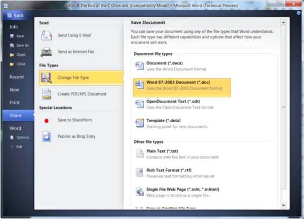
In Office 2010, BackStage's new Share menu replaces Publish with a full and richly self-documented selection of functions you can perform to enable the active document to be consumed by someone else, typically without using Office. This is Microsoft's acknowledgment, at long last, that Office is not the universe which binds together all intellectual property.
The Change File Type menu is particularly interesting and useful here, as it presents well-explained options for doing the kind of thing we used to call "exporting." Here is where you'll find one of the multiple places where Office now supports OpenDocument format, both as an alternate default file save format and as a vehicle for sharing files with others. The concept of "share" makes more immediate sense to new users than "export," and it has a more open and positive connotation: It doesn't mean to move data out of one universe to warp it into another.
While I'm on the subject of BackStage: When Office's designers first premiered the ribbon for the 2007 version, they claimed one of its principal benefits was to get options and commands out of the way of the document being edited. Nothing in the ribbon drops down, and the document is obstructed by dialog boxes only when vitally necessary. But BackStage runs completely contrary to that design ethic. When you're about to save a document or print it or see what it will look like on your printer or in SharePoint, the BackStage screen totally occludes the document you're working on, although in some cases it leaves a thumbnail open in the upper right corner as a reminder.
And yet it works surprisingly well. Because it uses all that space, there's all that space for it to use, and it gets used for explaining the user's options in clear and concise language. Here is where Microsoft finally learns a lesson from Web page design. Notice also the construction of the menus, in a three-tier fashion with the categories running top to bottom, and subcategories expanding to the right. Little left-pointing arrows align the commands to their respective categories like notations in an open book. It's very legible, very attractive, and yet in runs in stark contrast to the very design decisions that gave rise to it.
1. Fully customizable ribbons. The ability to customize Office completely, to make it into the application you need it to be, is something I've not only treasured but cashed in on. Two of the 17 books I've published under one of my two names, including this one, were exclusively about the subject of Office customization.
So when I learned that you needed Visual Studio to customize Office 2007's ribbons, I was a taken aback. I heard a number of various excuses, one of which being that the everyday end user was not familiar enough with the principles of ribbon design to be making a ribbon for himself (it's too dangerous, boys and girls!). And the bone that Microsoft threw for us customizers in the meantime, the "Quick Access toolbar," is not only too trifling to be fully functional or adaptable, but also (as its name clearly suggests) contrary to the ribbon design ethic -- it's a toolbar!
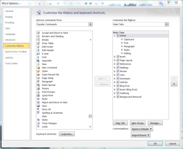
This glaring omission in Office's long-established functionality -- perhaps the most prominent regular Office feature ever to be omitted from a successor version for lack of readiness -- will be fixed in Office 2010. I would like to say it's fixed now, but in early Betanews tests, adjustments I've made to the ribbons in Word and Excel did not stick -- for some reason, components revert to their default layouts. (We're legitimately testing Office 2010, so when I discover the reasons, Microsoft will most certainly hear from me.) Nonetheless, you can see where in the new Options panel, there are separate tiers for the Quick Access toolbar and the complete ribbon.
Everything here can be changed, including the order and names of the menus themselves, and you can create completely new menu categories on your own -- you don't need Visual Studio or a lesson in "line-of-business applications." The background programming language for Office remains Visual Basic for Applications, which isn't altogether bad -- it means older macros remain compatible -- but it does forsake the enormously powerful possibilities of opening up access to the .NET CLI, and letting the user choose her language (VB, C#, F#, IronPython, IronRuby). While VBA is, on the whole, slower and based on an older Windows component model, it still has access to the complete Office type library, and that's the most important feature for developers. Now it's possible once again to re-engineer Office into a sophisticated information management system exclusively for global publishers. And yes, you're sensing a huge smile on my face.
We can debate the monolithic nature of Office applications until Steve Ballmer stops repeating the word "tenacity." It's almost a moot argument until anything the Web can deliver enables the degree of productivity, and the level of flexibility, as Microsoft Office. There remains no equal in the applications field, and that's actually a shame because there appears to be ample opportunity and talent out there quite capable of engineering a better and more efficient way of working. Until then, we Office users may have even less reason to complain for at least the next three years.
Copyright Betanews, Inc. 2009
