"Look up, waaaaaay up" is a phrase familiar to Canadians of a certain age, who watched "The Friendly Giant". The kids program aired from 1958 to 1985 on CBC, which our TV antenna grabbed from the local affiliate across the border in New Brunswick (I'm from Northern Maine). There's something about iPad Pro's enormity that makes it feel more like something the Giant would use.
My question this fine Friday: Is iPad Pro too big? For the majority of potential buyers, my answer is unequivocally yes. I don't see a product made for the majority. Whatever Apple's post-PC ambitions, iPad Pro is more a proof-of-concept for future laptop replacement. However, for the few -- creators looking for larger digital canvas -- iPad Pro offers much. For the many, the first version will work out the kinks, such as getting the app platform placed, for mass-market successors. Warning: Embracing the expansive tablet may make switching to something smaller nearly impossible. Size matters, and sometimes larger is better.
(This is second in a series sharing my experience, observations, and review of the tablet, which I hope to use as my primary PC throughout February.)
Deft or Daft?
During Steve Jobs' second coming as CEO, several design ethics consistently permeated Apple products: Humanization, touch as primary user interface, and miniaturization are among the primaries. There's a living, human-like quality to using Apple tech, and you see it too rarely from other inventors in the industry. iPad Air and mini, along with iPhone, are intimate devices because of how they respond to you and the ways you caress them with your fingertips.
Finger-first is one of Apple's oldest design ethics, going back to the original Macintosh launched 32 years ago. But touch's role started to expand with release of the click-wheel iPod in October 2001 before taking a huge leap with iPhone in June 2007. Apple is too obsessed with touch nearly nine years later, I contend. Touchless, voice-response interaction matters as much and in many ways more. iPad Pro is finger-friendly and human-like responsive but I wouldn't describe the user experience as intimate or immersive as the original 9.7-inch tab or its Air successes. Size is major reason.
Conceptually, iPad Pro reminds me of Microsoft's ill-begotten Windows CE for Smart Displays. The concept basically turned LCD flat-screen monitors, ranging from 10 to 15 inches, into pseudo touchscreen tablets. Mira (the codename) failed for many usability reasons -- size being the most forestalling. Carting around a PC monitor, even from den to living room made little sense in 2003 (not that Microsoft or its OEM partners understood). Apple's over-stuffed tablet isn't far removed, with respect to screen landscape but not heft or thickness. That said, meaningful comparison stops there with respect to iPad Pro's considerably greater utility, usability, and flexibility. I refer solely to the concept of carrying around a big slab.
Larger size pushes against Apple's long emphasis making computing devices smaller. Consider the Mac laptop's evolution for the 11.6-inch Air and 12-inch MacBook. iPod's size shrank as song capacity increased, culminating in the lovely iPod nano launched in September 2005. Less than two years later, Apple released the first iPhone, which shrank together capabilities by combining iPod's core functions with a telephony and Internet-connected device. Sure Apple sells a 27-inch iMac and once offered a 17-inch laptop, but the trend has been to put more capability into devices that are less bulky.
Sizing Up
The gorgeous screen is 12.9 inches diagonally, which is marketing-gimmick for making the size seem closer to 12 than to 13. iPad Pro measures 305.7 x 220.6 x 6.9 mm (12 x 8.68 x .27 inches). The cellular plus WiFi variant, which I own, weights 723 grams (1.59 pounds), while the non-LTE tab is 10 grams less (1.57 pounds). However, Apple's Smart Keyboard cover makes the heft more like 12-inch MacBook, which weighs 920 grams (2.03 pounds).
Thinness and lightness counter-balance the screen's expanse. Remarkably, iPad Pro is thinner than iPhone 6s, which is 7.1 mm thick. Regarding that one-and-a-half pounds, consider third-generation iPad, which bulked up for the battery to 662 grams (1.46 pounds). While being heavier, the Pro feels lighter because of balance, which is the hallmark of good design -- particularly for things that are handled. Digital cameras with detachable lenses are good examples of the concept in practice.
Physical balance is paramount. Consider the automobile you drive to work, the aerodynamics and how the vehicle turns. An aerodynamically unbalanced auto will vibrate or burn fuel faster. Likewise, an unbalanced SLR camera will be clumsy in the hand when telephoto lenses are attached, if design isn’t balanced.
For the size, iPad Pro has superb balance. That's despite the laptop-like screen size in the hand. However, the tablet is a bit clumsy to handle when attached to the Smart Keyboard. Unfolding from cover to stand operation can be awkward, and I suspect some people could drop the kit. Expect five or more seconds versus the immediacy of opening a laptop lid. As a slate, however, waking and using the Pro is similar to iPad Air 2. It's quick!
The 4:3 aspect ratio feels more sensible on this tablet than 9.7-inch iPads. In landscape mode, with keyboard attached, the view is more expansive and satisfying than the 16:9 of MacBook Air or 16:10 of the Pro models. If Apple wants the larger tablet to replace laptops, the screen's physical presentation is a check for the plus column.
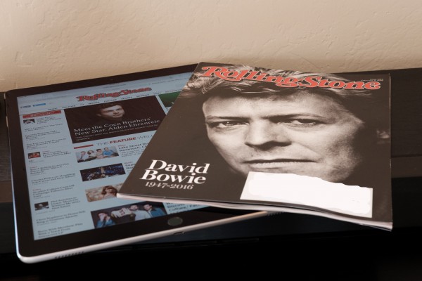
Portrait mode usage will be a matter of taste. Some people won't like holding the larger tablet. That said, because of fabulous balance, after four days use, my arms don't tire as expected from holding the extra weight. Think of the Pro as being large magazine size (why Rolling Stone for comparative photo) or small picture book. After first feeling the tablet was too large, my perception changed. iPad Air looks puny, undersized, now, If you think that's a vote for bigger being better, perhaps it is.
Nevertheless, despite iPad Pro's relative thinness and lightness, the overall size, shape, and aspect ratio make for one big-ass tablet. Stated differently, the proportions appeal in landscape mode attached to the Smart Keyboard. Held in portrait orientation, the tablet is too wide, like someone who is overweight. No, wait. Short, squat, and overly-wide. The emotional connotations are negative.
The large display, which resolution is 2732 by 2048 at 264 pixels per inch, is a fantastic canvas for consuming and creating content -- much more so than Apple's smaller alternatives. This usage benefit, more than anything else, pushes iPad Pro into the PC replacement category. Artists are going to love Pencil, which I will discuss in a follow-up post that also discusses the overall app experience. Four days usage is far too short a time to properly broach the topic. But even this short of time in, I see the appeal for creative types. Caveat: If the canvas isn't too big, something further testing can answer. Some artists might prefer iPad Air 3 and Pencil to double-wide Pro. Supply stores sell different size sketch pads for a reason. One size doesn't fit all.
And another category: Baby Boomers who are long-time Apple loyalists should find the massive screen real estate better for diminished vision. Every company should be designing with some thought to the rapidly aging population, and in the case of established Apple customers that means money to spend. Starting price is $799 for the 32GB WiFi iPad Pro.
Why No Touchscreen Notebook?
One last topic remains regarding size and the justification for choosing the oversized-tablet for any purpose, including PC replacement: Why is there no touchscreen Mac laptop? My answer: iPhone. Apple's active iOS install base is 1 billion, while during calendar fourth quarter 2015 the handset accounted for more than two-thirds of overall revenue. OS X is not the company's leading platform but iOS, which already is optimized for touchscreens. It's sensible that Apple should push the platform forward for PC-like utility and usability.
My feeling four days in: iPad Pro is for the few not the many, but that's nevertheless a viable and worthwhile market. Meanwhile, the device is proof-of-concept pushing iOS upwards. Platform maturity, or even successor tab, could tip the scales for the masses.
Don't forget the less-is-more principle. Too many professional reviewers hang up on iPad Pro or any other contextual cloud-connected device as needing to do as much as a PC to replace it. Of course not. There is a "good enough" threshold. For many people, a smartphone is computer enough, and it's a more natural progression for an iOS-only user to go to iPad Pro than a personal computer running any operating system.
Microsoft has proved with Surface Pro that there is a market for a 12-inch class device that is both tablet and PC. The company's slate also benefits from a mature desktop operating system capable of running many windowed applications together. From physical design, and associated balance of benefits, I regard Surface Pro 4 to be superior, something a future post in this series will explore.
That said, in some ways SP4 does too much and not enough. Windows 10 complexity and confusion are greater for a touchscreen tab, while many of the most appealing or popular apps available for Android or iOS are missing. While I regard Apple's UI as being tired, it is nevertheless less complex and more mature with respect to applications than Windows 10.
Will I still feel this way in a couple of weeks?
Photo Credit: Joe Wilcox


