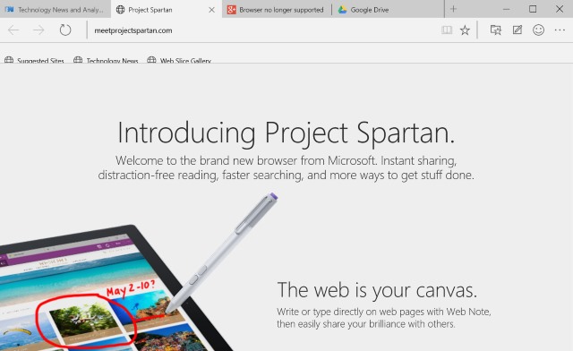
After all of the talk, some action. Microsoft has been gentling building the hype about Spartan for some time now, but it's only with the release of Windows 10 Technical Preview Build 10049 that we get to, officially, go hands on. This is the web browser that's replacing Internet Explorer, the default web browser in Windows 10, so it has quite a role to perform.
It's a browser that's "built for the modern web" -- whatever that means -- and it sees Microsoft trying to shed the shackles of IE and move forward. Microsoft has been talking the talking for months, but does Spartan walk the walk? No. Spartan, at the moment, appears to be a joke. Let me elaborate.
Of course there are the usual caveats of "this is pre-release software", "it's an early build", and "it'll all change by the final release". As when I have looked at Windows 10 previews, there will undoubtedly be suggestions that any criticism I may level at Spartan should be delivered to Microsoft rather than aired in public. I'm doing both. Anything I say here is also fed back to Microsoft. This article is a platform for me to share my thoughts with you and to see what you think.
It has been suggested that Microsoft's Technical Preview software is not meant for review. This is not a review, it's a recounting of my experience. It may be the same as yours, it may differ; I'd like to compare notes. If I have problems with Spartan but you don’t, why is that? Is there a difference with our setups, or is it just a peculiarity?
You might think Spartan is brilliant. You're wrong, of course, but I'd still like to hear why.
So what issues do I have with Spartan as it stands? Where shall I begin?
I realize, as I hope I have made abundantly clear, that this is pre-release software. It's meant to be the merest taster of what's to come, and our opportunity to shape the direction in which things might travel. That said, I fail to see why MS bothered with releasing it in its current form; there's nothing to it.
I realize that there's something of a clue in the name Spartan (should we see it as a reference to sparseness, or the city of Sparta rather than yet another Halo link?), but the interface is bare to the point of uselessness. It's like Microsoft just took the Windows Phone version of Internet Explorer and made it bigger. Windows 10 introduced the idea of (lots of) white space, and it's a theme that continues here. There's a place for white space, but here it seems to serve only to make interface elements huge.
Spartan's toolbar is decidedly overweight; let's compare it to Chrome. In the space Chrome houses tabs, the toolbar and the favorites bar, Spartan doesn’t even have room for the tabs and toolbar -- this duo is around 50 percent fatter than the three program elements in Chrome. A bold new design it may be, but it certainly could not be described as anorexic. Everything is so big and chunky. On the plus side, this makes it fat-finger friendly, but it's sure as heck not pretty or an efficient use of space. With everything being so stripped back, options are very few and far between making the browser very hard to personalize.
Apart from a horrible design, image rendering really isn't very good. A quick comparison between the Meet Project Spartan page in both Spartan and Chrome shows that Microsoft's new browser displays images in a fuzzy, smudgy way. It's almost as though really bad anti-aliasing has been enabled; things are so much clearer in Chrome.
Microsoft proclaims that Spartan lets you "do cool things like write or type on a webpage". What is this? A browser for 7 year-olds? Then there are compatibility issues. Google+, for instance, simply doesn’t work -- so much for Spartan switching engines as and when required.
I had been planning a week -- or at least a few days -- of using only Spartan, but at the moment, it's pretty much unusable. I can only hope that it comes on in leaps and bounds because at the moment, it's a joke.
This is meant to be about ditching Internet Explorer. I should be excited... but I need something to be excited about.

