 Like many Gmail users, I greeted the news of the introduction of tabs to the interface with a degree of anticipation -- now it was just a matter of waiting for the feature to roll out so I could try it for myself. Earlier today I was randomly signed out of my Gmail account, and after signing back in and checking the settings menus, I could see that tabs were now available to me. Excitement was short-lived, however; it quickly became apparent that this new feature is a disaster.
On the face of it, there's a lot to be said in favor of adding tabs to one's inbox. The idea is that emails that match certain criteria are automatically sorted so your inbox is easier to manage. I have an enormous number of filters configured that sort and label messages but the prospect of having a series of tabs to access certain types of mail was definitely appealing.
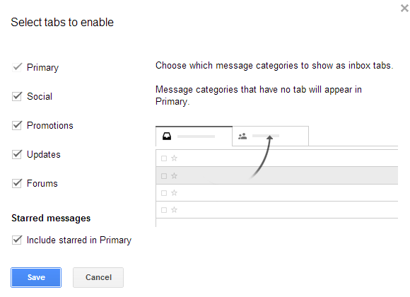
So, what does Google think would be useful tabs to have as default? Forums, Updates, Promotions, Social and Primary, it seems. As there are only five tabs, each covers a multitude of sins. Forums will, supposedly, capture emails relating to groups and forums, as well as housing your mailing list subscriptions. Social -- unsurprisingly -- groups all social networking messages together.
Promotions is fairly self-explanatory -- all of your offers, marketing mail (aka secondary spam) should end up here. But then things get a little odd. The Updates tab displays messages that are determined to be receipts, bills and statements. Everything else gets lumped together in the Primary tab.
OK, so these tabs may not be quite what you were expecting, but they can be customized, right? Right? Nope. The idea of tabs appealed to me at first as I thought I would be able to customize them to filter out emails from specific websites or people -- such as a Family tab. But no. Google has decided that these are the only five tabs I can have and that I cannot rename them or create any more.
This is not the only problem. Tabs are completely unintuitive. When a new message is received from Facebook, for example, Gmail determines that this is a Social email and filters it accordingly. A notification appears in the Social tab to let me know that there is an unread email, but nowhere else. Because the message has bypassed my Primary tab, my Inbox label is not updated with a new message count.
If I happen to be browsing my starred messages, I am not informed of the arrival of a new mail. Why? Oh, one thing I haven't mentioned yet is that tabs disappear when you are anywhere other than the inbox. But there's more. Or less. Depending on how you look at it.
The new message notification on each of the tabs does not tell you how many unread messages you have in this tab. Rather it lets you know how many new messages have arrived since you last visited that tab. This means that should I see that a number of messages are on my Social tab, click that tab to see them but then navigate elsewhere before actually reading any of the messages, the message count is zeroed.
There are unread messages on my Social tab, but I am not told how many -- I have to go and look. You might think that the craziness would end there, but it doesn't. Gmail does a spectacularly bad job of determining where emails should go. It is possible to re-categorize emails to different tabs, but only when you are in the inbox or on a tab. Email cannot be categorized from folder or label views, which means it is nowhere near as user-friendly as it should be.
 But the biggest problem is undoubtedly the way in which the unread mail count has altered. I want to see at a glance how many emails I have yet to read -- I don’t want to have to look at five different tabs. The terrible automatic categorization -- an inexact science, easily on a par with spam not being correctly identified -- means I really don't know when I have unread messages to attend to.
The five unread messages listed on the Social tab, are they emails that relate to Facebook and Twitter, or has that important work email I've been waiting for been misidentified? I have no way of knowing without looking at each tab manually thereby negating any timesaving their introduction was meant to bring about. The hoops you have to jump through to see everything in one place really beggars belief.
I love Gmail. I really do. It's not perfect, and there is a lot of room for improvement, but it gets so much right that I'm willing to cut it a little slack. But now things are starting to go awry. Tabs are a seriously bad idea. Yes, they are optional, but they are so close to unusable that hardly anyone is going to persevere with them to see if they improve with time.
Change is good -- it should be encouraged and embraced -- but change needs to be for the better and it needs to have direction and purpose. Some of the recent changes to Gmail make me wonder just who is making the decisions and who the target audience for the various features is.
Part of the problem is the fact that Gmail now offers so many different ways to organize and navigate emails. Labels are handy, as are folders (especially the more recent nesting option) and priority inbox -- in theory at least -- makes it easy to focus on the emails that are most important.
But it doesn’t end there. Multiple inboxes can be displayed when Priority Inbox is enabled, conversations view can be used to group together related messages and line spacing can be adjusted to suit your liking.
Having choice is nearly always a good thing, but Google is taking it to the extreme with Gmail. It's getting to the point that there are just too many options to choose from. It's a mess. I moved away from Hotmail years ago, seeking refuge in Gmail's cleaner, tidier interface. But now Google's webmail is starting to anger me. It's starting to be frustrating to use. I don't think I'm alone in feeling this way.
What do you think? Relieve yourself of your splenetic juices in the comments below.
Oh… if you were wondering. Tabs have now been disabled in my account.
Photo Credit: Roger Jegg - Fotodesign-Jegg.de/Shutterstock


 Remember the days when Google Nexus-experience phones were slim pickings? The days of one "Nexus" branded device are now gone, as Google continues to pull new handsets into the family -- granted, it is not really under the Nexus name, but they function as such. Now Chrome and Android chief Sundar Pichai announces that the pure Galaxy S4 unveiled at Google I/O will be joined by the HTC One.
 It seems that security has become a daily news story now, with multiple high-profile attacks. Evernote has had
  FoundersCard is a membership-based community designed for entrepreneurs which offers access to invite-only networking events throughout the world and provides various perks. The latter includes things like discounts for airfare, postal services and VIP treatment at upscale hotels.
 Touchscreen phones are just about the default choice these days, but there are still some users for whom a real QWERTY keyboard is an absolute must.