By Scott M. Fulton, III, Betanews
 Perhaps it was an accident that Microsoft released a series of Office 2010 preview videos this morning, instead of another chapter in its non-revealing "Office 2010: The Movie" theatrical trailer. The videos themselves were pulled down from Microsoft's servers, along with the micro-site that accompanied them, but not before search engine caches everywhere captured them, and not before blogger Long Zheng gathered them in one place.
This morning, these Microsoft-produced videos show extensive screen shots and demos of each primary Office 2010 component at work, although the appearance of the early code-name "Office 14" in a few of those shots indicates that videos may not necessarily be depicting the most recent build, being distributed to Technical Preview participants as soon as today.
None of the changes we see from these videos depict dramatically new features, especially when compared to the startling differences for many users between Office 2007 -- the first to include Microsoft's "Ribbon" front-end model -- and Office 2003. There are multiple noticeable tweaks, and there's an obvious effort by designers to make these applications cleaner looking, a little more like the 2003 edition.
Of the changes that Microsoft is willing to take credit for and claim this morning, here are the five we noticed that could impress customers gauging whether the upgrade is worth the money:
5. 3D rendering model in PowerPoint. Many companies' marketing divisions in recent years have taken to editing videos using an application specifically for that purpose, just to get 3D effects and transitions into a presentation that may then be imported into PowerPoint. The 2010 edition shows that more of the features of Windows Presentation Foundation (including some that were previewed for Office 2007, but which didn't make it in time) are now opened up for availability directly through PowerPoint.
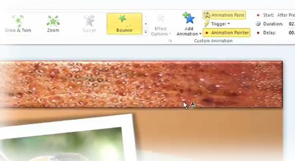
The Application Painter feature, demonstrated here, is derived from the Format Painter feature first created for Word before the turn of the century, and then carried over into Excel. The idea is that the paintbrush tool is "loaded" with the last animation effect used on an object, so that same effect may then be applied to new objects entering a scene without having to create some explicit style for them, or to repeat all the steps used in formatting the first one.
4. Search integration with Document Map in Word 2010. Document Map was a feature that was actually created for Office XP over a decade ago (in this excerpt, my wife was one of the first to document it). The original idea was to create some means for the author of a long document to build a meaningful, useful table of contents. Up to now, one of the key reasons this feature has gained so little use in business environments is because, once a document already becomes long, it's too late to spend time sectioning it into a map -- all the convenience and time you gain from having the map is wasted in actually creating it.
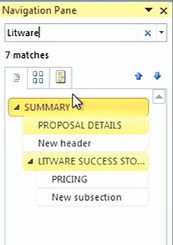 Finally with Word 2010, there appears to be some genuine effort to make Document Map useful in a real-world setting. Yes, only now can you use a search line (instead of Find-and-Replace) to locate an area in a document that may be worth mapping. Here, the search process is instantaneous, even more so than the 2007 version's old fashioned Home > Editing > Find feature, and hopefully it's also now indicative of the way search and replace will also work in Word.
(The second reason Document Map isn't as well utilized as it could be is because many businesses, including attorneys and publishers, prefer to maintain long documents in multiple files, especially if they're already divided into sections and chapters. Imagine how difficult it would be for many collaborating parties to edit a book, if the entire book were on a single document. Now, Microsoft would say the answer to that is SharePoint, but my experience tells me that the way you would motivate a business to use SharePoint is to take the time to demonstrate it to its employees directly.)
Next: Little cell-sized Excel charts, and a whole new "File Save"...
3. Little cell-sized Excel charts. With the latest Office 2007 Service Pack release last April, the charting features that had already been added to Excel were finally extended to Word 2007. In Office 2010, we're seeing some curious additions to Excel's charting abilities, including one we're not so sure a lot of folks may even have asked for explicitly.
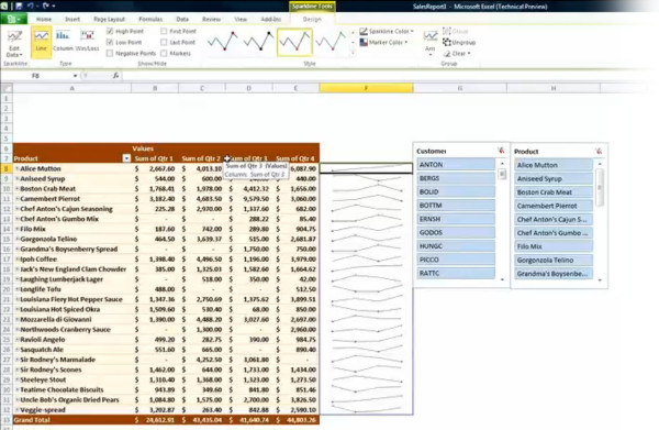
Excel 2007 saw the first stable use of in-cell graphics, specifically to enable things like "temperature charts" (hot/cold) and conditional background formatting. In Excel 2010, that in-cell engine is being extended to enable a feature its product manager is calling sparklines.
Here, the system is capable of rendering a single line or bar from a chart (whether it renders a single pie slice remains to be seen) inside a cell rather than in a chart of its own. You set up sparklines in a manner reminiscent of how you enter an array formula: First, you highlight an area of the worksheet where you'd like columns of sparklines to appear, then you designate the range of cells from which Excel is to ascertain trends. You can stylize these lines and bars very similarly to how you apply styles to chart elements in Excel 2007.
Now, just how far this new feature goes will require some hands-on testing. For instance, what we don't know yet is whether formulas and sparklines may cohabit the same cells, though our initial guess is that they may not. Sparklines aren't exactly a shot in the dark -- the concept is credited to layout artist Edward Tufte. In his own book on display concepts, Tufte writes, "When placed in a relevant context, a single number takes on additional meaning." Though you can't really use the sparkline as a chart, he goes on, at least it provides indications of a trend's range and current direction. (It will be interesting to discover whether Microsoft gives Tufte credit for the idea.)
Excel Sparklines is pictured here alongside another "new feature" being called slices. It may need to be renamed since "Web slices" for Internet Explorer means something else entirely. Here, it's actually a relocated version of table filters, with the filter range appearing in a flyaway palette rather than a drop-down menu. You use it to conduct live queries of table data, filtering for specific content -- another feature that Excel has actually had since the early days of Windows, only now repackaged.
2. Quick Steps customizable ribbon in Outlook 2010. "Office 14" was already delayed once. When its predecessor, the former "Office 12," experienced a similar delay in March 2006, it was reportedly to finalize some new features that weren't getting finished on time. Some of those features still didn't make it, and as a result, both Outlook 2007 and OneNote 2007 ended up lacking the Ribbon UI.
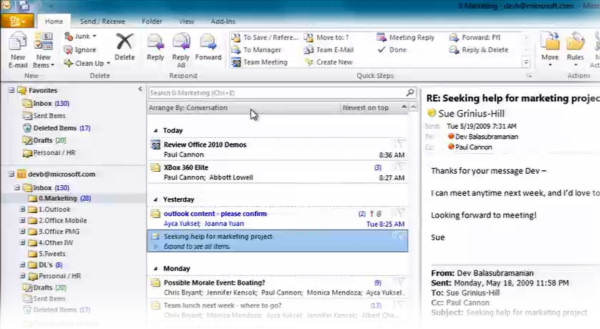
As widely anticipated, the ribbon for Outlook 2010 will make its debut appearance over four years later than originally planned. But in a curious move, the first official evidence of which was made public only today, Outlook's ribbon will have its own customizable function bay, being called "Quick Steps" -- a bay which we're not seeing yet in any other Office 2010 apps.
As described by Microsoft, the bay will store functions which the Outlook user will find himself doing often -- like accepting a meeting or broadcasting a group "OK" -- which should only require a single step. This was the original purpose, over two decades ago, of Office's customizable toolbars, especially for Excel users who wanted one-click access to macros. In Office 2007, though ribbons are officially "customizable," it's done using XML which is about as inviting to regular, everyday users as REGEDIT. With Quick Steps, customized commands appear with simple icons and text...almost the way you'd see them on a custom drop-down menu, except without the dropping down.
If Quick Steps becomes popular, as I suspect it might, there could be a movement to bring the feature to the other Office apps via a service pack.
1. BackStage. When the first glimpses of Office 2007 were revealed in early 2006, the most obvious visual feature -- like a giant ruby in a belly-dancer's naval -- was this prominent "Office button." It's the giant round button with the Office logo in the upper left corner, whose functionality replaced the old File menu. At the time, Microsoft engineers told us it was made bigger...so folks could find it easier.
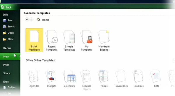
No, that probably wasn't the real reason. In any event, for Office 2010, the button is no longer giant. It is prominent, but it cohabits the ribbon menu, resuming its rectangular shape as originally seen in the Office 12 prototypes.
Behind it is a feature that Microsoft is calling BackStage. Essentially it's designed to gather together all the file and document management functions in one complete, large window. The File > Open and File > Save functions are relocated here, and the previews are large enough that they're not really "thumbnails" any more.
Perhaps most importantly, BackStage incorporates the long neglected feature known as Print Preview. There has been a technical reason why Print Preview in all Office applications behaves like a 1986 model application: For downward compatibility reasons, Print Preview has had to rely on the old GDI framework, mainly because so many customers continue to use old printers whose drivers required GDI. It was the only way older printers could provide renderings of previewed contents on-screen, and even though Microsoft itself came up with the replacement for .NET Framework years ago, there were still too many customers hanging on to old devices.
Let's face it: It's 2010, almost. It's time to let go. The new Print Preview features will be incorporated directly into BackStage, so users aren't effectively launching separate applications (which is literally what happens now) every time they want to preview what they're about to print. Instead, print previews will show up like document load previews, and controls will be much richer and more functional. For many businesses that rely on Word, the new Print Preview may be the feature which justifies the upgrade.
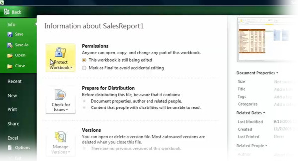
Elsewhere in BackStage, there's plenty of room now for the program to explain, using common languages such as English, the options available to users for managing their documents. That's important, because if you ask even the everyday Office user what the "Protect Document" function does, he might not be able to explain it to you. Borrowing the same textbook that inspired the design of Action Center for Windows 7, BackStage reports what each function does, without the user having to press F1.
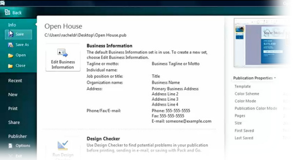
Some of those functions, it's worth pointing out, may end up requiring SharePoint access -- for instance, broadcasting files for collaboration -- so BackStage also ends up being a handy tool for Microsoft to push its server tools and Web apps for Office as well. No doubt the ability to save a file to Microsoft's cloud will be explained here in detail as well.
None of these new features are particularly "barn-burners," with the possible exception of the revamped Print Preview for some users. And since Office 2007 had the distinction of being one of Microsoft's most stable model years, there's very little in Office 2010 that can be considered a "bug fix," in the same way Windows 7 is being described as a "fix" for Vista.
The biggest improvements Microsoft could possibly make to Office overall are in creating consistency for the Ribbon. Although the old drop-down menu scheme derived from Common User Access was often cumbersome, redundant, and multi-tiered, the one thing you could say about it is that it was consistent. Once you understood the methodology behind where an app placed its functions, you could remember it. The Ribbon in Microsoft Office has a problem with not communicating its intentions well -- while some users pick up on it right away (my wife, for instance, truly appreciates the ribbon), others (including her husband) don't. If Office 2010 improves in the consistency department, then for me, it will justify the upgrade. Because right now, in terms of pure functionality for everyday operations, Office 2007 already left its competition in the dust years ago.
Copyright Betanews, Inc. 2009


 Welcome back, Microsoft. After a few years of getting your butt kicked by Google, it's nice to see you waking up from your monopolistic slumber. You seem to finally get it that both Windows and Office don't have indefinite or guaranteed futures, and you're willing to hang yourself out over the edge a bit to keep them both relevant.
 I'll reserve final judgment until I bring home my spanking new copy sometime next year, but if early indications mean anything, Microsoft is digging beneath the surface and giving us something more fundamental than the software equivalent of a fresh coat of paint.
 Finally with Word 2010, there appears to be some genuine effort to make Document Map useful in a real-world setting. Yes, only now can you use a search line (instead of Find-and-Replace) to locate an area in a document that may be worth mapping. Here, the search process is instantaneous, even more so than the 2007 version's old fashioned Home > Editing > Find feature, and hopefully it's also now indicative of the way search and replace will also work in Word.


 Adobe Systems today released the public
 This morning, stage 2 of that rollout process begins, with three new models in the HE series and two in the SE. The HE is AMD's "somewhat lower power" line-up; only AMD, not Intel, is gambling that there are two facets to the low-power side of the market, with the larger slice of that market preferring to balance power and performance, with a smaller percentage (the "EE" side) wanting low power at all costs. The SE side of the market is meant to attract the opposite market segment, seeking high performance at all costs, including some supercomputer builders. But in an interview with Betanews you'll see later today, AMD admits up front that side of the market is shrinking. Or at least that may be AMD's excuse at the moment for keeping its processors clocked under 3.0 GHz once again.
