By Scott M. Fulton, III, Betanews

 For close to two decades now, the design of applications has changed surprisingly very little. At their core, apps wait for users to generate input, and they respond -- a server/client model of processing on a very local scale. So in a very real way, what applications do has been a function of how they respond -- the whole graphical environment thingie you've read about has really been a sophisticated way to break down signals the user gives into tokens the application can readily process.
The big roadblock that has suspended the evolution of applications from where they are now, to systems that can respond to such things as voice and language -- sophisticated processes that analyze input before responding to it -- is the token-oriented nature of their current fundamental design. At the core of most typical Windows applications, you'll find a kind of switchboard that's constantly looking for the kinds of simple input signals that it already recognizes -- clicking on this button, pulling down this menu command, clicking on the Exit box -- and forwarding the token for that signal to the appropriate routine or method. Grafting natural-language input onto these typical Windows apps would require a very sophisticated parser whose products would be nothing more than substitutes for the mouse, and probably not very sufficient substitutes at that.
If we're ever to move toward an analytical model of user input, we have to introduce some sophisticated processes in-between -- we have to start endowing apps with the capability to ask the question, "What does the user mean?" And while this edition of Top 10 isn't really about natural language processing at all, it's about Microsoft's first genuine steps in the direction of evolving applications in the direction they need to go, to be able to absorb natural language as the next big step.
That first step, perhaps unexpectedly, is multitouch. It's a somewhat simpler version of solving the bigger problem of ascertaining meaning through input, because now that Windows apps will begin being able to process input coming from two or more points on the screen at once, the relationships between those multiple points will need to be analyzed. For example, when a program receives a series of signals that appear to show multiple points, arranged in a generally vertical pattern, moving slowly and then very quickly to the right...could that mean the user wants to "wipe the slate clean?" "Start over?" "Clear screen?" What's the probability of this?
Analyzing input changes everything, and if enough developers invest their true talents in addressing this necessary element of evolution, this could change everything for Windows apps -- everything.
Where we are now on the evolutionary scale is not too far ahead of where we started roundabout 1982. The creation of Common User Access (the use of graphical menus and dialog boxes that follow a standard format) led to the development of a kind of "switchboard" model for processing input. And if you follow the model of Windows programming espoused ever since the days of Charles Petzold's first edition of Programming Windows, that switchboard is the part you build first -- if you're a developer, everything you make your program do follows from what you put in its menu.
Veteran Windows programmers going back to straight C know this switchboard as the WndProc() procedure; and although languages that have crept into IDEs since the Windows/386 days do use different models and conventions, for the most part, they just provide developers with shortcuts to building this basic procedure. Literally, this procedure looks for the unique ID numbers of recognized input signals, called "window messages" or "mouse events," denoted in the nomenclature by the prefix WM_. A long switch clause goes down a list, checking the most recently received event ID against each possible response, one at a time, and connecting with the procedure associated with that response once there's a match. It's like looking for a plug on a telephone switchboard left-to-right, top-to-bottom, every time there's an incoming call.
Throughout the history of Windows, the evolution of application architecture has typically taken place in either of two ways: Either Microsoft improves some underlying facet of the operating system, which leads to an improvement (or at the very least, an obvious change) in how the user perceives her work immediately; or Microsoft implements a change which developers have to seize upon later in order for users to see the benefits down the road. As you'll certainly recall, the change to the security of the system kernel in Windows Vista was immediate, and its benefits and detriments were felt directly. But when Microsoft began introducing Windows Presentation Foundation (WPF) during the twilight of Windows XP's lifecycle, it took time for new developers to transition away from Foundation Classes (MFC), and many still choose not to.
Multitouch is one of those changes that falls into the latter category. Since December when the company published this white paper, Microsoft has been calling its latest layer of user input Windows Touch. Windows 7 will have it, and presumably at this point, Vista can be retrofitted with it.
Windows Touch is an expansion of WPF to incorporate the ability to do something the company's engineers call coalescing -- ascertaining whether multiple inputs have a collective meaning. Using two fingers to stretch or shrink a photograph is one example, or at least, it can be: In an application where two fingers may be used for a variety of purposes -- twirling, changing perspective, maybe even minimizing the workspace -- an act of coalescing would involve the application's ability to register the multiple inputs, and then ascertain what the user's intent must be based on the geometry that WPF has returned.
The concept of coalescing was introduced to us last October by Reed Townsend, the company's lead multitouch engineer. As he told attendees at the PDC 2008 conference that month, the revised Win32 Application Programming Interface (which will probably still be called that long after the transition to 64-bit is complete) will contain a new "mouse event" called WM_GESTURE, and it will handle part of the job of coalescing motions, in order to return input messages to an application that go just beyond what the mouse pointer can do for itself. Rotation, zooming, and panning, for instance, may require a bit more decision making on the part of Windows Touch -- a kind of on-the-spot forensics that filters out panning motions from scrolling motions, for instance.
 Since the first editions of the Tablet SDK were produced during XP's lifecycle, Microsoft has been building up a vocabulary of coalesced gestures that developers may be able to utilize through the assembly of gesture messages. Perhaps a down stroke followed by a right stroke may have some unique meaning to an app; and perhaps the length of that right stroke may impart a deeper meaning.
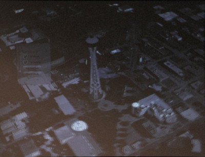
Simply endowing programs with the capability to judge what the user means based on the input she appears to be giving, changes the architecture of those programs, particularly in Windows. Born from the company's experiments with Surface, a simple manipulable globe application has provoked Microsoft's engineers to think very differently about how input is processed.
Video: Windows 7 Touch - Globe Application
The idea, as we saw last October, is simple enough: Place a globe on the screen which the user can twist and turn, but then zoom in to see detail. The project became more detailed once the engineers began to appreciate the complexity of the problems they were tackling. Stretching and shrinking a photograph is a simple enough concept, particularly because a photo is a) two-dimensional, and b) rectangular. But a three-dimensional sphere adds new dimensions, as users are likely to want to use the device spherically. "Down" and "up" become curved, sweeping motions; and zooming in on an area becomes a very complex exercise in transformation. Add two-dimensional floating menus to the equation, and suddenly the application has to analyze whether a sweeping motion means, "Get that menu out of my way," "Pin that menu to that building," or "Make that menu smaller for me." And when a big 3D object such as the Seattle Space Needle comes into view, when the user touches its general vicinity, does he mean to be touching the building itself? Or the globe on which the building is positioned?
In order to make input simpler -- to have a moving globe that folks will already know how to move and zoom into and look closely at and do things automatically with -- the application has to incorporate orders of magnitude more complexity than they've ever worked with before. The moment the program "guesses wrong," and the globe behaves in a way users didn't expect, they'll feel disconnected with it, as though an object in their real world were to wink out of existence or morph into some foreign substance.
Next: The immediate upside of multitouch...
The immediate upside of multitouch What the engineers are learning from this process is already having a positive benefit to Windows 7 in general, in features you'll see and use every day. The concept is being called Aero Snap, but it doesn't actually require the Aero rendering model at all -- it works fine in a virtual machine without Aero. After 19 years of the current window model, Microsoft discovered something that could have helped them as far back as 1984, during the days of the "MS-DOS Executive:" Perhaps a simpler way to maximize a window would be to just drag its title bar to the top of the screen.
Now, while that concept sounds simple enough, what if all the user's trying to do is drag an existing window up? If he hits the top of the screen, its size could blow up unexpectedly -- and once again, Windows feels like a foreign substance. The user experience (UX) engineers tackled that problem by creating a way to "feel" when a window dragged up there can be minimized. If the left button is held down while the pointer touches the edge of the screen and stays there, Windows 7 responds with a visual signal that highlights the entire workspace, advising the user that the window would be maximized if he let go of the button. (This effect does look cooler in an Aero environment, where the system applies a glossy finish; in normal rendering, the system merely covers the workspace in a blue halftone.) If the pointer continues beyond the upper edge, the window is merely dragged on up, just like before.
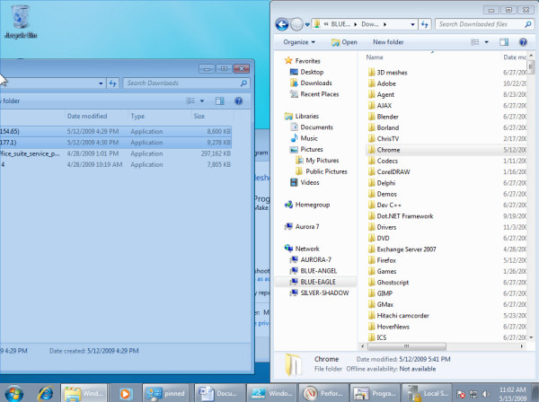
Taking this idea a few steps forward, the Win7 user can now drag a window to the left edge to have it "semi-maximized" -- to fill just the left half of the screen. The visual cue remains, so if the pointer moves to the edge and stops, he's given a clear warning with the visual effect. But then the user can do the same with the right edge as well, providing at long last, after two decades of complaints from me and Jerry Pournelle and the rest of the world, a way to create a dual-paned Explorer environment in about a second. And having learned lessons from the Surface and Touch projects, Win7's UX engineers remembered that doing the opposite motion should provide the opposite response; so once snapped windows are dragged away from their edges, they return to their previous size and shape.
This is the beginning of something, a lesson finally learned after years of plodding in the same general direction with the same general result. The introduction of styluses and now fingertips into the input model has finally led to a scenario where apps may at last be able to process natural language syntax -- not just single words like "maximize," but sophisticated concepts like, "Show me what that might look like in five years." Simply adding the input analysis phase as a step in the process of computing will -- if we do this right -- truly revolutionize the way we work. Of course, if we follow the same patterns we've followed up to now, the whole idea could also begin and end with Snap.
Download Windows 7 Release Candidate 32-bit from Fileforum now.
Download Windows 7 Release Candidate 64-bit from Fileforum now.
FOLLOW THE WINDOWS 7 TOP 10 COUNTDOWN:
Copyright Betanews, Inc. 2009


 For close to two decades now, the design of applications has changed surprisingly very little. At their core, apps wait for users to generate input, and they respond -- a server/client model of processing on a very local scale. So in a very real way, what applications do has been a function of how they respond -- the whole graphical environment thingie you've read about has really been a sophisticated way to break down signals the user gives into tokens the application can readily process.
 Since the first editions of the Tablet SDK were produced during XP's lifecycle, Microsoft has been building up
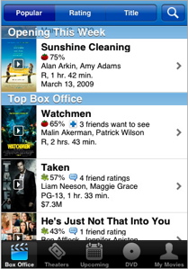 Flixster, the social network for movie buffs, has taken strongly to the gadget, widget, and mobile app distribution channel. Following up on the success of its Facebook, Myspace, Bebo, and Orkut gadgets, it released a popular iPhone app at the end of summer 2008. Now the service has moved onto the Android platform and released a similar app.