By Tim Conneally, Betanews
Samsung's custom Android user interface is the first thing we see on Galaxy S family of phones, but seems to be the last thing anyone is talking about.
Walt Mossberg from The Wall Street Journal recently reviewed the two available Galaxy S devices and seemed hung up on comparing them to the Apple iPhone 4, going so far as to call them "an appealing alternative to the iPhone," as if the iPhone is the standard first choice when it comes to buying new phones.
But Android phones are selling in greater numbers than iPhones, and Samsung is the second highest selling handset manufacturer in the world behind Nokia, with its position rising, according to Gartner's most recent mobile market share breakdown.
So we must look at Samsung's Galaxy S series in terms of what it does for Android, not how it compares to iPhone.
In the realm of Android, branded user interfaces have become a major differentiator, and the most prolific Android phonemakers each have their own: HTC has Sense, Motorola has MotoBLUR, Sony Ericsson has the UX Platform, and Samsung has TouchWiz 3.0. These unique versions of Android can have a serious impact on the public's perception of a phone's quality, and indeed the capabilities of Android as a whole.
With that said, TouchWiz 3.0 puts a clean, fast, and versatile face on Android with plenty of exclusive features.
Lock Screen

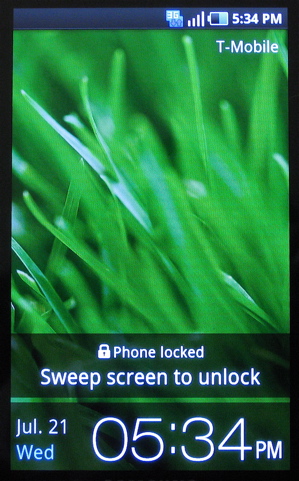
The simple, visually appealing lock screen is both aesthetically and functionally different from Android's standard version. The standard version presents two small drawbars (one for unlock and one for volume toggle) which you pull horizontally across the screen. TouchWiz 3.0's lock screen can be dragged in any direction to unlock the phone.
Home Screen

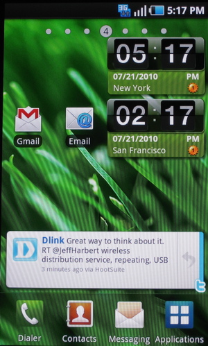
Google's stock version of Android has three open homescreens, a "drawer" where the apps are stored and a "shade" for running processes and notifications. TouchWiz 3.0 improves on all of these aspects by expanding the homescreen space, and consolidating common functions. For example, the "shade" pulldown menu includes buttons to toggle wi-fi, bluetooth, gps, and ringer. This handy feature eliminates the need for the "power control" widget standard with Android.
Users can add up to seven homescreens for apps or widgets, and there is a dock across the bottom with icons for the dialer, contacts, messaging, and applications. With this dock, icons for those common functions needn't be added to the homescreen space, which again gives the user more freedom.
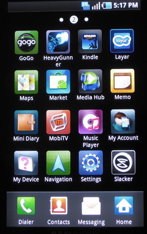
The applications button is the equivalent of Android's "drawer," and when pressed, instead of a vertically scrolling list of apps, the user drops into a screen absolutely identical to the Apple iPhone: a horizontally scrolling, 4 x 4 grid of app icons on a black background.

Widgets
Since Android's visual layout doesn't require all of the user's installed apps to be shown at all times, it has become a haven for always-on widgets. Users can peek at their homescreen and see the time, date, weather, news, and their various social and RSS feeds without opening a single application.
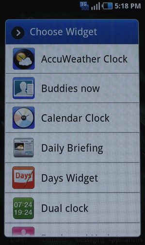
Google's stock version of Android comes with a different number of widgets depending upon the version (typically between six and ten) and Samsung adds eight more exclusive widgets into the mix.

While four of these are different types of clocks (accuweather clock, calendar clock, yahoo finance clock, dual time zone clock,) Samsung has added four very strong exclusive widgets into the mix: buddies now, daily briefing, days widget, and feeds and updates.
Buddies Now lets the user organize his contacts into quick "call/message" thumbnails which expand into a close-up of his correspondence with this contact, broken down into "info," "history," "updates," and "media."
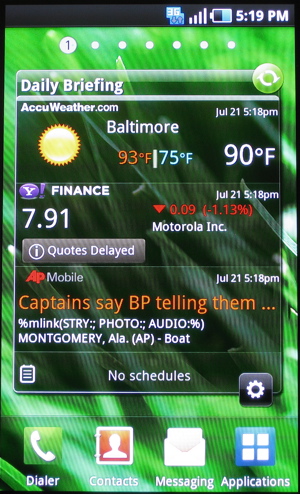
Daily Briefing combines weather updates, stock updates, Associated Press news, and schedule reminders into a single full-screen widget. When clicked, it launches the daily briefing app which is a four-panel expansion of the same information.

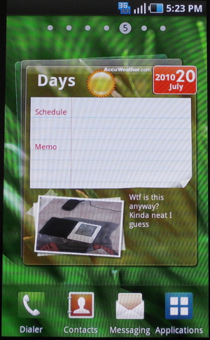
"Days" is an interesting widget and app combination that gives the user the ability to add notes and pictures to Google Calendar entries and then export them as a diary on Facebook or MySpace or be sent directly to another user via MMS.

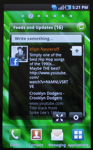
Feeds and Updates is similar to HTC's Friend Stream widget; it takes the user's Facebook, Myspace, and Twitter feeds and displays them in a single unified stream which can be set to refresh every 30 minutes, hour, 4, 8, or 24 hours.

Overall
TouchWiz 3.0 is not a simple reskinning of Android and actually goes quite a long way in improving the use of the homescreen space. It takes the commonly-used icons and widgets and stitches them into handy positions, freeing up space for user customization. Samsung's own apps are quite useful and carry over well as exclusive widgets.
One disappointing aspect of the UI was that Samsung did not integrate its DLNA-compatible AllShare app into it. This app is designed to make Galaxy S phones into a conduit for sharing files between NAS, DLNA devices, and the phone itself in home wi-fi networks. Though it is one of the first major steps toward integrating Android devices into home networks right out of the box, it is still a temperamental solution at best, and hasn't yet been included in the forefront of the UI.
Hopefully this is something we can expect in later versions.
Copyright Betanews, Inc. 2010


 Google
 -
Android -
IPhone -
Facebook -
Motorola


